Sat, Apr 25, 2015

: High Expectations: Apple Watch

Recently I helped a friend with her iPad. I’d showed her how to use FaceTime for free phone calls, but she panicked when she couldn’t figure out how to hang up on a call. She’d switched away from the phone screen and no longer saw a red phone “disconnect” button. Her problem was trivial and utterly obvious to anyone who’s used an iPhone — touch the colored status bar at the top of the screen that returns you to the active call — but since she only has an ancient dumbphone, it wasn’t at all obvious to her.

This experience made me realize just how much user interface we take for granted. Sure, today’s devices are remarkably easy to use for all the power they give us — but that’s because they’re built upon decades of computer use. No modern person would have a problem in using a simple calculator — but give that to a person 100 years ago accustomed to doing math on paper and they wouldn’t have a clue how to use it.

I bring this up because today we have a new user interface paradigm: the Apple Watch. On the one hand, I’m really impressed with all the incredible work Apple has done. The Watch is deep, full of thoughtful design touches, remarkably powerful, and surprisingly useful. On the other, it’s more complicated than any 1.0 product in history.

If we look back at the original 2007 iPhone, it wouldn’t even be sellable today: no third-party apps, tiny low-resolution screen, feeble hardware, not even support for copy-and-paste! Apple Watch 1.0, in relative terms, is far more advanced.

And yet, in a way, the original iPhone’s limitations were key in making the device acceptable. It was a huge leap forward in capability, but too big of a leap can be overwhelming for many users. That’s the first impression on Apple Watch for most people: “Wow, that’s… neat… but way too complicated for me!”

Apple Watch is new. Apple Watch is different. Just because you know how to use an iPhone doesn’t mean you know how to use an Apple Watch. It uses a different design language, a different metaphor, and has new use cases.

This makes sense. Apple understands at the deepest level that Apple Watch is not a phone. However, if you don’t understand that, it might frustrate you. You might not understand the point of it, wonder why you need it, or chafe at the device’s limitations.

Here’s one example. I received my Apple Watch yesterday (stainless steel with Milanese Loop, if you’re wondering) and allowed the default of installing all available third-party applications onto the watch. (This isn’t all apps in the world: just the ones on my phone that also have watch components.) This meant that a number of apps I barely use or haven’t used in years suddenly showed up on my watch. I didn’t even recognize the icons and most of the watch apps have such a minimal interface that you can’t even tell what app is running. Many of the apps basically showed me an empty screen with a message along the lines of “configure our iPhone app so something shows up here.”

I could look at this as frustrating and annoying. I’m sure many people will. I bet tons of people will just delete these apps as being “useless.” But this is the nature of watch apps: attempting to configure gobs of options on a tiny watch screen isn’t practical. Apple has done a very clever thing in making watch apps be tied in with iPhone apps. Perhaps some day that won’t be required, but for now it makes installing, managing, configuring, and using watch apps a lot simpler.

To elaborate on this with a practical example, I’m heading on a trip next week, one I booked through Orbitz. I noticed the Orbitz app on my watch, but it was empty. I realized I had downloaded but never even run the app on my phone. Sure enough, I wasn’t logged into my Orbitz account. Once I put in my login and password on the phone — not something you’d want to have to do on a tiny watch screen — all the details of my trip were on my watch! I can see my upcoming flights, travel times, eticket codes, etc. That’s awesome info to have on my wrist and will be incredibly helpful and convenient during my travel.

This illustrates the ideal use case for the watch: it is purposely simple and limited (I can’t log into my Orbitz account on the watch; that’s a complicated task that must be done on the phone), but what it does do is even better than on the phone as when I’m going through airports carrying luggage I don’t have to fuss with my phone to find my travel details.

Some will chafe at the watch’s limitations. For instance, you can read emails and delete them, but you can’t move them or reply to them. Text input is via either canned responses (typed on the iPhone, of course) or Siri dictation; Apple Watch has no typing keyboard. Most apps are “baby” versions of the main iPhone app with minimal features.

Yet I think as we use the watch, we will see these limitations make sense. Why would we want to reply to emails on the watch? That’s a complicated task much better suited to the bigger screen on an iPhone. Who would be masochist enough to want to type even a few words on a 1” watch screen?

In demonstrating the watch for my mother yesterday (she happened to arrive just a few minutes after the watch’s delivery), I discovered that just holding my arm up to use the watch for more than a few minutes was quite agonizing. There is no way you’ll want to actively interact with the watch for more than a few seconds. In that use case, it is useful. Having Siri available on your wrist for quick reminders or questions, being able to do a little email triage when you’ve got a minute in a checkout line, glancing at the screen for the latest stock quotes or weather report, or using your wrist to pay for something — these actions are all accomplished in seconds, not minutes, and are more convenient than fishing out your phone.

Once you wrap your head around the watch’s intentional limitations, you’ll start to think about how interact with it in a different way and its user interface, which seemed confusing a first, will begin to make more sense.

The Watch That Isn’t a Watch

It doesn’t take much foresight to realize that just like the iPhone isn’t really a phone, Apple Watch isn’t really a watch. And yet Apple has specifically engineered Apple Watch to revolved around a watch-like interface and features.

This is smart on several levels. It makes Apple Watch more approachable, and it also sets up expectations. While Apple Watch really is a computer on the wrist, it doesn’t work like that. It works like a watch.

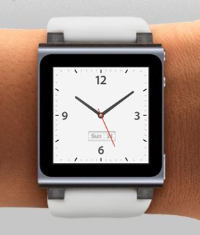
The main screen when you activate the watch (by merely raising your wrist) is a clock face. You can add “complications” (extra information widgets) to customize the display if you want, but it’s still basically a watch.

Contrast this with an iPhone or computer screen where the default thing you see are app icons or the contents of your storage device (apps or documents).

On Apple Watch, the watch face is the main screen. While there is an app screen — that colorful collection of circular app icons you’ve seen in pictures — it requires an extra step to get there.

And only from the watch face can you access Notifications and Glances. Notifications are a swipe down from the top of the watch. They consist of alerts from various apps (you can configure which ones and perhaps even what kind of information they’re alerting you about). Notifications are a big part of the watch for many, as if you’re busy they can be faster and more discrete than pulling out your phone all the time.

Glances are far more interesting to me: you can set which Glances are available (and their order) and they provide a simple screen with a little bit of information. For instance, the weather one could show you weather, the stock one the value of your stocks, and so on. Apple includes several for monitoring your watch’s battery level, your own activity level, your calendar, heart rate, music playback, and more. You access Glances with a swipe up (and then swipe left/right to move between them). I’m new to the watch, but already I think these will be used much more than actual apps. (They’re also a really handy way to actually launch the full app as a touch on them opens the app without having to search for it in the icon grid.)

Speaking of apps, prior to playing with an Apple Watch, I was most concerned about the overwhelming nature of the potential of too many app icons. While that’s still a concern, it’s not nearly as bad as it seems. First, you can disable any third party apps you don’t want to see. Second, you can arrange the icons in whatever order you’d like (for instance, putting your most used apps front and center). Finally, I suspect most people will only use a few key apps or access them via Glances. Remember, the watch is not a phone!

A Personal Device

Apple likes to describe Apple Watch as the “most personal device” they’ve created. That sounds like vague marketing-speak, but I believe it’s sincere. Not only is the watch intimately tied to your body, but the way it’s used means that it must be highly customized to your specific needs. You’ll organize the apps you want, the Glances you want, and the watch faces you want. After a while, I imagine putting on someone else’s watch would feel as weird as using someone else’s computer or phone. Yet I suspect the feeling would feel more like a violation, as your watch is you.

While Apple Watch is configurable — especially the watch faces — Apple has limited what you can change in ways that will probably annoy many. For instance, you can’t create your own watch face with a photo. There are no third-party faces, either. There aren’t that many built-in faces (I miss some of the classic watches from my iPod nano), and worst of all, not all support the same complications.

Currently you can add only a handful of complications — the date, temperature, battery level, stock quote, stopwatch, etc. — and you don’t always have a choice of what can be added where. That can be frustrating for tinkerers. I don’t believe it will always be this way, but I think Apple deliberately did this to keep things simple for the initial release. Over time the watch will open up, just like the iPhone. I’d love the ability to design my own custom watch face!

A Learning Experience

Though it feels like I’ve read everything written about Apple Watch since last fall and I played with an actual watch at the Apple Store for over an hour the other day, I discovered I still had a lot to learn. Some things made sense: I’d never gone through the pairing process to tie a watch to my phone before, so that was new (and incredibly well-done by Apple).

Other things were a bit more awkward and the experience wasn’t magical. For instance, I successfully paired my Bluetooth headphones with the watch but couldn’t get music to play through them. It was bizarre and there’s really no trouble-shooting possible on the watch. I searched through every setting I could find and nothing worked: music kept playing on my iPhone instead of the watch.

I finally decided that perhaps that was because the music was stored on my phone, not on the watch, so I figured out how to sync some songs to the watch. That took longer than I planned, because I didn’t notice Apple’s subtle text on the Apple Watch app on the iPhone that explained that syncing would only happen while the watch was charging. Once I got the songs onto the watch, there was still more info needed: I had to read the manual (free on the iBookstore) to discover that I need to hard press on the music app on the watch to bring up a “source” option that lets me choose between watch music and iPhone music.

Once I got through all that, I managed to get tunes playing through my headphones. But I still couldn’t do phone calls. After a lot of frustration, more research finally revealed something shocking: while Bluetooth headsets are required for music playback, they aren’t supported for phone calls!

I don’t know how I missed that info, but my initial reaction was a bit of outrage. It seemed like a critical feature that was missing. While I’m grateful the watch does have a tiny (tinny) speaker on it, it’s not very audible and you wouldn’t want to use it for more than a few sentences. (It also runs the watch battery down fast.) I pictured myself out for a walk while listening to music from the watch, receiving a phone call, and struggling to communicate in the wind and outdoor noise. If that was the situation, it pretty much meant no phone calls with the watch.

However, once I calmed down, I believe the solution for this simple enough: forget pairing a headset to the watch. Just pair it to the iPhone instead. Then it works like always, except you can keep your phone in your pocket and initiate the call answer via the watch. You’ll have more music, too. The disadvantage is you have to have your phone with you, but for phone calls that’s required anyway. The only reason to pair headphones to the watch is if you went jogging without your phone.

I wish that had been communicated more effectively, but it’s not a dealbreaker. Using a Bluetooth headset seems like a natural, but I suspect this is a technical issue: if Bluetooth is already being using to connect the watch to the iPhone to handle the phone call, perhaps there isn’t enough bandwidth to do both at the same time.

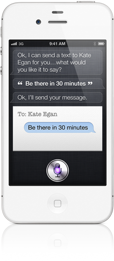
Not all the watch’s surprises were negative: I hadn’t realized that Siri could be activated with a “hey Siri” command while the watch is awake. This makes it really easy as you don’t even have to press a button. Just raise your wrist and say something like, “Hey Siri, what movies are showing?” and she’ll give you a list of all your local movies. (Not only that, the listing includes mini-reviews and a synopsis, not just show times.)

I’ve also been pleased by some third party apps. I mentioned Orbitz, but I was delighted to discover that my food diary app (Lifesum) includes a watch app. It is clever in that it doesn’t ask me to enter specific foods and calorie calculations on the watch (which would be convoluted), but simply choose the size of a meal (small, medium, or large). The app then shows me how many calories remaining in my daily quota. Really nice and useful.

It’s also cool that my new Elgato Avea LED lightbulb is controllable via the watch!

Much More to Learn

I haven’t yet had time to use the watch’s fitness features, but already it’s bugging me to stand up every hour (which I find incredibly helpful). We shall see how useful it is during exercising (keep in mind I don’t do anything athletic), but I’m hopeful. I’m really curious about the heartbeat history. I don’t know if that’s useful info to have right now, but it could prove invaluable in the long run (there’s a history of heart trouble in my family).

I have yet to try Apple Pay, though I set it up, and I haven’t tried the remote control features. (Apple Watch will let me control my Apple TV, which is potentially useful. I find the iPhone app too cumbersome.)

There are plenty more watch features I haven’t used yet, but I haven’t even had this thing for twenty-four hours! And much of the watch will be judged by what I’m still using months from now, not what seems interesting during my initial exploration. Plus, there’ll be new apps coming out and who knows what will prove useful.

Is It For You?

The big question that everyone has about Apple Watch is: “Should they get one?”

I honestly can’t answer that. While there are some people who could argue that due to the nature of their jobs (i.e. hands are occupied) they need an Apple Watch, that’s not very many. For most, Apple Watch is a convenience, not a necessity. While it has a lot of useful features, there’s little it can do that your iPhone can’t already do. Even if you want the fitness tracking, there are simpler, cheaper trackers that are possibly more effective.

But Apple Watch is interesting and fun. The value of convenience can’t be underestimated. While saving a few seconds now and then doesn’t seem like much, once you’re used to it, you won’t want to live without it. I can picture Apple Watch becoming essential in a few years.

Apple Watch is complicated. There’s a lot to learn. There’s not much info out there and few experts to help you. Right now I wouldn’t recommend it if you’re not into gadgets or if it seems expensive to you. For many, waiting until version 2.0 or 3.0 is probably the best course.

That said, Apple Watch is useful. I’m not disappointed, nor do I regret buying it. I even splurged on the more expensive stainless steel version. I’ll wear it for a while and see if it feels too heavy (I may decide I prefer the light aluminum version). Right now it feels slightly too heavy, a little too noticeable. That could change with time — it’s been years since I’ve worn a watch regularly.

I do really like the Milanese Loop band I chose. The rubbery sport bands, while not a bad fit or feeling, just seem too cumbersome to put on for me. If I have to hassle with it every morning I probably wouldn’t bother. I love that the loop fastens with a magnet so it’s always perfectly sized to my wrist, but I have had some trouble with the magnet sealing against itself while its off requiring a bit of fidgeting to get it ready to put on in the morning. (I suspect that will change as with experience I figure out what works.)

There are many who say that Apple Watch isn’t jewelry and shouldn’t be priced as such, especially since tech goes obsolete so quickly. While that’s true to an extent and for most the cheaper sport models are all they need, the truth is that if you’re wearing this every day, it by definition is jewelry, and for some folks it’s worth paying a bit more for something more stylish. (I don’t wear any jewelry at all, but even I wanted the higher-end steel watch.)

One thing that occurred to me regarding those who think Apple Watch is expensive is to compare it to the original iPod. I was an early adopter there as well, spending $399 on launch day for a device that was bigger and heavier than a modern iPhone, had only 5GB of spinning rust storage, a tiny black-and-white LCD screen, no wifi or Bluetooth, no sensors, and less battery life than Apple Watch. When you look at it that way, putting all the sensors and electronics into a thing about the size of a stack of six quarters is a steal for $399!

Topic: [/technology]

Link

Mon, Apr 20, 2015

: The Future Is Thin

I’m writing this on Apple’s new radically-thin MacBook. You know, the controversial one with the single USB-C port, ultra-flat keyboard, and gorgeous Retina display. The thing’s about as thick as an iPad — and that’s for the full clamshell, including the keyboard.

Granted, this clearly isn’t the laptop for everyone. For the same money you can get a laptop with a bigger screen, a more powerful CPU, and lots of ports for connecting stuff. I certainly wouldn’t recommend it as someone’s only computer (unless all you did was email and typing), but as a secondary device or travel laptop, it could be ideal.

For me, this replaces my cute little 11” MacBook Air which I used as a writing and travel laptop. While some are criticizing this new MacBook as being underpowered, compared to my slow 2010 MBA with 64GB SSD and a mere 2GB of RAM, this guy is a speed demon. (According to my Geekbench tests, the new one is three times faster than my old one.) With my MBA, I really could only run one app at a time. Anything more would just put too much of a strain on the machine, both memory and CPU. I didn’t even try to run anything complicated on it and pretty much only used it for word processing and even there it lagged on occasion.

On the new MacBook I already have been able to have iTunes playing music in the background while type, have email and chat running, and Safari open for web research, and the thing runs without a hiccup. It doesn’t even have a fan, so while that means the base can get warm during intensive tasks (it got quite hot when I was installing many gigabytes of data onto it during initial setup), it also means that it’s blissfully silent no matter what you’re doing. Combined with its lightness and thinness, that means this guy feels a lot more like an iPad than a Mac.

What you’re really paying for with the new MacBook is simplicity. For some, that feels too expensive, and that’s understandable. Not everyone values simplicity. As a writer, however, simplicity means less distraction and the ability to focus. That’s incredibly valuable, and to me makes this new laptop feel well worth the price.

While some are calling this MacBook a “compromise,” that’s because they don’t understand it. One of those ugly cars with the pickup truck beds is a compromise — not quite a truck, not quite a car — this ultra-thin laptop is a design choice. By getting rid of things you hardly ever use (ports) and simplifying others (lower-power CPU, flatter keyboard), you’re able to create a lighter, more portable laptop. Somehow adding in an ultra-high-resolution Retina screen while still providing incredible all-day battery life, and you’ve got a new class of machine.

Personally, I like the limitations of this device. I’m not going to install Adobe Photoshop on it, or try to do video editing or make it my main computer. This is my distraction-free writing machine. It’ll also be awesome for travel, because it’s so thin and light but still a full Mac and can do anything I need (just a little slower).

I still prefer my iPad for consuming content — reading blogs and ebooks is a joy on iPad — but though I’ve tried hard to use iPad for writing, even with an external keyboard the process just isn’t the same. While a real keyboard provides the essential cursor keys I need, I still find navigating documents awkward, and no iPad word processor I’ve found lets me open more than one document at a time. Writing on a Mac is just more familiar and more powerful. With the new MacBook, I’ve got the best of both worlds — the size and weight of an iPad with the power of a Mac.

(I also find a Mac better for lap typing; since an iPad’s screen also includes the battery, iPads with keyboards tend to be extremely top-heavy. That’s made worse by the fact that they’re touch screen devices, so when you have to touch the screen — and you must on occasion as not everything can be done via the keyboard — the thing tips over.)

That Keyboard

Beyond the shock of only providing a single port on the laptop, the keyboard is the most divisive aspect of the new MacBook. It’s so thin that there’s less key travel so if you like a keyboard you can really press down on, this isn’t it. On the other hand, I’ve heard people say it’s not much better than typing on glass and that’s absurd — it’s far better than that, as not only are there key shapes for your fingers to feel, but there is a millimeter or two of travel; the keys do actually press down.

I can pretty much guarantee that the first time you try it you’ll hate it for a few seconds. It definitely feels different. But try typing and you’ll soon see that you can type on it. It’ll still feel weird, but it works.

I wasn’t ever able to get comfortable typing on the demo unit at the Apple Store, but it wasn’t at a proper desk height with a chair and a regular kind of typing position. Here at home I’ve been able to sit back and actually use the new keyboard for more than a few minutes and I’m delighted to say that already the “weirdness” is wearing off. I can’t say I’m completely comfortable yet, having only typed a thousand words or so, but I’m getting there much faster than I would have expected. I still make some typos as the positions of some of the keys are different, but it’s not as bad as I feared.

(I thought it might take me a week to get used to it and it’s now just thirty minutes in and I’m already typing at near my maximum speed. Note that I’m not a particularly fast typist. I think I range between 60-80 word per minute. Most of the time that includes me thinking about what I’m writing, though, so it’s not just pure typing. What matters to me is how my speed feels and already this is feeling pretty normal in terms of speed.)

The biggest change on the keyboard are the arrow keys. I’d read about them but forgot to test them at the store. Apple did an odd thing: with the previous MacBooks the arrow keys are all half-size. In the “inverted-T” configuration, this meant there was blank space above the left and right arrows. The new layout makes those keys full-height, so the empty space above is gone. I hadn’t thought that was that big of a deal, but so far about 90% of the problems I’ve been having are with the arrows. Because some are bigger, I tend to push the shift key above the up arrow when I want to go up. It’s like my mind assumes that they’re all the same size. I don’t think it’s a dealbreaker — it’s just going take me a little while to get used to the new layout. Since my main computer’s a MacBook Pro with the old layout, it’ll be interesting to see how I adapt switching between them regularly.

All that said, I’ve long maintained that keyboard preference is a bad thing (in the past I’ve purposely tried not to get too tied to one keyboard by frequently switching). Getting so addicted to one particular keyboard that you can’t use a different one is terrible, especially for a writer. Now that doesn’t mean you can’t prefer one over another, or choose a particular external keyboard that fits your needs better, but I just don’t like getting too attached as you’ll never know if that keyboard will be available. I think that attitude has helped me over the years as I transitioned from desktops to laptops and now to this new keyboard.

Force Touch Trackpad

In a way, the new trackpad isn’t worth mentioning. That’s because if I didn’t tell you it was Force Touch, you’d never even know. Force Touch means there is no trackpad button — the thing has taptic feedback which vibrates under your finger and tricks your brain into thinking you pushed down on something.

What’s really creepy is that if you keep pushing down you’ll feel a distinct second click. You’ll swear on your mother’s cookie recipe that you felt the trackpad descend an extra notch — and yet it didn’t.

I played around with it at the Apple Store and came up with two ways you can tell Force Touch from a regular trackpad. The first is that second harder push. A traditional trackpad has only one level of press. You can also tell if you push down on an older trackpad as you’ll feel it depressing on that side, sort of wobbling. With Force Touch, you can tap anywhere and the feedback is right under your finger so it feels like the trackpad went down wherever you pushed it.

You can prove this is an optical illusion just by shutting down the new MacBook — without electricity, the trackpad is utterly dead. Turn on the MacBook and instantly the trackpad starts clicking!

Force Touch isn’t an essential feature right now — though Apple’s already incorporating it in some neat ways, such as that extra-hard push bringing up a word’s dictionary defintion or activating QuickLook — but eventually it’ll be the way all trackpads work. That’s when we’ll see a lot of app developers try to take advantage of the new tech.

Retina Screen

The 11” MBA has long been a favorite of writers and travelers, simply because of its portability. However, the screen was never large or pixel-dense. On the 12” MacBook, however, Apple’s found the sweet spot. With the high-res screen you can choose between several resolutions — my preference is the 1440x900 mode, which gives me more screen real estate. Though menubars, text, and icons are smaller in this mode, everything is still readable and incredibly crisp and sharp. (You may find it easier to make the font size in your word processor larger, though.) The default 1280x800 isn’t bad, though other modes really make the screen seem too small.

Technically when you use the 1440x900 mode it’s no longer a true two-to-one Retina as it’s scaled, but it’s still Retina in the sense that you can’t see the dots. I didn’t find the scaling impacted performance in a negative way, but then again, this is a lightweight laptop for lightweight tasks. If you’re doing anything that’s making this guy struggle, you’re using the wrong tool.

Some might not see Retina as a critical feature, especially for a “low-end” laptop, but if you’re a writer or simply used to Retina on all your other Macs and devices, it’s this machine’s killer feature. Simply put, if this MacBook didn’t have Retina, I wouldn’t have bought it. Then it really would be overpriced. But with Retina you’re getting an amazing machine. I thought it would be years before Retina made it to this form factor — you’d think the extra pixels would be such a battery hog that it would just kill battery life.

If you don’t need Retina, the 11” MBA is fine for you. If you need Retina and having the thinnest and lightest laptop isn’t crucial, the 13” MacBook Pro is for you.

Battery Life

I haven’t had this thing long enough to really test the battery, but so far it’s not bad. I’m not quite sure it’s good enough to truly last an entire day of constant typing, but you might be able to dim the screen and turn off certain features to help you survive longer. For my uses, it’s just fine, and certainly better than my ancient MBA that gets three to four hours.

Just sitting around doing nothing but with the screen on, the MacBook seems on target for the nine hour range Apple claims. Typing in a word processor doesn’t impact the life much (after forty-minutes of typing, it now projects nine hours left), but web browsing, installing applications, multitasking (i.e. playing music in the background), and other activities do take a noticeable chunk out of the projected battery time. In short, if you push the processor, you’ll see worse battery life.

The problem with that is that it can be a significant drop. It’s not like if you do twenty-five percent more you’ll see a twenty-five percent drop in life: it’s more like a forty percent drop. (This is not a scientific judgment, just my rough guess after using this thing for a few days. It’s just the way it feels to me. I haven’t actually measured it.)

The conclusion I have is that if you’re doing simple things: email, word processing, etc., this thing will last all day. But mix in more complicated activities and you may start looking for a wall socket. Certainly not a deal-breaker for this type of lightweight machine, but if all-day battery life is crucial for you, then you need one of the bigger laptops.

One Port

When I first heard about this MacBook, I immediately dismissed it as an option for me. While the size/weight sounded attractive, and I loved the Retina screen, the idea of having only a single USB-C port for power and accessories was just too radical. What would happen when I needed to charge and connect something? I’d be toast!

Then I started to think about it. How many times have I connected something to my MacBook Air? A few times a year I hook up a hard drive for a full backup. (I don’t do it more often since all work on it is on my Dropbox and automatically synced and backed up to the cloud.) I might have plugged in a thumb drive once. Other than that, it’s only connected to power.

Since you can buy a USB dongle for $19, if I did need to connect something to the MacBook, I could. I realized that with the new MacBook’s long battery life, even if I needed to hook up something to it for several hours it wouldn’t be a problem.

Suddenly the lack of ports wasn’t as big of a deal as I’d thought. I do almost everything wirelessly anyway, and this laptop really does represent the future. While it would be nice if this had at least one extra USB-C port (I’d get rid of the headphone jack and put a USB-C port there and just use Bluetooth headphones for audio), it’s not a deal-breaker. If you’re in a situation where you need to connect something full-time (like an external hard drive) while still connected to power, this isn’t the laptop for you. Its whole purpose is to be light and portable, not connected to a bunch of stuff. So even though I’m positive a third-party will come out with a dongle that includes a regular USB and a USB-C port for charging, that’s not something the buyers of this laptop should be needing.

The Perfect Machine

No machine is perfect. A two-seater sports car is fast and nimble, but it’s useless for carrying cargo. A truck is great for hauling, but not so good for passengers. A mini-van is great for the school carpool, but it won’t win any races.

Certainly there are some computers that hit a sweet spot of size, weight, performance, capabilities, and cost — but any extreme machine like this MacBook is going to have specific use cases.

What I do like about this MacBook is that while it isn’t the most powerful and has some hardware limitations, it is still a full Mac. That means that while an app icon might bounce in the Dock during launch a few more times and a video make take a lot longer to encode, you can still do it. The same is true of the single port: you might have to fiddle with ugly dongles and there’s occasionally some inconvenience, but when you really do need to connect something, you can.

For many, those times we need hard-core processing or external accessories are rare enough that this is the ideal machine. Certainly if you’re a heavy traveler or writer and like the idea of working anywhere, this is nirvana. It’s now my favorite Mac for writing.

Topic: [/technology]

Link

Thu, Feb 19, 2015

: My First Windows Tablet

As most know, I’m pretty thoroughly a Mac guy. I last regularly used a non-Mac in the 1980s (I bought my first Mac in 1989 and never looked back). In many ways, I missed the whole Windows era (when I used PCs, they ran DOS). Now that doesn’t mean I never used Windows: I ran it via emulation and even bought a used Dell back in the day (it’s in my garage now). But I found I didn’t like doing Windows development (too much hassle) and since I don’t actually use Windows, my Windows apps weren’t very good anyway. Why bother?

That said, I’ve always been a gadget fan. I’ve bought a lot of crappy tech over the years, just to learn about it. So when Paul Lefebvre mentioned a cheap Windows tablet on the Xojo blog, I decided the price was so good ($80 on sale) that it wouldn’t hurt to try it.

The tablet in question is an HP Stream 7, a petite 7” 32GB tablet. What’s fascinating is that this little guy runs full Windows 8.1, so you can run touch-optimized apps as well as regular desktop programs. Granted, the latter aren’t guaranteed to work that well, text and menus can become microscopic, and the hardware for this tablet isn’t particularly speedy, but overall I’m impressed that it works as well as it does. It’s rather cute seeing a full desktop computer in the palm of my hand, and quite useful.

Hardware

Among computer manufacturers HP has a better reputation than most, so I figured something they made couldn’t be too terrible. The screen (1280x800) is quite nice — perhaps not quite “retina” as Apple defines it, but certainly better than most tablets I’ve toyed with in stores.

The unit itself is plastic, heavy, and a little thick, but not so much as to be unwieldy. It feels like it’s heavier than my iPad Air 2, though it’s not, because it’s so dense. For reading ebooks, while the tablet’s size is like a paperback, it might be too heavy (more like a hardback dictionary). I may experiment with that with Amazon’s Kindle Cloud Reader (which works on any web browser).

The Stream is shockingly iPad-like in many ways: a single “Windows” touch button on the bottom of the front, with power and volume controls on one side. In terms of ports there’s a micro-USB for charging and adding accessories, and a headphone control. There also is a micro-SD slot, but it’s buried inside: you have to pry off the plastic back, which, while it works, doesn’t feel good (it looks and sounds like you’re breaking the thing).

The built-in storage is 32GB of flash memory, which really means closer to 24GB with about 19GB available after a basic install. (After I added Office, I have 17GB free.)

There also isn’t much RAM, just 1GB, but I didn’t notice any significant lagging and the unit was impressively responsive (though note I just fooled around and wasn’t trying to do actual work).

For instance, I painted with my finger in a drawing program and it kept up with my finger no matter how fast I zoomed around the screen. (I wasn’t painting just solid color, either, but “oil painting” strokes, which are a lot more complicated.)

In another test, I streamed several movies from my Mac’s Plex server and they worked just great over my home network. There was no skipping and I could jump to different places in the movie. (Though the playback controls are pretty minimal — there’s no fast-forward, rewind, or jump forward/back by 30 seconds like a lot of movie playback services offer.)

Launching Word from scratch takes long enough to be slightly annoying — three to seven seconds. Not terrible, but not instantaneous. Typing in Word and using it seemed fine, in terms of speed. (I haven’t used Word enough yet to comment on the interface, but I wasn’t wildly impressed with the “touch enhanced” UI.)

I even installed the Xojo IDE, though its minimum specs are above this tablet’s, and it seemed to work just fine. Launch speed and use wasn’t bad at all, though screen’s cramped.

Overall, this isn’t going to be a speed demon and I certainly wouldn’t recommend it as your only computer, but as a secondary device and for mostly consumption use, it has plenty of power.

The Stream 7 has two cameras (the front one for video conferencing), but both are of mediocre quality. (Not bad, just not great, and certainly worse than even older iPad cameras.)

One real disappointment is the included speaker. It has so little volume you can barely hear it. On my iPad I can watch a movie just fine without headphones. The volume isn’t great, and in a noisy environment you might miss a line of dialog, but it’s usable. Not so on the Stream: the built-in speaker is fine for beeps and alert sounds, but you couldn’t use it for music or a movie without headphones.

Another annoyance is that the tablet doesn’t seem to use Apple’s anti-fingerprint technology. iPads fingerprint terribly, but this Stream is even worse. Nothing fatal, but you’ll find yourself wiping it off frequently.

Software

Of course, a tablet’s hardware is just half the equation. It can only do what the software allows. In this case, we’re talking about Microsoft’s strange merging of desktop and mobile in Windows 8.

Coming from a Mac, it’s probably no surprise that I found Windows 8.1 to be a challenge. There are lots of things I don’t like from a personal perspective, and some things that I don’t know how to use because I’m coming at the from a different viewpoint. But I was really shocked at how impressed I am with Windows 8.

Microsoft was very late to the party, and there are still a lot of rough edges, but the overall experience of a Windows tablet isn’t bad at all. They’ve managed to copy so much of Apple that at least on the tablet side of things, it was easy for me to use. Let me give you some examples.

Take the on-screen keyboard. On a whim I tried holding down a key and sure enough, alternative characters popped up. This was especially useful for quickly accessing numbers when I was entering passwords. On Apple’s virtual keyboard, you have to toggle the keyboard to a different numbers keyboard to type numbers (though Apple’s keyboard does let you long-press to access accented and other special characters).

Another thing that impressed me was features like privacy, such as me having to grant apps permission to use the camera, microphone, and so on. That’s something Apple pioneered and it’s good to see Microsoft following suit. Granted, Microsoft does have a million other settings that probably aren’t that necessary and are overly confusing to newbies, but most of that you can leave to the defaults and Microsoft does have an “express setup” mode which sets up most things they way you’d want.

The “tile” metaphor for apps is still sort of weird to me, and feels gimmicky. Some of that may be my lack of knowlege (I can’t figure out how to set the size of tiles, as some are larger than I’d like). I also don’t get why not all apps show up as tiles. However, tiles do work quite well and the “live” nature of could be useful (like the weather tile shows you the current temperature and a few other details without having to launch the app). Some are a little odd: the photos tile shows you one of your photos at random, which can be sort of bizarre if it’s something like a receipt or screen shot. (My OneDrive photos were sucked in from my iPad, so they contained a few weird items.)

I also liked the configuration options for the Lock Screen and the way the tablet automatically animates my pictures in a screen saver. Everything is similar to Apple, different, but well done.

Microsoft has also done a great job incorporating the cloud. I’d signed up for a free Microsoft OneDrive account a while back and I used that account to set up the new computer, which worked wonderfully. Automatically all my OneDrive content shows up on the Stream and there are options during setup to use it as the default location for certain things (such as your photos directory). You can also set it to automatically save everything to OneDrive in addition to the local device.

Speaking of setup, while the process was sort of lengthy, and there was a long “setting up” window (about ten minutes, I think), it was complete and pretty nice. The installation of Office was also smooth: I received a notification that a year’s subscription to Office was included with my device and I should redeem it before the offer expires (next August). I touched the button and it began the install process. It verified my subscription and also upped my OneDrive storage to 1TB (from 30GB).

Note that this particular tablet was bought as a “Signature” edition on the Microsoft store, so it came without viruses and spyware and junky bloatware. I’d highly recommend that. For me, as a non-Windows user, that’s even more important, both because I’m used to that on a Mac (which have no bloatware) and because I wouldn’t know what was bloat and what was normal so I’d either be afraid to delete or I’d delete the wrong thing.

Key Flaws

While overall I am surprised by how well Windows 8 works, that isn’t to say it’s perfect by any measure. The mix between traditional desktop and touch apps is confusing and doesn’t quite work. I definitely will have to do more learning and exploring there. For the non-tech user, I’d still strongly recommend an iPad, and it’s a much more uniform experience and there’s not as much confusing legacy stuff.

Part of the confusion is that there are multiple ways to get to the same thing. For instance, some OS settings are enabled via the touch interface, while others (sometimes addition ones, sometimes the same ones) are via the traditional desktop interface. It’s hard to remember which one is where, and even harder to know which ones you should mess with.

Another issue is that traditional Windows struggles with certain tablet standards. For example, both rotation and “small” screen size on this tablet caused me some problems. A few times I noticed that a button I supposed to click was actually off-screen (I rotated the tablet to change the view so the button was accessible). But the worst was when I compounded that problem with one of my own making.

I found out the hard way that certain settings should not be modified. While I was exploring the tablet I came across a touch settings control panel. There was a button to “calibrate” the touch and I thought it wouldn’t hurt to do that. (Decades ago I had a Palm that you needed to calibrate like that.) The calibrations screen had crosshair targets you’re supposed to touch to teach it where things are located.

However, while I was doing that, I accidentally rotated the tablet. It took a second or two for screen to update, but it did, redrawing the crosshairs at the new orientation. I continued doing the calibration. When I finished it asked if I wanted to save the new settings. I said yes.

Big mistake. Huge mistake.

Almost immediately I realized something was dreadfully wrong. What happened is that while the calibration screen had redrawn when I rotated the tablet, the software behind the scenes didn’t realize I’d changed orientation! The result was that I’d basically taught the tablet that my touches were nowhere near where they were supposed to be.

This was not a case where my touch was say, a half inch off of where I expected. This was a case where my touch in one spot could be identified as a touch anywhere else on the screen. We’re talking crazy, almost random touch placement.

For instance, I got out some paper and tried to make a “map” of the touch. I drew a diagram of where I actually touched and connected that where the touch actually reported. (Fortunately Windows 8.1 really helped out in this regard — it has a circular highlight that glows at where it thinks you touched. So I could touch in the upper right and I’d see a circle in the middle of the screen showing me it thought I really touched there.)

My diagram proved useless, however. The touches were so out of sync in was crazy. Just moving my finger by an eighth of an inch might move the actual touch location by two or three inches! I discovered there were many areas of the screen I couldn’t touch at all. Worse, the locations of these touches changed completely when you rotated the tablet!

I spent several hours trying to fix this. It was impossible. I couldn’t make anything work. For instance, just trying to launch a particular app was crazy hard: if I touched the app tile with my finger, the actual touch might be reported as several inches away and it would launch some other app!

I tried to get back to the calibration screen which had a “reset” button on it — but even when I got there, I couldn’t “touch” the button! Tapping around the screen had me tapping in all sorts of places and usually switched me to a different app. I never could tap the reset button.

It occurred to me that since this is a full Windows computer, in theory I should be able to connect a mouse to the thing. With a mouse I’d be able to tap what I point at it and it would take me just seconds to find and click the touch settings “reset” button. Except that I didn’t have a Bluetooth mouse (and couldn’t activate the Bluetooth button anyway). My corded USB mouse would have worked, I think, except that it had a traditional USB connector at the end, not a micro-USB like the port on the tablet. I considered running to town to see if a store had an adapter, but worried that might be a wild goose chase (I’ve no idea how rare those adapters are — I don’t recall ever seeing one).

Eventually I started looking for help on the Internet when a real disaster happened. Earlier I’d set up a four-digit PIN code password as my OneDrive password is auto-generated and a bear to type in (random letters and numbers). While I was on my Mac looking for answers, my Stream went to sleep and locked me out. That’s when it hit me: I had no way to type the PIN code as I couldn’t type on the on-screen keyboard!

Yes, I’d effectively hosed myself. I now had a useless brick. I tried and tried and got so I could enter a number or two (and sort of remember where on the screen I’d pressed for that number — remember, it was often nowhere near the actual number on the keyboard), but it was really easy to touch the wrong place and insert in the wrong number. If I was lucky, I noticed and was able to hit the delete key and erase it and continue. Once I managed to hit the first three letters of my passcode and I was so close… but then when I tried to type the fourth digit, it put in the wrong one. Microsoft conveniently tried to allow me in immediately (since it knew my PIN was four digits), but since the last digit was wrong, of course the PIN failed and I was kicked out. And Microsoft erased what I’d typed, so then I had to start all over!

This was a really frustrating nightmare, but I finally came up with an interesting solution. On the lock screen Microsoft has a button to turn on some assistive use features (like a screen reader for blind users). I managed to turn one of these on and it helped a lot. What it did allow me to tap on a target and then it would speak what I’d touched. To actually press that button I had to double-tap it. This helped because with my taps hitting keys pretty much at random, it didn’t type random numbers into the passcode field but merely spoke the key I’d touched. This way I was able to test out various places to touch until I got the right one, then double-tap in the exact spot (not easy), and finally I got the four-digit PIN entered and the tablet was unlocked. Whew!

But I was still back to square one. I’d gotten back in, but how could I erase my touch screwed-up touch settings? Fortunately, the experience with the number pad had taught me a few things. I finally managed to get into a Windows screen that lets you reset the computer (the “recovery” section). There were several options there and I had I devil of a time tapping one of the buttons. I ended up touching one that was pretty much an “erase and start over” which wasn’t ideal, but at this point I was so desperate, I didn’t care. From there I had several more “Next” buttons to press, but after about 15 minutes of grueling work, I got through the series of dialogs (Thank God it didn’t ask me to confirm the reset with a password!) and Windows rebooted.

After the reboot I had to redo all my setup: put in my wifi password, my OneDrive account info, redo all my preferences, etc. A pain, but at least touch was working correctly again!

During my troubleshooting research I learned that the touch calibration thing is primarily for desktop computers with a secondary touch feature. For tablets, where touch is the main interface, it’s not necessary. That’s a perfect example of a key flaw in Microsoft’s one-OS-for-everything approach: why include a feature on my tablet when that feature isn’t needed and is actually incredibly dangerous? (Not to mention that the feature is clearly buggy as it doesn’t anticipate rotation during calibration.)

Conclusions

Despite this serious flaw and a lot of wasted time on my part to fix it, I still rather like the HP Stream 7. For my needs, it’s more than adequate. It’s not going to replace my iPad Air 2 for tablet use, but it’s great for me to learn more about Windows and I can test any Windows apps I write to see how they work for touch use.

For others, this might be great as a secondary tablet or computer, though depending on your usage and needs, you could research better tablets at a slightly higher price point. But for this price you really can’t get too much better. I expected a lot worse. I have no idea how HP or Microsoft can make any money on this thing! Fortunately, that’s not my problem.

Topic: [/technology]

Link

Wed, Sep 10, 2014

: The Real iWatch

Yesterday’s Apple presentation provided much to ponder, but, as usual, I have some preliminary thoughts.

Most fascinating to me is what a machine Apple has become. Products like the iPhone — despite being Apple’s most important product by far — were barely mentioned, at least in comparison. That’s mostly because little needs to be said. Every year Apple improves the iPhone and this year is no different (though there isn’t something as ground-breaking as TouchID).

Apple Pay has the potential to revolutionize a whole new industry, and yet that’s the future, and everyone wants to talk about the watch.

No one was sure before the announcement if Apple was going to actually release a watch or some other wearable, but a watch makes more sense in so many ways: there’s a lot more information presentation available on a watch than a bracelet or clip-on device, and a watch is a much more socially acceptable type of jewelry than glasses.

That said, many will be “disappointed” that it’s “only” a watch. Or that the price is so high (keep in mind that the $350 is the starting price, and there’s no word if that includes a strap or which band that would be).

But it’s clear from several aspects of the Apple Watch announcement what Apple is doing.

The Apple Watch is high-end jewelry.

This is required to make the watch palatable by those who no longer wear watches. The price is high because of the craftsmanship involved more than the embedded technology. It’s not hard to predict that less expensive Apple Watches will be available down the road with less expensive bands.

Apple is going all-in on the watch.

The fact that Apple would launch a new product like this with not one model, but 18 is astonishing. Apple is famous for being a company that can fit their entire product line on a single table. This is just beginning of the watch variety, too — undoubtedly they’ll release more designs later (I predict new bands coming out all the time, part of why Apple has recently hired several famous designers).

Apple is not testing the market with the Apple Watch. Apple believes it will be hugely successful and is putting huge engineering, design, and marketing efforts behind the venture. That tells me they are more than confident that this kind of wearable is the future.

Since select Apple employees have been using the prototypes in daily life for a long time (perhaps years), I suspect they know something we don’t. With technology this personal, it’s very hard to understand it without actually experiencing it.

I just recently found an article I wrote back in 2007 where I talked about how, though I admired the upcoming iPhone, I wasn’t going to buy one. Why didn’t I want one? Oh, I wanted one, I just didn’t think I needed one. Back then it was enormously expensive — $600 up-front just for the phone, plus $75/month in a cellular contract. Back then I barely used a cell phone except for emergencies.

Flash forward today and you’ll have to pry my iPhone out of my cold, dead hands. I could not live without my iPhone. It’s essential to my everyday work and life. I cannot begin to detail all the things it does for me. The list is practically endless.

I think the Apple Watch will be similar. Right now most of us are going, “Neat. Great tech. But nothing I need.” Of course, just like the original iPhone, many of us will buy the thing. Though it’s a lot of money, I suspect I will.

Once I start using the watch, it will transform my life in subtle ways I can’t predict. Tiny hassles like a text message I can’t read today because my phone’s in my pocket and I’m driving will be a thing of the past (it’d be trivial to read a few words on my wrist without distracting me from the road).

The fitness monitoring would become standard (already I have such technology and it’s amazing how quickly it becomes the “norm”), as would many other features, such as being able to see weather forecasts just by raising my wrist or having walking directions without having to look at a map.

I bet I’d be able to keep my iPhone hidden away much more, using the watch for routine things, like seeing who is calling or emailing, or for quick responses or questions. The convenience of a computer on my wrist sounds extravagant, but I suspect it will soon feel essential.

Apple knows all this because they don’t release products without using them for a long time first. I bet even within Apple their were many skeptics about how “useful” a smartwatch would be, but after using the Apple Watch for the last year or two (in various prototype configurations, no doubt), they’ve realized that a watch really is more convenient than a phone. Even if the watch requires a phone nearby for certain activities, it’s still much easier to have the phone in a pocket and a screen on your wrist.

We shall soon see if Apple’s right, but I wouldn’t bet against them. They don’t release products just because it might be successful. They already know. (Remember how Steve Jobs changed the name of the company from Apple Computer to just Apple on the day of the iPhone launch? He knew it would utterly transform the company and he was absolutely right. Pundits weren’t sure if the iPhone would succeed — many predicted failure — but Steve knew.)

Heart of a nano

I can’t write about the new Apple Watch without mentioning the previous “iWatch,” the square iPod nano I’ve used as a watch since Steve Jobs died.

I was extremely puzzled by Apple’s decision to change the nano’s design and “kill” the tiny square that could be adapted into a watch. I thought the form factor was awesome.

As a watch, it has some key flaws: battery life isn’t great, you can’t see the time unless you press a button, it takes a few seconds to wake up from sleep if you haven’t used it in a while, the screen is invisible in bright sunlight, and it’s a tad bulky. Of course, it’s not really a watch — it’s an iPod with a few watch faces — so there’s a lot of missing functionality.

But it’s clear to me that the folks who worked on the nano quickly realized the potential of a computer on the wrist. I’m now convinced that Apple killed that nano design as a way to hide the fact that they were designing a real watch. This new watch has nano roots, but this time it’s not an iPod that happens to be small enough to put on your wrist, but a device designed from the ground up as a watch.

That’s really cool. The nano is my favorite watch in many ways, but its limitations are frustrating. Having a real watch that’s very similar is compelling. Though I’m not excited about having to spend $400 to get one, I do love the concept and I can’t wait to try out an Apple Watch in a store.

Topic: [/technology]

Link

Fri, Jan 24, 2014

: My First Mac

I knew I wanted to be a writer back in 1980 when I was thirteen. I was a geeky bookworm back then, and vastly preferred the world of fiction to real life (I still do). Of course, my handwriting was illegible (it still is), so I began saving and dreaming of the day I could buy a typewriter. I knew exactly which one I wanted, too: the IBM Selectric. They cost $2,000, but were built like tanks. My mom had one for work and I dreamed of my own.

But in 1981 I visited my uncle in California and he showed me something fantastic: an Osborne I personal computer. Compared to computers today the thing is laughable: a “portable” 26-pound computer the size of a suitcase (and shaped like one) with a tiny green phosphor screen the size of two decks of playing cards side-by-side. It couldn’t even show 80 characters across — you had to scroll from side-to-side to see a full 80-character line of text!

I’d never seen anything like it, but the key revelation for me was that I could edit typos and rewrite without having to retype or use awful White Out. I was blown away and instantly all thoughts of a typewriter were gone. I wanted a computer.

As a young teen, saving up thousands of dollars wasn’t easy. I actually didn’t get my first computer until my junior year of high school in 1985. In the meantime I briefly had opportunities to play with other computers: Radio Shack TRS-80, Commodore 64, Texas Instruments TI-994A, an Apple II, and some video game systems. I went to stores and played with demos, and I wistfully dreamed of being able to afford a “real” computer like an IBM PC. But those cost three grand. Even the Compaq “clone” was over $2,000 and I barely had a $1,000 saved.

Then came along the first “under $1,000” PC. It was made by Sanyo and was innovative for its time. Technically, it was only semi-IBM compatible. That was mainly because it had pixel-based graphics while IBM’s had a character-based screen. That mean the Sanyo could mix text and graphics together while IBM’s had to switch to graphics mode to do graphics. The Sanyo could do eight colors at once, too, at a higher resolution than IBM. But the killer feature was that it was $999 — with a monochrome display.

I almost had that much money saved and my folks helped me with the rest. Soon I was the proud owner of a real computer! However, I’d forgotten about one important detail: a printer. What good was writing my school papers on a computer if I couldn’t print them out?

Fortunately, my mom was interested in using my computer for some of her work — mainly printing mail merge letters — but she insisted on a printer that did “letter-quality.” She absolutely abhorred dot-matrix printing that looked like it came from a computer. I remember shopping with her and looking at a lot of expensive printers: we settled on a 24-pin Toshiba that cost more than my whole computer!

But the Toshiba came with several built-in fonts and the print quality was really excellent (especially compared to the 9-pin dot matrix printers that were common). In high-quality mode, it looked typewritten, and I was able to help my mother send out thousands of mail-merged letters over the years.

There was an interesting aspect of both the Sanyo and the Toshiba, however. This was back in the mid-80s when “standards” were non-existent or flexible. Neither was really a standard device. The Toshiba could emulate a standard Epson printer for basic text printing and so while you could print from many programs, they couldn’t take advantage of the full 24-pins. I had no programs that supported its high resolution. The same was true of the Sanyo, where finding software was a challenge — most regular IBM PC programs wouldn’t run on it.

That’s what led me into programming. To really see what my Sanyo could do, I had to use the built-in BASIC programming language. I migrated from that to Turbo Pascal, a more advanced language. I typed in games and programs from magazines and tried writing my own stuff.

My crowning achievement was writing to Toshiba in Japan and waiting weeks for them to snail mail me a special programmer’s manual that explained how to talk to the 24-pins of the printer. With that in hand I was able to write my own Pascal app that could print graphics in full 360-dpi glory — incredible for those days!

(Remember, this was back when a laser printer cost as much as a car!)

Of course, to mix text and graphics together, I had to write my own program as the word processors I had only supported text. That’s when I ran into another obstacle — in graphics mode the Toshiba wouldn’t print its high-quality text. I had to print my text as graphics, which meant, crazy as it seems, making my own high-resolution font!

So I wrote my own font editor and created a font. Nothing fancy, just a plain typewriter-looking font. I made it pixel-by-pixel and I made my graphics program support it. Then my program could read in text and graphics from files and print them out together on the same page.

It was incredibly convoluted. It took me years to get it working right, and even then it was very limited. Merging text and graphics together on a page was awkward — keep in mind you couldn’t actually see anything on the screen. This was all just a bunch of code. To test the result, you had to print and if it was wrong, you tweaked the code and reprinted.

I write all this so that you know my mindset at the time, because that was important. This was 1988 and I had dropped out of college to spend a year writing and “finding myself” when I was offered a position at the college where my mom was working. I’d be in charge writing and producing the alumni newsletter for the school. The pay was minimum wage, just terrible, but the carrot was that I had a brand new Macintosh SE with a huge 19” black-and-white monitor attached. There was also a grayscale scanner and a laser printer. The software included Aldus PageMaker for layout and design, FreeHand for vector drawing, and Digital Darkroom for photo manipulation.

It’s probably good to point out that I had used a Mac once. Briefly, before I went off to college, I “worked” at a new computer store in my hometown. I didn’t get paid, but just hung out there and played with the equipment. In return, when customers had questions, I answered them. Even though I knew nothing, I apparently knew more than them. Computers were not the commodity they are now, that’s for sure.

I remember I got to play with a Macintosh. I drew pictures in MacPaint, typed and formatted text with MacWrite, and learned about Desk Accessories and the Mac OS. It was a blast. I’d never seen a computer so amazing. I wanted one, sure — but they were so expensive I didn’t even dare dream of such a thing. It’d be like me today lusting after a Lamborghini worth more than my house. It’s just not even worth the fantasy.

So nearly two years later, the opportunity to use a Mac was definitely the key selling point in getting me to take that low-paying job. The pay was barely enough for me to live on — I was amounting credit card debt just to get by each month — but as long as I could use a Macintosh, it was worth it.

I fell in love. That system was awesome. I threw myself in head over heels and spent every waking moment learning everything about it, about graphic design, about typography, and making lots of horrible design mistakes. For the first time, I had a system where I could see on the screen exactly what I’d have on the printout.

I remember the real kicker for me was Christmas that year when I wanted to do my own newsletter. Of course, I wanted it to be fancy, with graphics and text, so I worked hard on my computer at home. But that system was so kludgy — I only had the couple of fonts I’d designed, and making more was hideously awful (you had to draw them pixel-by-pixel with arrow keys, pressing the space bar each place where you wanted a dot to be). Merging pictures and graphics was a joke. And that fantastic Toshiba printer, as good as it was, was not a laser printer.

One day, after many, many hours of work at home struggling with my system, I was so frustrated I took the text of my letter to work. I stayed after work and retyped the letter on the Macintosh. In less than an hour, from scratch, I not only recreated the letter there, but it was a hundred times better. The graphics were better. The fonts were better. And the layout was infinitely better. I was converted.

Now I lusted after a Mac the way I had that original IBM typewriter almost a decade earlier. I began saving. Macs were horrendously expensive, especially a system as powerful as what I had at work. Even worse, I’d already begun to see limitations in that system. Apple had come out with new, even more powerful computers that were mind-blowing. I remember visiting a high-end computer store and seeing the brand new Mac II. It was a workstation-class machine that did full color and was incredibly fast. I wanted one so badly, but the price tag was an insane $10,000!

But after that newsletter incident, I knew there was no going back. I hated my PC. Even using that Sanyo for plain word processing seemed primitive and awful after the Mac at work. I used it less and less. If I needed to do anything, I’d stay after work and do it there.

I researched and by late 1989, I knew what I wanted. I found a place in Texas selling used Macs and they set me up with a used Mac II upgraded with a Marathon 68030 processor running at a blazing 33-Mhz (the original Mac II was a 20-Mhz 60820). The price included a RasterOps 24-bit color card — which was $999 — and an Apple 13” RGB monitor. For a while there it looked like I wasn’t going to be able to afford a hard drive — ridiculous in retrospect — but I finally came up with the funds to get the computer with a 40MB internal drive. (That seemed obscenely huge at the time, but I needed more disk space within a few months!)

The entire system cost $6,000 and I got a bank loan and borrowed from relatives to make it happen. I spent all my savings and was paying off the thing for years. But man, was that system awesome.

Just to show you how extraordinary it was, I remember after I got it looking for some “full color” pictures to display on it. Remember, it had that fabulous 24-bit video card. Almost all color displays at that time were limited to 256-colors at once — which meant pictures didn’t look like photographs. My system was capable of showing 16 million colors at once — but I had no such pictures! Just finding some 24-bit photos to display was a huge challenge (color scanners weren’t common — even at work my grayscale scanner cost $2,000).

But at a trade show in San Francisco, I got a fantastic giveaway: a floppy disk by RasterOps, the maker of my video card, that included a half dozen 640x480 high-resolution (for the time) full-color photos in the then-new JPEG format. These were incredible photos: a sunset, a lovely beach picture, etc. My favorite was one of a collection of fruit: kiwis and bananas and oranges and such, and everything was so jaw-droppingly realistic that your mouth watered to look at it.

Even on my super-fast Mac II displaying one of the pictures wasn’t fast: the picture would scan onto the screen an inch or two at a time. It took it 3-5 seconds to load the picture and show it! (Think about that the next time you’re swiping instantly between hundreds of 8-megapixel photos on your iPad.)

That Mac II served me for many years and I actually made a lot of money doing graphic design with it. It more than paid for itself, even factoring in all the upgrades I put in. (I still have a receipt for the $700 I spent upping the RAM from 4MB to 16MB. That seemed like an insane amount at the time. My Mac today has 16GB!)

I still have that Mac II. It’s in my garage and I haven’t booted it up in over a decade, but in theory it still works. (I suspect I’ll have to put in a new battery on the motherboard. The original computer had a non-replaceable coin battery that is required to power on the computer, but that ran out in the mid-90s and I replaced it with a third-party upgrade board that uses a standard battery I can replace. I’m sure it needs a new battery by now.)

I’ve bought a ton of Macs since then. I have a PowerMac 8500 in my closet. It’s another awesome machine. I’ve gone through several iMacs (I still have two, though I’m going to sell my oldest one). Mainly I’ve been buying laptops. I started with a PowerBook 160 and upgraded every two or three years. I guess I’ve gone through nearly a dozen in twenty years. The king was the $3,500 Titanium, which I amazingly sold for $500 well after the Intel transition was finished.

I still have that Sanyo, too. I doubt it will boot. Floppy disks supposedly demagnetize over time and 30 years is a long time. I’m not even sure I’d know how to use it. That machine was all DOS-based with cryptic text-based commands. In theory I still have some of my high-school writings on those floppies, but even if I could get them up on the machine, how would I get them over to my Mac? Via a serial port to USB-serial converter, I guess, presuming I could find the right cables and software. The nightmare of Z-Term haunts me and I haven’t dared try it.

I’ve gone through a lot of computers over the years, but there’s definitely something magical about that first Mac. That Mac II represented potential in the way that every computer since has not. Now I buy computers for practical business and professional reasons, not for dreams. That first Mac was much like the college student I was then — raw and unpolished, ready for whatever direction the future led. What an awesome ride it has been.

Happy birthday, Macintosh!

Topic: [/technology]

Link

Wed, Sep 11, 2013

: Red Herring

We’ve all heard the story of the Golden Goose, how the owners cut it open to find its source of gold and thereby destroyed its daily output. Apple, with its iPhone, has a veritable Golden Goose: its profit margins (around 50%) are unprecedented in the tech industry (where many products make their makers a mere 10%, if that).

Initially such a remarkable feat was explainable because Apple had tech that no one else had: an innovative new touchscreen device that was unique. As long as the iPhone is special, Apple is able to command high subsidies from carriers.

These days everyone has copied Apple, so the logic is that the iPhone is no longer unique and Apple’s subsidy Golden Goose must end.

But here’s the thing: the copies are selling, but Apple’s iPhone is also selling. In fact, Apple can barely keep up with demand! Thus Apple’s margins have remained high. Carriers are willing to pay a premium to carry the iPhone because the iPhone brings in customers that otherwise would flee to other networks.

So why would Apple kill the Golden Goose by releasing a cheaper iPhone of their own volition?

Making It Up in Volume

Analysts claim a cheaper phone is the thing to do because it will drive market share. Apple might make less profit on each phone, but they’ll lock millions more customers into the Apple ecosystem and over the long haul will make more money.

This is dubious, at best. How many extra phones would Apple sell for each ten percent price cut? If an iPhone sold for $500 instead of $600, would that mere $100 price difference really sell that many more phones? In order to sell enough phones for ecosystem sales (where Apple makes as much as 30% of each sale) to make a difference — let’s say double the number of phones — the price would have to be significantly lower. That means 50% less, or $300 instead of $600. If Apple were to do that, the phones would have to be of lesser quality and margins would be razor thin. Pretty much what everyone in the industry except for Apple is doing!

So go look at Android and see how that’s working out for them. Most of the manufacturers are losing money on the hardware (Samsung is only profitable because they also make many cell phone components), and Google makes very little post-sale. Basically, people who buy cheap phones don’t buy anything later!

Most Androids are used as a feature phones (dumbphones). Their owners never buy apps, barely use the web, and don’t buy media (they either don’t consume it or pirate). They don’t even tap on mobile ads (Google makes far more selling ads on iPhones than it does on Androids, even though there are more Androids out there).

Apple, therefore, has chosen to compete in the higher-end of the market. It will not make cheap phones. By owning the best customers, Apple makes money at both ends: at the initial sale and long afterward, when the customer buys apps, movies, books, and more. Apple is intentionally ceding the lower market, the cheap customers. Is that a mistake?

The argument against that strategy is that Apple is losing market share to a competitor. The idea is that Android will become the dominant platform and developers will stop making apps for Apple’s device and concentrate on the bigger market.

But this forgets two key points. One, that larger market isn’t making developers money. Developers want to make apps for iOS because that’s where they can actually profit.

Two, the smartphone market is not like the PC market of old. In PCs, Microsoft established an ecosystem — Windows — and locked customers into that platform. That lock-in is a key advantage of ecosystems. But where’s the lock-in when customers aren’t actually using apps or buying anything on that platform?

Even if customers do buy a few mobile apps, mobile apps don’t cost as much as traditional desktop apps. It’s quite a different thing to move from a Windows PC with possibly thousands of dollars of applications to a Mac where you have to buy all those programs again, versus mobile where you might have $50 of games and apps to buy on the new platform.

In other words, what makes a mobile platform “sticky” isn’t the same as on the desktop: it’s the user experience that keeps people on iPhone. That’s why vastly more people move from Android to iPhone than the other way around.

Another key difference with the PC market — where Microsoft ruled for two decades with an OS-based monopoly — is that desktops are long-term purchases. People don’t buy a new computer every few years any more. But in mobile, that’s not true. Mobile tech is changing so rapidly that everyone wants a new phone every year or two. That’s a huge opportunity for Apple, especially if customers aren’t happy with their cheap Androids.

In other words, Apple’s fine allowing Android to gain a little ground now. It’s temporary. In a couple of years, those frustrated and unhappy customers will be delighted to switch to Apple.

When Will the Golden Goose Die?

Clearly, no Golden Goose lasts forever. At some point, Apple will have to reduce their margins.

Or will they?

Look at what Apple did with iPods: over time, they introduced a variety of models with different capabilities and price points. They still made a nice profit on each one.

It doesn’t take a genius to see that Apple’s strategy with iPhone will be the same. However, until yesterday’s announcement of two new phones, the 5C and 5S, Apple had never produced multiple models of an iPhone. (In the past, Apple has just kept around older models to sell at discounted prices.) This is the beginning of Apple’s strategy, but many are impatient. They forget that Apple didn’t release all those iPods instantly: they evolved over time.

The iPhone is far trickier than an iPod. An iPod is relatively simple: it just plays music. It needs a way to sync music to it, to charge it, an interface to control song selection and playback, and perhaps a few other bells and whistles (such as Nike fitness tracking, a camera, or a radio). Within those requirements, Apple was able to produce a range from high-end iPods that featured large amounts of storage and bigger screens to the diminutive iPod Shuffle with no screen at all.

How in the world do you produce an iPhone without a screen? It is feasible: Apple already has voice control, so I can imagine a tiny device that you control with a voice interface. But the tech to do that in a way that meets Apple’s standards of quality isn’t here yet and probably won’t be for a few years.

Apple is in a precarious position regarding its Golden Goose: if it produces something cheaper that’s “good enough,” most people won’t buy the higher-end product. Finding just the right mix of features while still being an “iPhone” is extremely difficult. If Apple trims out too much for a cheaper product, it risks damaging its brand. With a pocket computer like an iPhone, removing hardware features can ruin the whole purpose of why someone would buy it in the first place.

That’s why Apple must move carefully in how it adds new products to the iPhone lineup. Too cheap hurts the brand and cannibalizes higher-profit sales. Too low-functioning and the product is no longer an “iPhone.”

What Apple has done with the 5C and 5S is fascinating. The 5C is not much different from the iPhone 5 in terms of internal hardware. It’s year-old tech in a new plastic case. But the colored phones are plenty functional and fun and slightly cheaper. That means big margins for Apple, but still plenty of appeal to buyers. I predict the 5C will be a huge seller.

The 5S is definitely aspirational. The fingerprint sensor is awesome: everyone will want it, but it’s not critical. The new camera features are desirable, but not critical. The unique M7 chip that tracks your motion without battery drain is cool, but not critical. If someone is pinching pennies, they’ll drool over the 5S and buy the 5C. Some will sell a kidney and buy the 5S just because it’s aspirational.

Apple has successfully separated the two models. The two are close enough it’s like deciding between a smaller, slightly cheaper iPod nano with less storage and a bigger iPod with room for all your songs. It’s genius.

Apple’s Sleight of Hand

Many are critical the 5C isn’t cheap enough, but they’re missing the point: the second model wasn’t about price. It’s about differentiation.

This is just the beginning of Apple’s long-term plans for having multiple iPhone models. I believe that eventually Apple will have a whole slew of different models at different price points, just like they did with iPods. It just will take more time with iPhones, both because of the nature of the device — it’s more complicated and mobile tech was progressing far too rapidly (that pace of change is slowing) — and because Apple has to be extremely careful it doesn’t kill the Golden Goose. Its products need to be perceived as high-end for it to command a high price. It would ruin the brand to suddenly introduce something cheap.

In fact, I believe that Apple has fooled everyone with the 5C. People are seeing it as the cheap phone and the 5S as the “real” iPhone. That’s the opposite of what Apple has done.

In reality, the 5C is the “real” iPhone. That’s the iPhone for the masses. The 5S is the red herring. Apple has made it to move the high-end upward. In effect, Apple has actually lowered the price of its main product. Yet it did this in a way that has fooled everyone. By making the case plastic and the manufacturing process simpler, and using year-old parts, Apple’s profits are the same even with the lower price. Yet now an iPhone costs $100 less!

This trick is brilliant because it keeps the perception that Apple is expensive. It doesn’t hurt the brand at all. Apple is still aspirational, and even the “low-end” 5C is so well-made and designed that people will desire it. Teens, especially, will love the 5C, while the 5S will appeal to well-heeled adults and security conscious IT people.

This trick also sets Apple up for the future: who doesn’t believe that next year’s iPhone 5C-equivalent won’t have a fingerprint sensor or other features that are standard today on the “high-end” 5S?

Apple has set the standard for the top, and it can, as needed, ease those features down the line, producing a slew of different iPhone models. Each would have the basic capability of being an “iPhone” — running apps, making calls, taking pictures — but some models will have more features for a little bit more money.

By doing this, Apple is preserving its Golden Goose. It may eventually even have a cheap phone — perhaps a $200 cellphone watch without a screen — but because the Apple brand will still be so coveted, carriers will essentially be forced into carrying Apple’s products and paying Apple a hefty premium.

At that point, Apple will have products all over the price spectrum, yet still be generating margins in the 50% range!

Topic: [/technology]

Link

Tue, Jun 11, 2013

: iOS 7 and More

Yesterday Apple kicked off their Worldwide Developer’s Conference (WWDC) with a preview of the next Mac OS X (“Mavericks”) and iOS 7, along with two new Macs (Pro and Air), and tons of new software and services (iTunes Radio, iWork for the cloud, iBooks and Maps for the desktop, etc.).

I watched the entire two-hour keynote streamed via my Apple TV and it was awesome. It’s a fantastic way to watch the keynote (far better than on a smaller screen). I had zero issues with picture quality or performance (though note that I didn’t view it live, but later in the afternoon).

The first thing that needs pointing out for the “normal” Apple consumer is that this conference is for programmers. Most of the tech world forgets that, and criticizes Apple for omissions or is upset that all this great new stuff won’t be available for months.

But that’s how it has to be for developers. Apple has to reveal the new operating systems for developers early so that they can get their apps updated by the time the new OSes are ready to download. If they didn’t, we’d get the new OSes and be upset when our apps didn’t work right or weren’t updated to include the new features of the OS.

This preview aspect of this event also shades what Apple announces. There wasn’t a huge amount here geared toward consumers, and of course there was no mention of any new iPhone hardware. Apple will save that stuff for the fall, when new hardware is ready.

Apple did reveal two pieces of hardware: a new Macbook Air, which uses a newer Intel processor and has a longer battery life (but it’s still not a Retina display — no doubt such an intense display would suck battery life and is too much of a compromise right now), and the radically new Mac Pro.

The Airs are $100 cheaper for more (128GB is the minimum drive size now), with faster SSD and graphics and improved wifi. Sounds like a no-brainer to me, especially considering they’re shipping right now.

The Mac Pro used to be a massive tower with gobs of room for internal hard drives and expansion. The new Pro is tiny, with futuristic design that looks more like a high-tech trash can. There’s no internal expansion of any kind. Instead, the computer has six Thunderbolt 2 ports, each capable of supporting six high-speed devices.

That’s a fascinating design choice. I can see why Apple likes their computer itself to be so nice-looking and compact, but what’s a pro’s desk going to look like with 36 peripherals connected to it? I’ve got a ton of external drives connected to my iMac and it looks hideous, with wires everywhere (each hard drive needs its own power cord and brick, too).

This really isn’t an issue for me as the Pro isn’t anything I want or need, but it does point to a different future. Hopefully some third party right now is designing a Thunderbolt case that will house drives, PCI cards, and more in an elegant Pro-matching design. There will be time to make such accessories as the Mac Pro won’t ship until “later this year.”

More interesting to me are the OS previews. The Mac’s new operating system is going to be called Mavericks, after the California surf spot. (Having lived in Santa Cruz, I recognized the name immediately.) I know many don’t like the name (I find it awkward), but it’s important to remember that even Apple’s traditional “big cat” names were always code names, and not necessarily supposed to be the official name. But since it’s easier to remember “Snow Leopard” or “Mountain Lion” over cryptic number sequences like 10.8, the cat names took off. Mavericks is just a name and it’s utterly unimportant in the long-term scheme of things.

(The one criticism I have of the name is that with the cats, each cat got bigger and faster — Cheetah > Puma > Jaguar > Panther > Tiger > Leopard > Snow Leopard > Lion > Mountain Lion — or corresponded with the update in some way, like the way Snow Leopard was a minor improvement to Leopard. This made it easier to tell that Lion was “bigger” than Leopard, for instance. One of the things I don’t like about Google’s silly dessert names for Android is that it’s impossible to tell from the name alone whether “Gingerbread” is more recent than “Froyo”. How is Apple going to handle that with California-themed names? Will “Long Beach” or “Yosemite” be perceived as better than “Mavericks”?)

Beyond the name, the new OS looks like it’s got some solid behind-the-scenes improvements to CPU and memory usage that will make things faster for users. I’m especially excited about the changes to Safari, which right now uses far too many resources on my computer. (These days, a browser is something you pretty much keep open 24/7, and mine uses about 2GB of memory no matter how I trim it.)

Another feature I’m interested in is the ability to use my Apple TV with Airplay to turn my TV into a second monitor for my laptop. Now that sounds useful!

Also useful is a new iCloud password-management feature that will work across iOS devices (running iOS 7). You’ll be able to generate random passwords on your Mac or iOS device and it will sync them to iCloud and they’ll be available on any device when needed. (It will presumably auto-fill login forms for you, though I didn’t see anything about how this is secured. Is there a master password you have to type to access these shared passwords? Or are these available to anyone once your phone is unlocked?)

I already use a third-party app to do password management, so this isn’t hugely radical (and it may not even work as well in some aspects), but having it built-in will be far more convenient.

Other features, such as iBooks and Maps for the desktop, make sense but aren’t exactly life-changing.

Now iOS 7 is the real story of the show. Apple has taken a lot of risks and is radically changing the look-and-feel of iOS. I’m not sure how I feel about this. While on the one hand, change is inevitable, and it does bring a freshness to the operating system that some people find invigorating, it’s also different and I don’t think there’s that much wrong with the current OS (I’m more concerned about missing features than how it looks).

Of course, iOS 7’s interface overhaul isn’t just about appearance. It’s about functionality. The way that layering works — the keyboard, for instance, has a tiny bit of transparency so you can tell it’s an overlay — can be helpful to users.

The real key for me is that I’m just seeing a few snapshots and some short video clips of the thing in action: I haven’t been able to actually use it yet. So I’m reserving judgement.

My initial reaction is a mixed bag. While I love the Helvetica font and like a lot of the trends — buttons less “buttony” and a clean, less interface-heavy design — there are worries. I don’t like the similarities to Microsoft’s new OS. I have never been a fan of that style and I liked the Microsoft had gone a different direction from iOS and Android.

But what I really don’t like about Windows Phone is that it uses text as buttons. Instead of a list of icons, for instance, it uses lists of giant text. That just turns me off. It looks lazy and too simple. I love beautiful graphics and the intricacies of icons and the way they make each app stand out. With text, everything looks the same.

Fortunately, Apple has not chosen to follow Microsoft in that regard. It appears that iOS 7, while bearing some superficial similarities to Windows Phone, is still its own animal. That’s good, because Apple needs to differentiate. I do worry that app developers — who are free to do whatever they want — will make their apps more like Microsoft’s, following that model. Hopefully Apple has info and details at the conference (everything’s under NDA, of course) that will help developers follow Apple’s model.

It’s important to note that any radical change like this is going to take time to settle down. Possibly the screen shots we’ve seen of the new OS will look different by the time it actually ships. Apple could change icons and tweak the look of some screens before final release, and who knows what developers will do with this.

For consumers, this change is going to be radical. It’ll take getting used to and some may not like it, at least at first. But when you compare screens — say the old weather app to the new one — after looking at the new one for a few minutes, the old one looks really primitive and dated.

I’m also wondering how older apps will fare on the new OS. I’m not just talking about compatibility — though that also could be an issue — but how will an older app look and work under the new paradigm? Will it feel so awkward and old you’ll stop using it? Will it be confusing? I have several old apps that the developers seem to have abandoned, but I still use. I’m a little worried about losing those.

In terms of features, iOS 7 impresses. The new Control Center, to quickly access settings, is much needed. Better multitasking sounds like for a lot of apps. My mom is thrilled with not taking to manually update apps all the time (I’ll often find her phone with several dozen updates waiting and then it takes a long time to update them all). The new photo organizing features and better Siri seem solid, though the app switching is borrowed straight from WebOS which seems hypocritical of Apple. The better organization of the Notification Center is also a step up.

Like always, there’s plenty of stuff missing, but Apple tackles quite a lot whenever they do an update like this. They can’t possibly please everyone, but it’s amazing how much they accomplish, especially on a yearly update schedule. I still think there are probably a few features they haven’t revealed yet, and will unveil those in the fall when everything ships.

Topic: [/technology]

Link

Fri, Nov 02, 2012

: Point Nine

Today I stopped by the local Apple Store to check out the new iPad mini. I played with it for about 15 minutes, and that really was all I needed to tell me everything I needed to know.

As I expected, the smaller form factor is amazing. The iPad mini really feels like a completely difference device. While still as solid and well-built as ever, it’s so thin and light I can imagine taking it places (I rarely take my full-size iPad anywhere, except on longer trips). Reading, playing games, surfing the web, checking email, etc., are all easier and better with a lighter device. I really believe that the mini is the iPad most people want and need. I can think of very few tasks that require the larger screen of the big iPad. (My mom’s need to see full-size sheet music for piano playing is one where the bigger pad is better.)

The only disappointing thing is the screen resolution, though that is only an issue for those who are accustomed to Retina displays and who read a great deal. For me, reading is pure joy on my big iPad — even after seven months I still marvel at the crispness of type on the thing. It’s better than most printed books. There’s no such joy on the mini, where type — especially small italicized text — is unbearably fuzzy and reminds me of grainy newspaper print. It’s the one thing that makes me hesitate getting one (especially knowing that Apple will introduce a Retina mini down the road and render the current generation obsolete). Yet I’ll probably get one (they were sold out or I might have picked one up) and just plan on replacing it with a Retina version when that comes out.

The size and weight of the mini is killer. The new form factor just rocks. It’s what a tablet was meant to be.

This got me thinking. I’ve been disparaging of the 7” tablet for years. While those tablets feel good in the hand, I never liked them. There was something that bothered me and it wasn’t until I actually used the mini that I figured it out.

It’s the point-nine inch difference.

Apple’s mini is 7.9” measured diagonally. All the other small tablets are just 7”. That doesn’t sound like much, but according to Apple, that .9” difference means 35% more screen real estate. That is the key difference. (Apple’s 4:3 aspect ratio is also a factor, as most other tablets go 16:9 widescreen, which feels horrible in portrait mode, the most common orientation for a tablet.)

At (basically) 8”, the mini is the perfect size. The tablet itself is small enough to be held with one hand and so light and thin that the device almost completely fades away. A full-size iPad isn’t bad or that heavy, but it’s mostly lead battery and so dense that you just can’t escape its solid feel. Its presence is always there and you’re aware of it, like a slightly-too-heavy watch weighing down your wrist.

The mini is physically almost the same as the competing 7” tablets; it’s actually thinner and lighter than all but the grayscale E-ink book readers. But the mini’s screen is just that little bit larger and that .9” makes all the difference.

You see, a touch screen tablet is all about the screen. That’s even more true of a smaller tablet where the light weight makes the device disappear and you’re only left with the screen. But 7” is just too small. It’s little more than a big phone. Full-size tablet software has to compromise to run at 7”. Buttons become too small to push with your stubby finger. Everything feels cramped and shrunk down.

But on the mini, I didn’t feel any of that. In fact, if I’d never seen a full-sized iPad, I would have thought everything was designed for the mini’s 8” screen! It’s shrunk a little from the 9.7” iPad screen, but you’d only know that if you were making the comparison. This is unlike the 7” screens where everything feels artificially reduced as though you’re looking at the tablet through the wrong end of a telescope.

This is what Apple does. On the surface, 7” and 7.9” seem so close as to not make any difference. I’m sure executives at other companies, when trying to come up with a tablet to rival Apple’s, settled on the 7” size based on LCD panel costs and other factors. Probably there was some efficiencies there that meant a significant cost savings to go with that size. So that’s why they picked it — to save money — not because it was the best size for a tablet.

Apple doesn’t work like that. They make the best device regardless of the cost. They took the time to do the research, probably trying out every variation of size possible, and concluded that 7.9” was the optimal size. Any bigger and it’s too close to the big iPad. Any smaller and it’s just a big iPhone, not a tablet. Genius.

There really isn’t any compromise with the size of the mini — it’s big enough for real tablet apps just like the big guy, but the whole device is so much smaller and thinner it’s a joy to carry and use.

I hereby predict that competitors will start producing 8” tablets now that Apple has shown them the way.

Why Now?

This got me thinking, if this new size is so much better, why didn’t Apple do it in the first place? The answer is cost. Remember when the iPad first came out, there was nothing like that on the market. Netbooks were the hot thing — tiny $300 notebook laptops with cramped mini-keyboards, small screens, and slow CPUs. If Apple had tried to produce an iPad mini back then, it would have been thicker and heavier with the tech of the day, and it would have still cost close to $500. (Back then it was difficult to produce any size tablet for less.) Would even Apple have been able to convince people that spending $500 on an unproven 8” handheld device was better than spending $300 on a tiny but familiar laptop?

Apple needed to produce the full-size iPad to demonstrate that there was a market. The bigger size meant more value to most people, and it established $500 as the starting price for a full-size tablet. It also killed off netbooks as people realized a tablet could do most of the things people were buying netbooks for — mainly email and web surfing — and the form factor was far superior.

Now is the right time to introduce the mini. Clearly it’s just before the holiday season, which is good, but it’s also the right time in terms of the tablet market as a whole. Tablets are real now. They’re not a fad. They’re established and people understand what they are and why they should buy one. By coming out with a mini that’s just as good as a full-size iPad, Apple is setting a new standard that is the future of tablet computing. Apple didn’t rush out the mini to compete with other tablets on price (and they aren’t even trying to compete on price with the sell-at-loss Kindle and Google tablets). Apple doesn’t work like that. They waited until it was the right time for a new kind of device and then released it.

Point-nine inches. That’s what makes the mini so different.

Topic: [/technology]

Link

Wed, Sep 26, 2012

: Thoughts on iPhone 5

What can I say about iPhone 5 that hasn’t already been said? It’s a gorgeous upgrade, doing typically “impossible” things that Apple is famous for doing. In this case, they’ve simultaneously made the phone bigger and smaller!

That is pure genius. While other companies make their phones wider and thicker, Apple keeps theirs the same handheld size and yet makes the screen noticeably larger. It’s not a huge difference, but it is significant. And that pretty much describes the entire phone: everything is just better. The phone is faster, the screen more vibrant and detailed, the camera higher quality, the software more polished.

The differences are subtle and that makes some think they aren’t that important, but I’m here to tell you that they add up to real significance. You might think thinner and lighter isn’t a big deal, but use the new phone for a weak and when you pick up the older model it feels like it’s made of lead. (That’s not to say that the new phone feels plasticky or cheaply made — just the opposite, as it feels very durable — it’s simply thinner and lighter.)

The new camera — especially for me coming for the iPhone 4 — is a big jump in quality (it’s only slightly better than the 4S camera). I’m actually amazed at how good it is. It’s still not a match for a DSLR, but considering the size of the lens and digitizer, it’s astonishing. It also takes pictures faster, and the new panorama feature is so easy to use and does such a good job for the hassle that I’d actually use it. (I’ve had apps that did panoramas but the process was so tedious I never did it out in the real world.)

Of course there’s a minor furor over the new Maps app, where Apple is using their own data instead of Google’s. In my own use it seems just fine (I haven’t noticed any glaring inaccuracies) and is actually much clearer and easier to read. While I’m sure that some areas have poor coverage, map errors are prevalent in all mapping products — they’re all a bit stupid in understanding what you want and you do have to use your brain and not take the directions too literally. And of course there’s nothing preventing you from using any of the dozens of third-party mapping apps available on the iPhone.

(Personally, if getting rid of Google was the cost to bring me voice guidance via Siri, it’s a price well-paid. I vastly prefer saying, “Siri, take me to Costco” instead of having to find the destination by hand. And I get tracked less by Big Brother, which is also good.)

Topic: [/technology]

Link

Tue, Jun 19, 2012

: Surface Error

Here’s an amusing picture. This morning, while researching material for my article on Microsoft’s new Surface tablets, I couldn’t remember the URL to their site about the tablet. Thinking that maybe Microsoft organizes their website in a logical manner (the way Apple does), I typed in microsoft.com/surface into my browser. Here’s the page I got:


[Click for full view]

Hilarious! What a brilliant and 1978-style design. More genius from one of the largest companies in the world.

It turns out the real URL is: microsoft.com/surface/en/us/about.aspx — now that’s intuitive!

[Update: This apparently has been fixed, because now microsoft.com/surface takes you to the correct page. Glad I got the screenshot when I did!]

Topic: [/technology]

Link

: Below the Surface

Yesterday Microsoft announced their new Surface tablet, an obvious attack on Apple’s iPad. As a technologist, many things about this fascinated me.

First, it is interesting to see the change over the years in how Microsoft copies Apple. In the old days, Microsoft would make deliberate changes — basically doing everything upside-down and backwards — just to be different. (See Windows things like the arrow cursor direction, the “recycle bin” versus “trash can,” the menubar on each window instead of fixed at the top of the screen, etc.) But more recently, particularly with Microsoft’s “stores” physically duplicating the Apple Store look and feel (but not the swarms of customers), Microsoft has grown more comfortable mimicking Apple exactly. (And probably the legal systems’ sluggishness in penalizing Samsung for its blatant copying of Apple products has emboldened Microsoft to do the same.)

Nowhere was this copying more evident than in the presentation, where Microsoft copied Apple in ways that were eerie they were so similar. Microsoft started things with a rundown of their “success” in hardware, unveiled two new tablets, and touted their innovative manufacturing process.

Unfortunately, that’s where the similarities ended. Like Microsoft’s new tablets, the presentation was all surface, and lacking in many critical details. My favorite bit was when Microsoft actually introduced a segment by saying, “And now for pricing and availability…” and revealed nothing at all. No availability beyond “about the time Windows 8 is ready” (which most presume to be next fall) and no pricing details except for “competitive.” Why even bring it up if you’re going to be so vague? Apple always includes full pricing and availability information. (Occasionally, such as with the original iPhone announcement, Apple will say “Summer” or “Fall” instead of a specific release date, but Apple always knows what their pricing will be.)

What this tells me is either the products are such vaporware that Microsoft still doesn’t know their pricing, or they know the pricing will be high and didn’t want to distract from their announcement by people grumbling about the cost. I believe it will be the latter; Microsoft’s tablets will be more expensive than Apple’s, and Microsoft’s going to hope that their “improvements” and “advantages” will still make people want to buy their stuff. (The sad truth that Microsoft will painfully learn is that people only buy Microsoft’s stuff because it is cheap.)

But let’s move to the actual products. Once again, we need to go below the surface of what Microsoft revealed. On the surface, they unveiled a tablet with an integrated keyboard (attached magnetically, an idea stolen from Apple, of course).

For many people, that’s all they will hear. Undoubtedly Microsoft will sell a few of these based on that premise alone. Many people are intimidated by Apple’s iPad because it doesn’t have a keyboard. The idea of typing on glass doesn’t sound practical (though it truth it works quite well for anything but long texts) and purchasing a separate keyboard sounds expensive and a hassle. These morons will be suckered in by Microsoft’s ploy and buy this thing simply because it “comes with a keyboard.” There will be no thought to if and how well the keyboard works, or if the person might be better off with a traditional netbook or ultrabook.

Interestingly, journalists were not allowed to use the keyboards after Microsoft’s unveiling, so either the keyboards don’t work yet or the experience is a negative one. I suspect it’s a combination of both. From the appearance of the keyboards, they are flat and extremely thin, meaning not much key travel and probably an awkward feel. I vastly prefer Apple’s approach, which lets me use a full-size external wireless keyboard. It’s also a solid keyboard instead of flexible rubber, meaning I actually can use it on my lap instead of requiring a hard surface like a desk.

(Note: there are two keyboards for Microsoft’s tablets. One is a “multitouch” keyboard, meaning no moving parts, and other than some indentations on the surface to help position your fingers, little different from typing on the iPad’s glass screen. The other keyboard is a physical one, but still very thin and presumably nothing like typing on a genuine keyboard.)

Other than the keyboards, Microsoft’s tablets are unremarkable. (I guess some think the integrated kickstand in helpful, but honestly I stand up my iPad so rarely it’s not a feature you’d use often.) Microsoft conveniently left out critical details such as battery life, performance info, availability of software, and glossed over the fact that they are making two different versions of the tablet that are completely incompatible with each other! (The “RT” version will only run new tablet apps, while the more expensive “Pro” one will run traditional Windows software — though without a touch screen interface.)

The bottom line is what Microsoft introduced are tablets that aren’t quite tablets and an ultrabook that isn’t really an ultrabook. While size-wise, the “pro” tablet competes well with ultrabooks, we don’t know the price or performance — it’s quite probable that ultrabooks would give you a much better experience if that’s what you’re really wanting. An Apple 11” Macbook Air, for instance, has a similar-sized screen and specs and sells for $999 — yet it’s got a real hardware keyboard, a rigid unibody chassis for durability, and it can run Mac OS or Windows. I bet it would run circles around the Surface Pro. If you’re really wanting a laptop, why not just get one?

As for the Surface RT, if it sells at the same price (or more) than an iPad, why would anyone buy one? Just because it has a floppy keyboard attached? Don’t forget, it will only run software from the Windows Store. That’s new software written exclusively for this tablet. It will not run traditional Windows software. There is very little of such software written, and without huge sales of the new tablets, why would developers neglect the giant iOS and Android markets to pursue a third platform?

But this will come with Office, won’t it? I’m not so sure: according to the fine print on Microsoft’s site it will include “Office Home & Student 2013 RT Preview” — that sounds like beta software to me. It was telling that there was no demonstration of Office running on a Surface RT at the event: Apple always shows their tablets running new versions of their desktop applications specifically rewritten to take advantage of the tablet format, such as iMovie and iPhoto and their iWork suite. Without information, we don’t know if the RT version of Office will be the full Office or some crippled variation. And since it’s a “preview” that could mean it expires and customers will have to fork out more dough to buy the real thing later when it’s finally released. So much for any advantage of it being “included.”

Some might look at the “better” compliment of ports — the Surface includes HDMI out and a USB port — but again look at the fine print. The HMDI port requires an adapter, and Apple’s wireless solution is a million times more convenient anyway. The USB port only “works exclusively with printers, mice, and keyboards certified for Windows RT.” That means all of your existing USB equipment probably won’t work (I would guess it draws too much power). So what good is that? (And those in the know are aware that you can add a USB port to an iPad via an adapter, though few accessories work because of the power draw problem.) The Surface RT has a Micro SD slot (not full size) which some might see as a plus (again, an SD slot is added to an iPad via a tiny adapter).

The biggest problem I see with Microsoft’s Surface tablets is that they aren’t really tablets. By saddling them with a keyboard, they are wimpy laptops. The entire point of a tablet is that it is a tablet. The tablet form factor is what makes it useful. It should be something you use instead of a laptop for when a laptop isn’t appropriate: sitting on the couch while watching TV, in a warehouse walking the aisle, a doctor checking on a patient while making rounds at a hospital, a sales guy making a presentation or demo, reading ebooks, students learning in school, cooking in the kitchen, etc. In those situations the keyboard is a liability.

Granted, some will say that you can just tear off Microsoft’s magnetic keyboard and you have a tablet, but if that’s the case, what “advantage” does the device have over Apple’s iPad? In every category it seems worse: screen resolution, thicker and heavier, with less battery life, more expensive (speculation), less software, buggier, a weaker ecosystem, etc. With Apple’s device you can have an external keyboard if you like: there are tons of third-party cases with built-in keyboards and you can use any Bluetooth external keyboard.

Microsoft’s idea that the magnetic keyboard somehow makes it more convenient is a joke. Software keyboards pop up instantly and are far more convenient than any physical keyboard. If you want to do some long typing, using a real keyboard is easier, but you have to weigh the hassle of finding the keyboard, connecting it, etc. In the case of the Surface, you also need to find a desk. I don’t see how it’s any advantage over an iPad with a keyboard. Either way, fussing with a keyboard is a hassle and trust me, you rarely bother. (My mom bought one for her iPad thinking she’d prefer it, but she’s found she uses the virtual keyboard 90% of the time. I predict that 90% of Surface RT buyers will hardly ever use their keyboard.)

Another point I should make is that Microsoft’s lame design means that the keyboards can only be used in landscape orientation. I use my external keyboard with my iPad in portrait (vertical) orientation almost exclusively. It looks like a letter-sized page in that view and that’s what I prefer. With Apple’s solution, it’s my choice — I can rotate the iPad and use the keyboard any way I’d like. With Microsoft I’m stuck using it widescreen, the way they designed it. Ugh. (And by the way, I hate the aspect ratio of the Surface. It might be fine for movie-watching, but for just about every other task, especially reading, which is the thing I do most on my iPad, it’s horrible. I noticed Microsoft never showed the tablet in portrait mode, always widescreen. That’s because in portrait mode the screen looks skinny and bizarre.)

So the bottom line is that Microsoft’s iPad-like device is still inferior to the iPad, and unless it sells for significantly less, will have an uphill battle against the leader. Microsoft’s ultrabook device faces a similar problem: unless it’s cheaper or more powerful than ultrabooks, why buy it? It’s an uncomfortable cross between a tablet and a laptop. I suppose if you’re the type of person who takes both devices on a trip getting a Surface Pro would be easier, but how many people do that? I see this is a very niche market device, odd for Microsoft.

But we’ll just have to see. I am glad Microsoft’s at least trying in this arena. It nothing else, it confuses the tablet landscape and gives Google something else to worry about. (I see Google and Microsoft competing more against each other than either hurting Apple.) It’s also going to be interesting to see how Microsoft’s former hardware “partners” react to their software source branching out into hardware. How many of them will divorce Microsoft and go to Google or elsewhere for an operating system? The next six months are going to be fascinating.

Topic: [/technology]

Link

Mon, Mar 19, 2012

: Old iPad Versus New iPad

Two years ago I stood in line to get the original iPad. I skipped the second generation and the addition of a feeble camera and a thinner design weren’t enough to sway me to upgrade. This time, however, I was definitely interested. I do a lot of reading on my iPad (emails, blogs, web pages, books) and the high resolution screen had a strong appeal.

I’ve also run into situations where my first-gen iPad just doesn’t quite have the memory and horsepower to keep up with demanding applications. Some apps just won’t run and others crash so regularly that they aren’t worth running. Because the original iPad doesn’t have much memory, there’s a lot of memory swapping going on when you switch apps, making that task slower and forcing web pages to reload constantly.

Because I already have perfectly usable iPad (I use it at least five hours per day), I wasn’t in a big rush for the new one. So I didn’t pre-order. I thought about it, but I was considering a white one and decided I’d like to see one in person before committing. I hadn’t intended to try and get one during the chaos of launch day, but as that day approached and I read about the glories of the new display, I found myself wondering if perhaps I shouldn’t try. I also had plans to help my uncle set up his — he’d pre-ordered one — so I knew that once I played with his I’d really be wanting one. Since I had errands near my local Apple Store anyway, I decided to swing by at noon on Friday… and lo and behold I was able to walk right in and get one. (They were out of some models, but I got my white 32GB Wifi model easily.)

The New iPad

This is the first new iPad since iCloud and in theory I could pop in my iCloud credentials and restore the new iPad from that. But I had concerns about how much that restored: would it be a true backup restoring everything identically as before? When I asked at the Apple Store, the response I got made that seem questionable. For instance, it sounded like I’d have to redownload my apps manually. (I have since read anecdotal evidence that says that is incorrect, but you do have to leave it connected to power overnight.) So I opted to restore my iPad from my computer instead of the cloud. That worked fine, though it wasn’t fast (iCloud is even slower over Wifi). The restore made my new iPad identical to my old one, except for my email passwords which didn’t transfer (presumably for security reasons).

As I was restoring and configuring Friday evening, it really wasn’t until Saturday that I got use the new iPad as an iPad. Wow! What a transformation! Compared to the original iPad, this machine is night and day better. iPad 2 users will see definite improvements, but they are more subtle. For me, however, this new iPad is slimmer and lighter, has a surpisingly good rear camera and a useful front one, the display is out-of-this-world good, and the machine as a whole is blazing fast.

Faster

While the screen is the most obvious improvement — it’s what you’re staring at for hours every day, after all — for me the most positive benefit is the increased memory and processor speed. I run a lot of apps and switch between them frequently. With the new iPad that is flawless and smooth. Jumping to Safari to copy something from a web page is almost instantaneous. The web page doesn’t reload each time I go to Safari like it did on iPad 1. Before the was a slight pause before I could use the new app. Now the new app is ready to go immediately. (For instance, I used to tap the “new message” button in Mail and nothing would happen because Mail was still loading.)

Don’t get me wrong — the original iPad is still marvelously quick and responsive. But the new iPad is even better and that translates into pure joy. There’s no lag and everything is instantaneous. A list of a thousand photos scrolls like butter and you can zoom in and out faster than your eye can see it. That is despite the fact that the new iPad can handle much larger photos (up to 19 megapixels, I believe).

I haven’t yet had much time to explore painting and drawing programs or 3D games, but in my limited tests, such apps — which used to put a strain on my original iPad — will work vastly better on the new iPad (they are probably fine on iPad 2 but I haven’t tried them there).

Clearer

The new iPad’s screen is a fascinating thing. On the one hand it’s clearly better. But even the original iPad screen is fantastic and even with the two side-by-side you’re hard-pressed to say that one is worlds better than the other.

But that only happens because you quickly get used to whichever you’re using. This past weekend, while helping my uncle set up his new iPad, I had occasion to use his wife’s iPad 2. I found that after using the new iPad for a little while, switching to the old one — that didn’t seem very different — was jarring. I thought for a second I’d gotten my contact lenses in the wrong eyes. Text was fuzzy and graphics with curved edges had distinct stairstepping. But the interesting thing is that this effect only lasts for a few seconds. Once you start using the iPad 2, it seems fine. You quickly forget how good the new one looks. When you go back to the new one, it’s shocking how crisp and sharp text appears.

It’s clearly the contrast between the two resolutions that produces this effect. As long as everything is the same, you’re fine on either iPad, but when you mix resolutions (i.e. by switching between devices) you’re aware of it. After you’ve been using the new one for a little while, you start to notice elements that aren’t sharp. Apps that haven’t been updated for the retina display often have lower-resolution graphics that were fine on older iPads but look fuzzy on the new one. For instance, in Words With Friends, the letters on the tiles are sharp, but the tiles themselves have rounded corners that are very jaggy. I’m sure developers are working frantically to upgrade everything, but it may be a few months before your favorite apps are all updated.

This effect also happens frequently on websites. Because text is rendered at the full resolution of the new display, it always looks amazingly good. But then you see logos and graphics on the same page and they are fuzzy. Text in ads, for instance, is usually a graphic, not actually text, and it often looks very poor on the new iPad, especially when sitting right next to crisp article text. I am already wondering how many websites and advertising companies will be redoing their graphics at a high resolution just for iPad users with retina displays!

Another subtle effect of the higher resolution is you find yourself reading microscopic text without realizing it. I was just browsing a page and scrolled to the comments at the end of the article and was perhaps 50 comments deep when I realized the comment font was really tiny (much smaller than the article text). Yet I was reading it just fine: it was so crisp and clear that I didn’t even notice it was tiny!

This means you do a lot less zooming and panning with the new iPad — don’t need to zoom in to read the text. This especially handy on sites with a lot of headlines as you can scan the entire page with everything reduced small and still read everything you need.

Camera

I have never been much of a fan of cameras on tablets. Who wants to hold up a giant camera the size of a sheet of a paper? But two things are changing my mind.

First, a friend of mine used his iPad while traveling the country and he recorded a ton of fascinating interviews and videos of the people and places he visited. He discovered that because the iPad is so large and obvious, people opened up and didn’t mind being filmed. If he’d tried to do the same thing with an iPhone or small camera, people would have been suspicious and critical.

Second, using the iPad myself and comparing it to my iPhone as a camera, I have noticed that having the larger screen is remarkably helpful in noticing if elements are out of focus, poorly exposed, or simply framed correctly. On my iPhone (which I have been using as a camera for nearly two years), I often am disappointed when I later examine a “great” picture I took: zooming in shows that it is grainy and not that good. If I had noticed that at the time I took the picture, I could have tried some other settings, but only seeing the shrunk-down view on my small iPhone screen it seemed fine. On the iPad the screen is huge, so any flaws and instantly noticeable.

While I haven’t yet tried to use it as a camera much, I am growing intrigued by the possibilities. It wouldn’t be a common use — but at times it could be very useful. For instance, at a party or wedding where you want to quickly share what you’re doing with others. People love instant results and being able to show a whole group the photo you just took on a large screen versus a tiny camera screen is a boon.

Supposedly the camera’s similar in capability to the one on the iPhone 4S (which is better than my iPhone 4) and if that’s the case, the camera could be legitimately useful. The camera’s HD video qualities are similarly intriguing, though my first couple of tests were both shaky and grainy (too much movement and poor lighting).

The Bottom Line

In short, the new iPad is everything that made the earlier iPads great — but even better. It may not be worth upgrading from iPad 2 if you’re happy with that device and don’t need the improvements, but if you’ve got an original iPad justifying the upgrade is a no-brainer. Sell the old one on Craigslist or trade it in (Apple will give you a modest credit, depending on the model), or hand it down to someone in the family who could use it.

Topic: [/technology]

Link

Sat, Oct 08, 2011

: iWatch

Product design is something that has fascinated me since I was a child. Though back then I didn’t know what it was or anything about the field, I knew what I liked. Watches and cameras and gadgets were my passion. I loved to take things apart and try and figure out how they worked.

I will never forget my first digital watch. I got it for my tenth birthday. We were in France. Compared to today’s watches, it was unbearably primitive. It had red glowing digits for the time. That was it. No date, stopwatch, or any other features. I don’t think it even had an alarm. You couldn’t even see the time in sunlight.

But it glowed.

I still remember going to school and crowding with my friends under some trees to create shade so I could touch the button to make the time light up. It was fantastic.

I suppose I’ve been searching for that feeling in every gadget I’ve bought since. But it’s a rare thing, that childish wonder, and it doesn’t last long. I’ve felt it only a few times since. My first computer. My Mac II. My first laptop. The original iPod. The first iPhone.

Back then when I dreamed of new gadgets, I did it with zero knowledge of the realities of engineering. I knew what I wanted, but not how to achieve it. (That’s still my problem today, now that I think about it.)

They didn’t have Transformers when I was a kid, but I probably would have been mad for them, because I love the concept. I remember wanting a watch that would let me change its appearance. (I wanted clothes and cars that could change colors and styles at the push of a button, too.)

In high school I discovered calculator watches and that’s all I’ve owned since. Yeah, really geeky, I know. Though I love mechanical watches, I favor the practical over the fashionable, and back then I used that calculator a lot. Today, not so much. In fact, with my iPhone capable of doing just about anything, I really don’t need a watch any more. But I still like the idea.

Recently two things happened to impact my thinking on this issue. The first was that last spring my watch suddenly got stuck in 24-hour time, which I hate. I tried and tried and couldn’t figure out how to switch it back. In desperation, I went on the web and eventually found a PDF version of the original manual on Casio’s website. The instructions were mind-numbingly insane. I’d barely used the watch for anything but the time in a decade and I’d forgotten just how complicated it was to use. This is a watch that stores phone numbers and has lots of gimmicky features, in addition to being a calculator. In other words, it’s useless and obsolete.

More recently the watch’s low-battery indicator went on and I lost some functionality (the light and some features are disabled to save power). I started thinking that maybe it was time I got a new watch and for the first time, I was thinking of not getting a calculator watch. But what would I get? I had no idea.

Then on Tuesday — my birthday — Apple lowers the price on their iPod nanos and shows off the nifty new watch faces.

I was never very impressed with the 1” square nano. It seemed too small to be usable and it was expensive for such a limited device. But using it as a watch is something that has always intrigued me. Apple, seeing that usage, and adding tons of new watch styles, caught my attention and suddenly that form factor seemed ideal.

In an instant you can transform your nano into any watch you’d like. I already knew that bands were sold to turn your nano into a watch, but those bands used to be expensive. They’re cheaper now, too. The whole thing isn’t cheap — in fact it’s the most expensive watch I’ve ever owned — but I got it for myself as a birthday present. A rare treat.

Let met tell you, this is the watch I dreamed of when I was a child. The touch screen interface is gorgeous. I didn’t think much could be done with a 1” square. I figured the nano was a pretty limited device, barely more than a shuffle with a tiny screen.

I was wrong. Look at everything this “iWatch” can do:

  • There are eighteen different watch faces — including a Mickey Mouse watch! Now a single watch can match your mood or style of the moment. The level of detail in these faces is amazing: one of them shows actual gears that rotate as the watch “ticks.” You can set it to display the clock on wake, so it acts like a real watch. Swipe left and the clock becomes a stopwatch. (A sophisticated one, too: the lap counter can remember a whole list of laps, not just one or two.) Swipe left again and it’s a countdown timer.

  • This thing has a fantastic FM radio in it. It gets great reception, I don’t know how. It can memorize favorite stations, shows you the names of songs and artists as they play, lets you tag songs for later checking out on iTunes, and can even buffer the station so you can rewind and pause live radio!

  • There’s a Nike+ fitness app on the thing for tracking your runs and walks. It’s a pedometer.

  • It can hold your photo library and display slideshows. They’re only one-inch in size and there’s only one level of zoom, but the quality of the display is excellent.

  • Oh yeah, it’s a real iPod, too. I got the 8GB model and I’ve put 1700 songs on it, which is plenty for me. (I’ll take some music off my iPhone, which will free up space on it.)

  • I’m also surprised by how customizable Apple has made this: you can pick from various backgrounds, control the order and placement of the “apps” on the home screen, and easily tweak many aspects of how the thing works (i.e. a double-tap on the wake/sleep button can be set to either pause music or skip to the next track). The coolest thing is that you can easily rotate the screen to any orientation you’d like. You just put two fingers on the display and spin! (Have you ever tried to show someone the time on your watch? With this just rotate the watch instead of your arm!)

The interface is actually very impressive. It’s iPhone-like, but different — it’s a slightly new style, tweaked for the size of the nano. It’s incredibly easy to use. Just a few seconds and you’ve mastered it. Most other companies would have tried to adapt or force an existing interface onto the smaller device, but Apple came up with the best interface for such a size. It’s really quite brilliant.

If you’re curious, you can watch a little movie I made of the iPod nano watch in action.

Now I’m not suggesting an “iWatch” is ideal for everyone. It’s a little larger than most watches (about the same as my old calculator watch). It’s not cheap (though cheaper than many luxury watches and way more powerful). But it fits my personality to a T. I love gadgets and the ability to change the watch face to suit my mood is unbelievably awesome. I’m feeling giddy like I did as a kid with my first digital watch!

Topic: [/technology]

Link

Tue, Oct 04, 2011

: First Take on Apple’s Announcements Today

Today Apple had a big press conference — the first sans Steve Jobs — and unveiled their newest iPhone, the 4S:

For some reason, Apple right now is receiving a bit of a backlash. People are “disappointed” the new phone isn’t an iPhone 5 — whatever that would be. The stock is down (don’t worry, it will be right back up) and bloggers and idiot tech journalists writing hit pieces.

I really don’t get this sentiment. Today’s announcements were fantastic and typically Apple. Apple has traditionally done minor upgrades every other upgrade (this applies to everything from OS updates to hardware products like iPods and Macs). Just look at history:

Product Improvements
OS X Leopard Radical upgrade, many new features such as Spaces and Time Machine
OS X Snow Leopard Minor upgrade, with most improvements “under the hood”
OS X Lion Radical upgrade, with many features improved in ways people notice
iPad2 Same design, faster processor and a camera
iPhone 3G Same design, faster cellular connection
iPhone 3Gs Same design, faster processor, better camera
iPhone 4 New design, faster processor, better camera, Facetime
iPhone 4S Same design, faster processor, better camera, voice control

The new phone is what I expected. I love the current design of iPhone 4 and I don’t see a need to change it. There are some who talked about Apple making the screen larger; that’s insane. I never expected that. That’s not how Apple does things. Apple isn’t like other companies that ship every possible product variation in the hopes that someone will buy it. Apple ships the best version and that’s it. Apple has already spent years figuring out the optimal size for a phone: big enough to hold and use, but not so big it’s awkward and heavy. Apple isn’t going to change that now.

While the new phone has a lot of impressive tech inside (faster dual-core processor, better camera, etc.), the biggest improvement is on the software side where Apple is adding amazing voice control. This isn’t mere dictation (though that’s supported as well), but actual artificial intelligence so you can ask your phone for information and it will provide it. You can schedule meetings, looking up info on the Internet, and more, with just your voice.

I’ve been critical of the voice control concept for computers (imagine an office building with everyone talking to their computers) but for phones, it’s the ideal interface (we already talk into them). This is a huge revolution. (My only gripe is that it seems to be limited to the new iPhone: I can’t tell if that’s really a hardware issue or if Apple is just restricting the feature for marketing purposes.)

We also can’t forget everything else Apple announced: lower prices on iPods, the new Cards app (for snail mailing greeting cards from your phone), iOS 5 (huge improvements for those who aren’t buy a new iPhone), and the “I-can-hardly-wait-for-it” iCloud. The latter two are gigantic and the only reason people aren’t more excited is because Apple had to show that stuff off to developers last spring.

Ultimately, this is a fascinating game about expectations. People expect the revolutionary and fantastic from Apple. But so often in the real world, revolutions aren’t spotted as such at the time. People criticized the first telephone and even electricity. Apple itself was lauded as crazy with the first iPhone.

I predict all this will blow over and sales of the new phone will be insane. Me? I’m not in the market for upgrade since I’ve got a year left on my contract, but I am tempted. Meanwhile, I can’t wait until next week when I can start using iOS 5 and iCloud.

Topic: [/technology]

Link

Wed, Sep 28, 2011

: Kindle Fire

Today Amazon unveiled their new $199 ereader, the Kindle Fire. Despite the lame name, this is an interesting addition to the tablet landscape that has been dominated by Apple’s iPad.

I have mixed feelings about Amazon — I partially love them, for they are great at what they do, but like Google that I once loved, they worry me as they get bigger and move into industries outside of their proper domain and the way they can abuse their monopoly power. But unlike Google, that sticks its fingers in everyone’s pie regardless of the consequences and legalities, Amazon is not directly attacking Apple. Amazon is smart enough to know their market and this new tablet is very focused on their core audience.

People have been criticizing the iPad as a mere “consumption” device since its launch. Despite tons of evidence of real people using iPads for real work, that’s still a meme that’s playing. Amazon, however, is embracing that. Look at Amazon’s web page for the Kindle Fire: it’s all about content. Movies, books, music, magazines, games. Not one mention of a spreadsheet, calculator, or Office suite. Contrast that with Apple’s iPad, where work and productivity are key features.

That’s the difference between these devices. Amazon’s tablet is a toy. That’s its function. It’s an entertainment and consumption device. The iPad, while not strictly a laptop replacement, can work as such for most folks. (The Kindle Fire doesn’t include a camera or even a microphone.)

Steve Jobs was very critical of the seven-inch form factor for tablets, saying that the screen was too small for real tablet apps. He’s right. While it’s good enough for mild work in a pinch, you can’t build something like Apple’s full-featured Pages word processor for a seven-inch device. (It doesn’t sound like much less than the iPad’s 9.7 inches, but the screen is a whopping 45% smaller. That means a lot less room for the buttons and controls you need for tablet apps that rival desktop ones in functionality.)

Note that I’m not dissing Amazon’s tablet. As an ereader, it looks to be excellent. My mom has a regular old Kindle and finds it more difficult to use than her iPhone. One of these would probably work great for her (except that she’s not much interested in video and other content: the new Kindle Touch would suit her just fine). Touch-screen devices are much simpler than cursor-based control devices.

I also admire what Amazon’s doing leveraging their content business. They already offer movie streaming, digital music, movie and TV show purchases and rentals, and of course, ebooks. They also are one of the biggest “cloud” services companies on the planet, so they are using that to make their tablet faster and better. And with Amazon’s One-Click buying system, they arguably have the only online payment system to rival Apple’s iTunes. (It’s frightfully easy to purchase apps and content with either system.)

Also, Amazon has finally gotten a design clue, as their new devices have gotten rid of the horrible Kindle keyboard and extra buttons and created tablets with clean lines and an uncluttered appearance.

I personally don’t need a Kindle Fire and won’t be getting one. (I’m happy with the combination of my iPad and e-ink Kindle.) But I don’t like the way some of the media tries to make the Kindle Fire look like an iPad competitor. They are completely different devices. One is a productivity device, the other strictly for media consumption. I also don’t like the way some are characterizing this as an Android tablet; this is Amazon’s custom version of Android, so twisted and changed it’s not “real” Android (which means it runs only apps Amazon allows and can’t be upgraded by Google or anyone else). By that definition, this tablet hurts Google more than helps it, as it will create a new version of Android incompatible with the rest of the Android world. And with Amazon’s clout — and possibly high sales — behind it, the Amazon version could become the standard developers support.

Topic: [/technology]

Link

Mon, Sep 19, 2011

: Netflix Goes Downhill

I’m not very happy with Netflix today. They have apparently announced their decision to split the company into two businesses, one that does only streaming (Netflix) and one that only does DVDs-by-mail (Qwikster). This fits in line with their previously announced price changes that caused such an uproar earlier this summer.

While I didn’t like the price increase, it wasn’t that big a deal to me. After all, I could merely switch to a lower capacity plan and keep my price the same. A few less DVDs per month, but I can live with that. But now they are really messing things up.

On the one hand, I understand the rational for what they are doing. With postal rates constantly rising and DVDs becoming less attractive than streaming over time, it makes sense that that business will eventually decline. I also appreciate what CEO Reed Hastings says when he writes:

Most companies that are great at something — like AOL dialup or Borders bookstores — do not become great at new things people want (streaming for us) because they are afraid to hurt their initial business.

I’ve heard this argument given against newspapers, for instance. They are too reluctant to truly move to digital delivery because their business model is all about print. Yet print is also responsible for the bulk of their costs. In other words, they have to charge too much for digital to help pay for the declining print. I can foresee that happening with Netflix where streaming ends up funding the expensive DVD rental business, thereby prolonging its life unnaturally. By splitting into two companies, the DVD rental must stand on its own and if there aren’t enough customers for it continue, then it is time for it to die.

That said, I feel like Netflix has given us customers a big “bait-and-switch.” Instead of offering streaming as a separate product from the beginning, they lured us in by making it a free add-on to the DVD service. Now suddenly they want to separate the two.

For me the attraction of the whole business is having both. While I agree the two services are very different from a business operations viewpoint, from a customer perspective the two are complementary. Each has advantages and disadvantages.

Streaming DVD
Instant delivery 2-3 day delivery
Limited selection Unlimited selection
All-you-eat Select 1-2 items at a time
Inconsistent quality Consistent quality
Very poor playback controls Decent playback controls
Requires strong broadband connection Requires no Internet
Plays on multiple devices Requires DVD player

I like both services. I mainly like the choice I get with DVDs. But I also like having the option of hundreds of streaming titles available to me instantly.

I really hate the limited playback controls of streaming. Though it ostensibly offers fast-forward, rewind, pause, etc., they work so badly they are nearly useless. It’s very difficult to find your way back to a point in a movie where you stopped (yes, many times streaming has stopped streaming and made me start a movie over from scratch), not to mention the horrors of trying to rewind for five or ten seconds and catch some dialog you missed. Everything you do is God-awful slow and painful, and there are no features like slow motion or frame advance. Controlling a DVD is infinitely better (and I don’t even think DVD control is really that great compared to computer control).

The bottom line is that this decision by Netflix is premature. The reality is that right now, you really need to have both services. There’s just no way one service is sufficient. Instant alone does me little good because half the movies I want aren’t there. DVD alone is limited because I can’t stream the discs to my iPad or watch a film instantly on a whim. There are certain kinds of films I prefer to watch instantly (generally cheap stuff I don’t care about). There are certain kinds of film I vastly prefer on DVD (foreign films, in particular, where I can control the closed captioning and have better rewind capability if I miss something).

Unfortunately, with the services split into two companies, using both will require two separate websites, queues, accounts, and credit card charges. They claim this will make things “simpler” for the customer! Yeah, having to visit two websites to see which has the movie I want is brilliant.

I read someone who said this like going to Wal-Mart and having to go through two separate check-out lines, one for groceries and one for everything else. That nails it. The whole idea of convenience is to get everything done with one-stop shopping.

But the real worry for me is that Netflix clearly is positioning the DVD business as a separate entity to make it easier to sell. It may not be on the auction block yet, but within a few years I wouldn’t at all be surprised to see it put on the market. At worst that could mean the days of DVDs-by-mail are numbered, or at best, that the service will change yet again as some other corporation takes over the business.

Either way, I’m not happy.

Topic: [/technology]

Link

Sun, Sep 18, 2011

: Cooking Windows 8

Last week Microsoft unveiled a preview of their next operating system (Windows 8) to developers at a conference and people are commenting. This means we now have a lot more details about how W8 will or won’t work. We can now see that Microsoft wants W8 to be an “everything” operating system. It will run on regular PCs as well as tablets, and those tablets will run both on Intel and ARM hardware (ARM is what iPad and other super-efficient tablets have been using for long battery life).

It’s still confusing about which will run what software, though: it sounds like ARM devices won’t run existing Windows applications which is puzzling, since I thought the whole point of Windows 8 was to give you access to legacy applications while allowing new touch apps. That sounds to me like a real mess brewing: consumers won’t have a clue which devices do what.

But Microsoft’s strategy is interesting. It’s the opposite of Apple’s approach, which is that tablet apps only run on the tablet and computer apps only run on full computers. Apple thinks that tablets need software optimized for the device. Microsoft thinks people don’t want “compromises” and want to run traditional computer applications on tablets.

I’m leaning toward Apple on this one. If you’ve every used an iPad to remotely control a regular computer, you know that the regular computer interface is really difficult to use with a finger. I’m also skeptical that Microsoft can get a “full” computer running on a tablet similar to an iPad: thin tablets have hardware compromises that even Microsoft can’t ignore. A thicker slab with a fan and a few hours of battery life seems to negate most of the advantage of tablets to me.

But hardware does improve remarkably fast. Windows 8 won’t be shipping for a year, and may not be mainstream on tablets for a year after that. By that time, perhaps tablet tech will be sufficient to run a desktop-like OS in a handheld device. Yet I still wonder if Apple’s simpler approach isn’t better even in the long-run.

Is Microsoft right? Do people want to run their traditional desktops on a lightweight tablet?

I was thinking about this while preparing dinner the other night. I was making an omelet. Now the thing about a lot of dishes — omelets, sitr-fries, even breakfast cereal — is that anything goes. You can pile as much stuff as you’d like on the food. Make an omelet with just cheese and ham, or throw in the kitchen sink and put in onions, mushrooms, bacon, broccoli, shrimp, salsa, cheese, olives, zucchini, and tomatoes. It’s a free-for-all. There are no right or wrong ways to make an omelet.

One of Marc's omelets

When I first started cooking I used to take advantage of that freedom and make some ungodly concoctions. Frankly, the food wasn’t that great. With so many ingredients, nothing stood out. All the individual tastes blurred into nothing. I’d make a shrimp omelet where I could’t taste the shrimp. It might as well not have had any! Another thing was that all my omelets tasted the same no matter what the ingredients.

Over time I have learned to control my “throw in everything” instinct. Now I make omelets that feature, at most, 3-4 ingredients. They are delicious. The flavors compliment each other instead of overwhelming one another. Everything is enhanced. It was a hard lessom for me to learn, but the bottom line is less is more.

Ask any chef and they’ll tell you this is true. It’s also Apple’s minimalist approach to computing. Apple is famous (or infamous) for not including (or even removing) features. But while some greedy people see this as delicious ingredients being taken away from them, the wise know that this just makes the whole meal taste far better.

Only time will prove if Apple or Microsoft’s approach is the right one. But my cooking instincts tell me that Microsoft is throwing everything into the pot and the result is going to be a tasteless mess.

Topic: [/technology]

Link

Fri, Nov 05, 2010

: Kindle Follow-up

Now that I’ve had a chance to use my Kindle a little more, I am more comfortable than ever with my original impressions:

  • size, weight, and readability is great
  • hardware user interface is poor

One of the most interesting things that happened to me recently was on two occasions, I got “lost” in the book I was reading. What happened was that I picked up the sleeping Kindle, turned it on, and started to read. But I couldn’t quite remember where I was in the book, so as I often do with a paper book, I flipped back a page to begin reading at an earlier point to refresh my memory and catch up to where I’d been. Only with the Kindle, I was suddenly in unfamiliar territory. None of the text was remotely familiar. I hit the Previous Page button again, and then again, and then several more times in a row. Bizarrely, the Kindle kept showing me text I had a never seen. From my perspective, the Kindle had mysteriously jumped some unknown number of pages forward in the book!

My first thought was that I was encountering some strange syncing bug. As you may know, the Kindle has a feature where it will remember what page you are on even between devices. This allows you to read a few pages on your iPhone while in line at the grocery store and then when you get back home and pick up your Kindle, it jumps forward to the new location where you stopped reading. Very convenient, but it seemed feasible that the software could become confused and think I’d read further ahead than I really had. Initially that was my conclusion to the strange problem.

When it happened a second time — and again it took me quite a while (several minutes) of paging around to find where I’d stopped reading — I was really frustrated. If this was going to happen all the time, it would really make the Kindle a useless gadget. I wondered why I hadn’t heard of this bug before.

But while I was trying to get back to my reading place, I suddenly noticed something. Occasionally, as I was trying to page through the book, I would hit the big lower button on the left side of the Kindle. If you’re familiar with the Kindle hardware, there are four page turn buttons, two on each side. The upper two are smaller and mean “Previous Page.” The lower two are bigger and mean “Next Page.” From the beginning I’d wondered why Amazon included four of these buttons. It seemed excessive and pointless. Why not just have Previous on the left and Next on the right? But it didn’t seem like a critical design flaw, only an annoyance.

I am changing my opinion of that now: the four buttons are a major design flaw. You see, I finally realized that the Kindle had never jumped to a future reading point without my control. There was no sync bug. What happened was simple: when I intended to go back to the previous page, I hit the button on the left — the big button. In my mind, that was the “Previous Page” button. After all, it’s on the left. Left is previous and right is Next. That’s just natural (at least with books that read left-to-right).

So I hit the wrong button. I told the Kindle to go to the next page when I intended it to go to the previous page. The result left me baffled and confused, and in a panic, I hit the button several more times, but again, I was going right in the book instead of left, but still thinking I was going left. It was the strangest feeling: like running toward your home and getting further away with each step but not being able to understand why!

The key is I wasn’t thinking. I was operating on instinct. I wasn’t conscious of what I was doing. I wasn’t sitting down at a computer, interacting with a machine. I wasn’t thinking, “How do I operate this machine?” Instead I was just trying to read a book. I was focused on my goal, on the content in front of me, and the machine was essentially invisible. That’s a good thing. It’s part of the purpose of the Kindle. But in this case, because of the confusing design of the buttons, the machine did not respond in the way my mind expected. That’s poor design.

Now that I know this, I don’t think I’ll have the same problem again. I am aware of the situation and can compensate. For instance, if I go to a book and it’s on an unfamiliar page, I won’t start hitting the button a bunch of times to turn back pages. Instead I will concentrate to make sure I’m hitting the correct button for what I need the device to do. But just because I can learn my way around the machine’s flaws, that doesn’t mean there is no flaw or the Kindle shouldn’t be corrected.

I find this situation a fascinating example in design. Apple, for instance, would never have designed a reading machine like this. Apple always goes for fewer buttons. At most Apple would have had a single page turn button on each side of the device. Such a design would be far simpler and clearer. Brains are good at left-right distinctions and once I learned which button was which, I would be able to operate the thing forever without once getting confused. The way Amazon designed the Kindle, however, dramatically increases the chances of problem operation:

  • I might press the wrong button subconsciously (like I did).
  • I might press the wrong button because my fingers happen to be in the wrong place.
  • I might press the wrong button simply because there are so many I’m not sure which is the right one.

Some may think this isn’t a big deal, or that Amazon’s approach is better because it gives the user more choices and it allows one-handed operation. But that is only true for a tiny subset of users. The vast majority of users want simple and transparent and could care less about choice.

That is the difference between Apple and Amazon.

Topic: [/technology]

Link

Sun, Oct 24, 2010

: Kindle

Okay, we all know I’m a glutton for gadgets. I was first in line for the original iPhone, got the upgrade this summer, and I got an iPad last April. But I’ve been keeping my eye on Amazon’s Kindles since they were first released. The original versions intrigued me in terms of the concept, but the hardware was hideous. Later it got a little better, but it was still way too expensive at $260. Recently Amazon came out with a new version that tempted me, especially considering they dropped the price to a mere $139 (WiFi-only — the 3G version is an extra $50). For a long time I’ve said they need to get the price down to $99 for it to be a true hit and get me to bite. Well, they got close enough to make it tempting, but I was still resisting.

Until recently, that is, when I actually got to see one at my local Staples. I’ve seen other ebook readers (Sony) and I wasn’t impressed at all. The e-ink screens were black on gray and very hard to read (I have weak eyes that require high contrast, so that could be a factor). Two things stood out when I saw the new Kindle. First, the gray background is almost white with much more contrast. It is very readable. It really does look about as close to paper as you can get. Second, the thing is thin and tiny! That was the kicker for me: it is thinner than my iPhone, thinner than any magazine, and the size of a 6x9 paperback. Something that thin and light and yet still powerful (it can hold 3,500 books) gave it some real advantages over my iPad for pure e-reading.

Kindle and iPad showing the same page. [Click for larger image]

Don’t get me wrong: I love my iPad and I do read a lot on it. I just haven’t found myself reading too many novels. I’ve read some technical books, reference books, comic books, and cookbooks, but only a few novels. For the former, the iPad is ideal — it’s super fast for skimming through a book, examining diagrams (zooming in and out is instantaneous), or studying technical material. For just plain novel reading, however, I’ve found there are two problems.

One is the size of the device. An iPad is magazine size, nearly a letter-sized page, and while for actual magazines that’s great, it’s not so good for novels. I prefer the paperback size for casual reading and on the iPad, seeing so many words on a page is slightly intimidating. It makes reading feel more like work and it’s easier to lose your place. (I can increase the font size so there’s less info per page, but then it feels like I’m reading a large print edition which has its own weirdness.) The iPad is also dense and heavy, and while that’s not a big deal (many of my paper books weigh more) as it’s comfortable to rest the device against your chest or bed or table, it does add to the feeling of effort. Just like a four-inch thick novel is intimidating, a heavy iPad gives you the impression that there’s a lot of words left to read.

The second and greater problem with reading novels on the iPad is one of distraction. Here I’ve found there are two types of distraction. One is actual interruptions: fresh email chiming, alerts from various programs, a Words With Friends’ alert that it’s my turn to play, and so on. The other distraction is simply the knowledge that there’s so much I can do on my iPad: games, work, web pages to read, music, apps to check out, and so much more. This latter distraction is the worst because it saps my energy for novel reading. When it occurs to me I’d like to read and I reach for my iPad, it’s natural to first check my email to make sure there’s not an urgent message waiting, and then I see all my app icons and remember I need to do this or that, or maybe I’ll play a quick game of solitaire or Boggle and before I know it I’ve used my reading time doing other things.

The Kindle, on the other hand, only lets you read. That’s it. I hope they don’t change that. They’ve got some simple games available as they’re attempting to get developers to write apps for Kindles — but I don’t want apps and games on my Kindle. First off, apps on Kindle pale in comparison to the gorgeous color and touch-screen simplicity of the iPad. Second, because of the Kindles’ e-ink screen limitations (more on that in a minute), stuff can’t be very interactive. But most importantly, what I like most about Kindle is when I pick it up, it’s to read and that’s it. It’s much more like a paperback in that respect — you can’t play games, surf the web, or check stocks with a paperback!

Though I felt sort of silly buying a Kindle when I already had an iPad, the two devices seem to serve such utterly different purposes that it also felt like the correct thing to do. An iPad is great as a lightweight general purpose computer. It also lets you read books. I’d recommend it for the casual reader. For the hardcore reader, I recommend both.

After using both, I’ve also come to realize that they each are best for different types of books. Kindle is ideal for novels. Novels are read linearly, you don’t jump around in them, and they usually don’t require pictures or complex formatting. All you really need is a good black-and-white display and a page turn button and Kindle does that pretty well.

Moving around a book on a Kindle is not easy. It’s not terrible — it’s actually better than I expected — but it’s not as good as a real book and an iPad is actually better than a real book. For reference books or manuals where you flip through them a lot, I much prefer the iPad. Charts, diagrams, and pictures look far better on iPad as well. Of course, once you’ve established bookmarks you can jump around inside a book instantly, but that doesn’t work for new books and even then a lot of the slowness is due to the Kindle’s display and the cursor-based interface. For instance, if you have 10 bookmarks or a table of contents listing and you want the 8th one, you have to move the arrow down 8 times until that row is highlighted and then press the select button. On an iPad, you just touch that row with your finger. For novels this isn’t an issue at all as you read them straight through, and if you didn’t have an iPad for comparison, you probably wouldn’t think the Kindle too bad. But for me, I’ll just pick and choose which device I use for which kind of book.

That’s the real beauty of the Kindle system: I don’t feel locked into the Kindle because all my Kindle books are available on both my Kindle device and my iPad (and iPhone and Mac). Of course, on the iPad, I can also use other bookstores (iBooks, Barnes and Noble’s Nook app, Stanza, etc.) and my own content (PDFs, texts, etc.). Basically the iPad can read any digital format while the Kindle hardware is more limited. Having both is the ideal, but that somewhat depends on what you like to read (if you read only novels and have no interest in iPad’s other functions, a Kindle might be all you need).

First Impressions

Though I’d never used or even seen a Kindle, I had read a lot about them and thought there would be little to surprise me. Instead, I got a number of surprises, most of them pleasant.

The e-ink screen on the Kindle is one pleasant surprise. It really is paper-like. I’d been skeptical of e-ink from what I’d seen in the past, both in terms of poor contrast and because of sluggish updating. But this latest generation Kindle is surprisingly fast.

If you aren’t familiar with e-ink, the key difference between it and other kinds of display technologies, is that e-ink requires power only to change the display. Once pixels are set to “on,” they stay in that state with no power. For book material where things are static while you read the page, that’s ideal, as power is only used when you change the page. That’s why a Kindle gets weeks of battery life compared to an iPad’s one day. (iPads use color LCD screens which require constant power and backlight to be visible.)

The problem with e-ink is that it is slow to change state. Showing something like a movie isn’t too feasible because the pixels can’t be changed fast enough for animation (they’re working on this but I don’t think e-ink will ever be as good as LCD for movies). In earlier e-ink readers, the delay to change the entire screen was quite long — two seconds, I think. I’m not sure how fast this one is — maybe half a second — but it’s plenty fast enough for changing pages in a novel. I found I was able to read the line at the bottom of the screen, hit the next page button, and start reading at the top without missing a beat in the slightest (the screen refreshes in the time it takes your eye to move from the bottom to the top). It is actually smoother, easier, and faster than turning a page in a physical book! E-ink screens still have a brief flash when you change pages (the entire screen inverts for a fraction of a second) and I had worried that would bother me (or trigger an epileptic fit), but literally after minutes of use I forgot all about it and I don’t even notice it now. It’s quick enough it’s hardly noticeable.

I had also worried that the device would feel sluggish because the screen wasn’t updating very fast, but that wasn’t much of an issue. There are times when you do something faster than the device can display it — like move the cursor too fast or change several pages in a row — and it feels like the device can’t keep up, but it’s only annoying, not terrible. Typing, for instance, can’t be done too quickly. When I tried pushing buttons as fast I could, the display couldn’t keep up and I ended up with different results than I expected. But since you don’t need to type much on the Kindle and when you do it’s usually just a word or two, it’s not a problem.

I expected the display to work well out-of-doors and it does (it’s way better than iPad’s washed out display in bright light), but I hadn’t realized just how poor the lighting in my living room is for reading. I’ve read paper books there okay, but the Kindle was nigh unreadable until I turned on a lamp. It really requires plenty of light. That tells me that its contrast, while far better than in the past, still isn’t quite as good as paper. In dim light you’re reading dark letters on a dark gray background and it’s difficult. The solution of a reading lamp isn’t a big deal and is probably better for my eyes anyway (I have a bad habit of reading wherever I am even if the lighting isn’t ideal). This means you can’t read Kindle in the dark, like an iPad. (But I wouldn’t recommend reading an iPad in the dark as it’s not good to stare at bright screen in the dark.) I was glad to see that my small bedside lamp gives off plenty of light for Kindle use; I’d been worried it wouldn’t be bright enough.

One aspect of the display that’s disconcerting is that never seems to go off! Even when asleep, the Kindle screen still has stuff on it — since it doesn’t use any power it doesn’t hurt anything so this isn’t an issue at all, but it feels odd. Amazon did a very cool thing to take advantage of this feature. When the Kindle goes to sleep (or you put it to sleep), the screen changes to a picture of a famous author. The pictures are old-fashioned woodcut-style drawings. Really nice. I don’t know how many there are, but I haven’t seen a duplicate yet. So when your Kindle is lying around unused, it has a picture of an author on it instead of an empty screen (see the cool Mark Twain one in the photo I took below). It’s surprising to me how much pleasure this feature gives me!

Unfortunately, other surprises weren’t as nice. The biggest for me was right away when the first thing I needed to do was enter the password for my wireless network. That’s when I realized that the keyboard has no numbers! To type a number, you press the Symbol key to bring up an on-screen menu of special characters (punctuation, symbols, numbers, etc.) and you use the cursor keys to navigate to the character you want and press select to “type” it. It’s a bit like typing text on a TV with a remote control. Not fun. My password is a long mix of random numbers and letters so it took forever to type it on the Kindle. Fortunately, it’s a one-time thing as Kindle will remember it and automatically log in in the future, but it was still annoying.

On a similar note, when I noticed that Amazon had automatically named my Kindle “Marc’s Kindle” I saw that it had used a straight quote (foot mark) instead of a curved apostrophe. Being a perfectionist and graphic designer, this irked me so I went to change it and was shocked to discover that curved quotes (“smart” quotes) are not on the symbol chart! There’s just no way to type those on the Kindle. I ended up changing the name to “The Kindle of Marc” just to avoid looking at that awful foot mark. Later, I noticed that I can also set the name via Amazon’s website on my Mac, so I changed it to “Marc’s Kindle” with a curved quote and it worked wonderfully! At least there’s a workaround, but this example perfectly shows the kind of details that Apple sweats and Amazon does not.

Most everything else about the Kindle worked as I expected. It basically displays the text of books so you can read it. There are options for adjusting the font, text size, and some other visual aspects, but there’s really not a lot of variation. (Most of the ereaders on the iPad give you much more control over how text looks.) I found the default settings were fine — all I want to do is read.

One interesting thing is that the Kindle hardware allows you to create “collections” of books. These are sort of like named folders, except that books can appear in more than one collection. This is awesome. I’ve been dying for this on my iPad: none of the ereader apps support this and essentially show you a long scrolling list of books you have to wade through (which makes it really hard to find the right book). I like to organize my books by type, mood, and other characteristics. I sure hope Amazon updates the Kindle app for iPhone and iPad to support collections because they are awesome. For now, collections are only supported on Kindle devices. If I had known that, I might have been tempted to buy a Kindle earlier — it’s that important of a feature to me.

Putting your books into collections on the Kindle isn’t trivial, but it’s not too bad. On an iPad you would just touch and drag items around, but of course you can’t do that on the Kindle. Instead, you have to use the cursor to move through each book, item by item, until you reach the one you want. It’s tedious, but not complicated. Amazon has done some nice things to make it easier. For instance, when you go inside an empty collection there’s only one thing in it — a menu selection to add items to the collection. When you choose it, you’re right within your list of books and just can just hit the select button on each one you want to add to that collection.

Speaking of that list, while it’s a neat feature that Amazon lets you put items into multiple collections (each member of the family could have their old collection of books, for instance, with some overlap where reading tastes coincide), it is a bit annoying that Amazon has to show you the complete list of items on your Kindle when all you want is the last few that haven’t been put into collections yet (you have to scroll through the entire list of every item on your Kindle to find them). It’d be nicer if there was an option to only show unfiled books. Amazon does help in subtle ways, like showing your most recently added books first, but that doesn’t help when you’re setting up a brand new Kindle and all your books are recently added. Also, there are other ways to put books into collections, such as selecting the book and then assigning it to a collection.

Getting Content

Getting books into your Kindle is easy. Once you register your Kindle — a simple process of typing in your Kindle’s serial number on your “Manage My Kindle” page on Amazon’s website — all books associated with that account are immediately available for that device. Since I’d already bought a bunch of Kindle books on my iPad, those books were now available on my Kindle. I still had to download them — they’re archived on Amazon’s site until I request them — but that’s just a matter of selecting them from my archive list. You’re allowed to download most books onto multiple devices (six is the typical limit though some have different restrictions) so you can read the same book on multiple Kindles, iPhones, iPads, etc. Amazon will keep them all in sync, too, jumping to the most recent place read, as well as copying all the bookmarks, notes, and annotations you’ve made.

Once your Kindle is registered, it is tied to your Amazon account and able to make purchases. This is almost too easy: if you see a Buy button and select it, the book is immediately purchased and downloaded to your device. When Amazon says “books in sixty seconds,” they are exaggerating — it’s much faster than that. While this is convenient, there is no confirmation dialog, which made me wary. Apple makes you tap twice before you buy something, to ensure you didn’t hit the button by mistake the first time. Amazon just buys it. There does seem to be an “unbuy” procedure, but I’m not sure how that works and I didn’t test that. (Apple, on the other hand, famously has a “no refunds” policy for their bookstore and app store.)

You can also get subscriptions to magazines and newspapers on the Kindle and the new issues are wirelessly delivered as made available. I’m not a newspaper reader, but that’s partly because I hate getting the ink all over my fingers so this is somewhat tempting as Kindle obviously eliminates that problem. But I still don’t know that I’d pay for a paper (or have time to read one). Magazines don’t seem like a good fit for Kindle — at least not glossy, design-heavy publications. They’re awesome on iPad (I already have several subscriptions via Zinio). Some periodicals might work. I saw Reader’s Digest is available via Amazon for a reasonable $1.25/month and gave it a try (easy as I can cancel within 14 days and not be charged). Since that publication is mostly bare text, it works extremely well. All the sections are easily jumped to via navigation tools, making it better than the print edition. However, the vocabulary quiz “Word Power” is really easy since on Kindle you can just point at a word and have the definition pop up! (Just to be clear, I didn’t cheat: I just tested this on a word I knew to see if it would work and it did. I got a 14 out of 16 on the quiz, which isn’t too bad, though I obviously need practice as I usually do better.)

Another way to get content into your Kindle is to email it to a special email address Amazon assigns to your Kindle. I wasn’t too sure about this until I tried it — it really is cool. It will even convert documents into a Kindle-friendly format if you want, though the formats supported are limited and the results are not always good (I converted a PDF and though it was generally readable, a lot of the formatting had been lost making the text awkward). I knew that Amazon offered this feature but thought that it cost money. Since Amazon pays for the free 3G service that comes with Kindles, they usually do charge for this. But the new Kindle I have is Wifi-only, so there is no charge! Because of that, I think I will use this. It’s a great way to get stuff to the Kindle. From any computer, phone, or iPad, I can instantly email my Kindle one or more documents and within seconds they are on the device. You do have to register the email address you send from on Amazon’s website or this won’t work (it prevents unauthorized people from cluttering your Kindle), and there are some other limits, but generally this worked surprisingly well. I thought maybe it would take too long but it seemed really fast — by the time I’d finished hitting send on my computer and picked up the Kindle, the new file was there. (As a nice touch, Kindle displays the email address that sent the file next to the file name so you can remember who sent it.) I bet family members with multiple Kindles could send things to each other this way as a “You should read this” suggestion.

You can also hook your Kindle to the USB jack on your computer to mount it like a flash drive and copy files to it that. That’s how Amazon recommends you get big things like music and audiobooks onto the Kindle.

Other Features

Kindles can do more than just let you read digital books, but I question the need for some of these abilities. They add to the complexity and learning curve of the device, and yet I suspect that few use the features. But other things I hadn’t expected to like might be useful, so I guess it’s fine they offer these. I just don’t want the device getting so feature-heavy it tries to be something it’s not. What appeals to me about it its simplicity and as long as Amazon focuses on reading, it will sell, but if they try to make it more iPad-like, it’ll fail.

I’d heard that the Kindle has a built-in voice that can read books to you. It didn’t sound like such a good thing — a robot can’t read like a real person — and I didn’t think it would be that useful. I still don’t think I’d use it often, but I tested it on the Kindle User Manual and it was great for that. I’m not sure it would work for fiction, but I listened to the manual being read while I fixed my breakfast and it was rather cool — I could get the gist of what was being said without distracting me from my main task. It’s a nice feature and would be useful for reading news reports, blogs, cooking instructions, or other non-emotional material. I can also imagine using it on a airplane when I’m exhausted of reading but I still want to follow a story.

The Kindle can also play real audiobooks and music (even music in the background). While there’s nothing wrong with such features, they seem superfluous (but that could just be because I’ve got an iPhone for such tasks) and I expect they would severely damage battery life.

This new Kindle can read PDFs directly, which is really nice in principal. In practice, however, most PDFs aren’t formatted for the Kindle screen, so the text ends up microscopic. Kindle will let you zoom in, but it’s an extremely convoluted process, and once you’re zoomed in, moving around the zoomed area is slow and awkward (you use the arrow keys to pan).

One tip is to read to-small PDFs while holding the Kindle sideways. You can do this by going to a menu and telling Kindle to rotate the screen. This works fine, but after using iPhone for years, it feels bizarre that the device can’t tell which way I’m holding it and rotate automatically. It’s also weird that all the controls (keyboard, etc.) are sideways. When you’re working sideways you can’t see the full page of the PDF, only about half of it, but the page advance controls work well to let you move through the document in half-page chunks (except that now those buttons are on the top and bottom of the horizontal device instead of the sides). In short, the PDF ability is useful in a pinch, but not too practical. If I had both an iPad and a Kindle, I’d use the iPad to read PDFs hands down.

Kindle includes a Web Browser under the “experimental” section. It works, but pictures look pitiful in muddy grays and it’s rather painful navigating through web pages without a mouse (the arrow keys jump you between links and you can push select to open the link). Useful, but definitely not essential.

You can shop for books right from the Kindle, which is nice, but I wasn’t too impressed with the options and presentation. For instance, it’s easy to look at best-seller lists, Amazon’s recommendations, etc., and you can search for titles by name or author, but there’s no way to sort such lists by price or other characteristics. This makes finding a particular edition tedious as you have to go through each one (and you’re fighting with Kindle’s cursor-based navigation the whole way). This happened to me when I was looking for some free books — I kept finding paid versions and yet knew those were old out-of-copyright books that should be available for free (I did eventually find some).

The bottom line: while it’s handy to buy able to buy books right on the device and it works wonderfully if you know the exact book you’re looking for, it does not work so well for browsing the store. For instance, when the lists show thumbnails of book covers, the art is in shades of gray and the pictures are so tiny (way smaller than a postage stamp) that you can’t tell what it is. It’s far more practical to shop for books on a real computer or iPad than on the Kindle.

One of my favorite extra feature of Kindle is the ability to see the definition of any word as you read. It’s not quite as easy as on the iPad where you just touch the word — on Kindle you have to use the arrow keys to move to the word which is slow.

Kindle also makes it easy to highlight phrases, add notes and annotations, and bookmark places. That’s an obvious function, but what I didn’t know is that Kindle automatically saves such highlighted text into a “clippings” file. It’s a plain text file you can access on your computer when plug your Kindle in via USB, so it’s a terrific way to preserve quotes or copy short passages of text. This is interesting because you can’t copy text from Kindle books on the iPad, but this effectively gives you a way to do that on the Kindle device. The drawback is that the only way to access this file is via the physical cable connection — it would be nice if you could email this to yourself or access it wirelessly.

Interface

I had expected the Kindle interface to be horrible. First of all, it’s not made by Apple, who are famous for creating elegant interfaces, and second, the device’s hardware by its nature prevents certain kinds of interfaces (i.e. touch). To my surprise, the Kindle’s not that bad. There’s a Home button which takes you to the main screen which lists all your content (collections, books, PDFs, music, etc.). You move around with the arrow keys, highlighting lines (one item per line). If you press the right arrow, you’re given some options of what to do with the item (open it, delete it, etc.). If you press Select instead, the item opens up to the last page you read in it.

Amazon has placed two page turn buttons on either side of the Kindle. These are flush with the device and right in the middle. The bottom ones are taller than the shorter upper buttons. The bigger button is “next page,” the smaller one “previous page.” Presumably you flip to the next page a lot more often so it’s bigger, but aesthetically it looks unbalanced. (Why not just make them both nice and big?) I’m also not quite convinced about the placement of these buttons in the middle of the device. If I grip the Kindle with one hand, my fingers wrap around the edges where these buttons are and I squeeze them accidentally. I can hold it lower in my hand, which isn’t too bad, but then I have to use my other hand to press the “next page” button. It’s not terrible, but I’m still not used to it, and I haven’t quite figured out the ideal position for holding the Kindle and turning pages. It feels like more work than it should to turn a page, but that’s probably because I’m too used to iPad, where I can just give the screen the faintest tap with my wrapped around finger (the iPad’s wide bezel around the screen keeps me from tapping the next page area unintentionally).

The biggest frustration I’ve found with Kindle is that there is no counterpart to the “back” button. The Back button returns you to the previous screen — not the previous page within a book, but the previous screen where you had a choice (like the view inside a collection where you see the books in that collection). It also works if you follow a link in a book to jump to another section: pressing Back returns you to that original point. This is great and useful, but it’s somewhat unpredictable. I’m not always sure where Back is going to take me. If it takes me to wrong place or I hit it by accident (easy to do), I can’t figure out to to return to where I was as there’s no Forward button. (It could be I just haven’t explored Kindle deep enough and there is a way to do this, but I haven’t found it yet.)

Another interface quirk that I haven’t decided if I like or dislike yet, is the way the purpose of the Menu button changes depending on where you are. For instance, to get to Settings, where you can change some of the device’s settings, you must be on the Home screen when you press Menu. If you press Menu while on a different screen, the options on the menu are completely different.

This context-sensitive menu can be helpful by eliminating unavailable choices, but it’s often hard to remember where you saw an option. You remember that there was a way to move a book to collection, for instance, but when you press Menu, that option isn’t listed. So where is it? You eventually figure out that you have to be on a book’s nav page (right arrow) to find it. If you’re inside the book or elsewhere, that option isn’t available, which can be frustrating.

Keyboard

Earlier versions of the Kindle were hideously ugly. This new Kindle is far better, but unlike the clean and simple iPad, it does kludge the design by including the tiny keyboard across the bottom. It wastes a lot of real estate on the pad with something you won’t use that often (unless you’re really into typing notes on the books you read or do a lot of searches). If they can ever get a touch-screen Kindle with a virtual keyboard, I’d go for that option any day.

(For those who think a hard keyboard is so much better, it’s actually not: on a device this small, neither is optimal and a hard keyboard isn’t faster. Its disadvantages — no automatic rotation, no foreign language support, and real estate wasted when you aren’t typing — outweigh any benefits of a hardware keyboard.)

Since this Kindle’s not touch, the hard keyboard is far better than a virtual keyboard navigated by arrow keys, but it’s still not great. The layout is poor, with dangerous keys right next to each other. For instance, there’s a return key right below the same-sized Del (backspace) button, so when I was attempting to type the name of a Collection I’d created and needed to erase a typo, I accidentally hit return which accepted the incorrect name. In that case it wasn’t fatal, as there is a rename feature, but in other situations return accepts the current or default answer to a question which could be something important like, “Are you sure you want to delete this?”

The Kindle keyboard. [Click for larger image]

The all-important Home, Menu, and Back buttons are not placed in any particular order (you could rearrange them and they’d be just as effective — in other words, there’s no logical reason for them to be where they are). I found I kept confusing Home and Back. Home is the most important, but Back is the bottom rightmost key which is the easiest to find by feel. Personally, I’d have put Home in the bottom right, Back above the directional pad, and the less-used Menu to the left of Home (this assumes I’m keeping the layout the same and just rearranging the keys).

The five-way arrow pad (with select button in the middle) is tiny. It works, but though I have small hands and love small things, it’s really too small for me. It should be twice the size as it’s the main thing you use on the device (far more than the keyboard).

I do like the feel of the keys. They are solid without being too hard to press, and they aren’t so raised as to make the device feel thicker. But I don’t know why more thought wasn’t give to the layout. Why are so many keys the same size? Several control-type keys, such as Symbol and the “Aa” text resize button, seem stuck in random locations where there was some leftover space, and there’s not even color distinction to show that these keys are different from regular letter keys. Another oddity is the naming of the Alt key which is used for keyboard shortcuts (like Command on the Mac or Control on Windows) which seems needlessly different from the Alt key people are accustomed to on computers.

The Bottom Line

Though I’m critical of the design in several areas, overall I am delighted with my Kindle. I’ve only had it for a couple of days so it’s still too early for me to judge if it’s something I’ll use long-term or not. Right now it feels like I would, but my enthusiasm could wane. We shall see. (I have a 14-day return option, so if I actually use it, I’ll keep it.)

What I like about the Kindle (compared to iPad):

Size. Remarkably and delightfully small and light. Makes me want to read.

Single purpose. I pick it up when I want to read novels. No distractions of other functions.

What’s good about both iPad and Kindle:

Long battery life. With three weeks of reading time on the Kindle, it’s nice to not have to worry about the battery at all. But in truth I don’t worry much with iPad as its battery lasts more than a full day for me and it’s no chore to plug it at night before bed.

Clear screen. For reading a good screen is vital. The iPad and Kindle both excel in this area. Some prefer one over the other, but that’s a personality thing. Kindle definitely wins for outdoor reading, but how often do you do that? Kindle is definitely far worse in poor lighting which to me is a more often occurrence than the need to read outside (but then I live in Oregon where it rains all the time so we’re indoor creatures here). I like both of them.

Overall, the Kindle ecosystem — hardware, digital store, software readers on every platform — is very nice. Using the Kindle you really get the feeling that this is the future of books. As a science fiction fan, this Kindle is something I would have imagined and lusted over as a child when I could never find enough books. The idea of a thin pad that holds thousands of books and can get any book over the airwaves in seconds is a dream. The future is here. Within a couple of years when these are selling for $59, I bet people will have several all over the house, each with all their books on them. For instance, I could keep one in my room for reading before bed. Why carry one around when I can have several and just use Wifi to keep them all in sync? Shoot, if they get cheap enough, you could have one in every bathroom instead of a stack of old magazines!

While I worry a little of Amazon’s tactics to extort publishers, at this point the digital book market is still tiny and Amazon’s monopoly is a problem for another day. For now, I’m pretty happy with it and the Kindle store. I really have the best of both worlds owning both iPad and Kindle.

If you’re a reader, I encourage you to check one out in person (they’re being sold at Staples and Target stores, I believe). Like the iPad, it’s the type of device that is best experienced versus just reading about it.

Topic: [/technology]

Link

Mon, May 24, 2010

: Why I’m Beginning to Hate Android

Google had their developer conference last week and they did a shocking amount of Apple bashing. I keep up with tech news, so I have been following all the back and forth. I have been struggling with my feelings and it’s been bothering me. I have literally been depressed — like unheathy depressed — and I realize a lot of it has to do with this Google-Apple battle. It reminds of the political scene, which I avoid completely, as the whole mess makes me want to move to Mars to escape the disgusting bickering. The sides are diametrically opposed, won’t listen to each other at all, spew the same lies over and over until they sound like truth, and both claim to be correct.

The first thing to note is that I admit up front that I’m a fan of Apple products and I don’t apologize for that. Note that I don’t say I’m a fan of the company: that’s an important distinction. I love products that make my life better, but I don’t care who makes them. I could care less what logo is on the thing. If it works for me, then I support it. So far, Apple products have done that. I’ve been buying them since the late 1980s and they just keep getting better and better. I love my Macs, my iPhone, and now my iPad.

I used to be a big Google fan. I can still remember — a long, long time ago — when I switched my search engine from Alta Vista to Google. Google was a tiny company few had heard of back then. I loved the plain homepage that loaded up instantly and didn’t have the awful clutter of Yahoo and other search sites. I loved many things about the company: their homebrew nature, their embrace of open source software like the Linux operating system, and the way they emphasized simplicity over Microsoft’s embrace of complexity.

Today I have serious problems with Google. They have lost their way. The Google of today resembles Microsoft far more than early Apple. Like Microsoft, they are a huge company with an insanely profitable business and with a monopoly in their industry. (Remember, a monopoly in and of itself is not illegal — only the abuse of monopoly power is illegal.) Google’s monopoly on search is even more insidious than Microsoft’s OS: at least Microsoft’s is visible and you have to choose to buy it. Google probably has data on you if you’ve think you’ve never used the service!

But the business problem with a monopoly is that you’ve already conquered the market. There is no room to grow. Thus both companies have been on a voracious search for new revenue. They’ve bought their way in dozens of unrelated industries. Microsoft co-owns a television network and makes video game machines. Google’s now making operating systems, just announced plans on getting into televisions and set-top boxes, is coming to tablets and netbooks, and will start selling music and ebooks soon. Where will it end? None of these new ventures are profitable and both companies have neglected their core products, but both have plenty of money to lose on experiments and apparently feel it’s key to expand and get into these other markets in case they get lucky a second time.

Because I’m an Apple fan, perhaps it seems natural for me to resent Google’s move into Apple’s territory (I’m mostly talking about Google’s mobile phone operating system, Android, which attempts to compete with iPhone, though Google is also promising to compete with Apple in a slew of other areas, such as music downloads). But I don’t like to think so simplistically. I pride myself on being fair and open-minded. Am I such an Apple freak that my emotions are outweighing logical and rational thinking? Could it be that I’m overreacting because I’m afraid of Android? I don’t like to think so, but until recently I wasn’t sure.

Now I realize that my mixed feelings are the source of my dilemma. I have strong feelings and opinions about the Google-Apple battle, and I wondered why my emotions were so powerful. Some of the things I’ve heard recently have made me extremely angry. I don’t like feeling angry. This has frustrated me and bothered me but I couldn’t get a handle on it because I didn’t want to pick sides based on emotion. I wanted to pick the right side.

I feel like the child of divorcing parents. Suddenly two people I looked up to are fighting and I’m lost and confused and bitter. Who do I support? Why must I choose? (A lot of my anger, I see, comes from being forced to choose.)

But Google is forcing this decision. They are actively attacking Apple. Has Apple ever attacked Google? Apple puts Google on their phones and used to have Google’s CEO on their board of directors. They were friends. But Google is not just competing with Apple, they are bad-mouthing the company, spreading lies about Apple’s products, promoting their own technology, and expanding to compete with Apple on multiple fronts. This is vindictive and nasty, just like a couple who once loved each other and that love has turned to hatred and they know each other’s vulnerabilities and hot buttons. It is this nastiness that I am sensing and that has been depressing me. These are two great companies that I loved and supported. And I’m going to have to choose one. That pisses me off.

Topic: [/technology]

Link

Thu, Apr 08, 2010

: More iPad Thoughts

I’ve had a few days to use this thing and think about it a bit more. As with anything new, experiences are mixed, but am learning more how to use the iPad and how it can fit into my life. What is most interesting is the way my perspective is changing. Things I had assumed before I got it, I’m not so sure about any more.

For instance, I never really considered the iPad as a “real” computer. For me, it would be more of a consumption device, not a laptop. But already that perspective is changing. First, this thing is so light and yet still functional, that I am finding it a joy to use. It is blazingly fast — apps launch instantly and scrolling, zooming, and other functions feel so quick and responsive that I just love using this. There are still many areas where it cannot replace my laptop, but some of those are unique to my needs: for many people, an iPad is all the computer they need.

Another area is typing. Prior to trying the iPad, that was a minor concern. I am comfortable with my iPhone typing, so I wasn’t too worried, but I also wasn’t sure it would be that much better. My first tries at typing on iPad were a disaster: I struggled and made constant errors and the process felt painful. But today I decided to really try to type as though this was a real keyboard, with all hands on the home keys. To my shock and amazement, it works far better! It’s not perfect, and I still make some errors, but I just need practice. I downloaded a typing app and with 10 minutes of practice I found I could type “The quick brown fox jumped over a lazy dog” at a rate of 60 words per minute without a single error! (More significantly, it felt comfortable and effortless, as typing without physical keys requires only the faintest touch.) That is impressive, and convinces me that with a little work I could do just fine without a real keyboard and probably be almost as fast. In fact, because my main problem seems to be carelessness on my part of using the wrong fingers (especially for keys like Q, where I’m used to a hard keyboard where I can feel the right key) and the iPad keyboard works much better when you use the correct fingers, getting good on iPad will probably improve my regular keyboarding.

The biggest obstacle is punctuation, as those characters are oddly placed, but practice will help with that. The auto-correction works much better when you use your hands in the right position. It must be optimized for that: when I used two fingers, like I prefer on iPhone, auto-correct didn’t work most of the time. (And yes, in case you were wondering, this post was written entirely on my iPad. Compared to my previous post, which felt like I was running uphill with weights on my limbs, this time it feels like running on a level surface with no excess weight: far smoother. Ultimately still tiring, but not bad at all.) The biggest problem with iPad typing is that many won’t give the glass keyboard a chance — they’ll give it the 30 second try and when it doesn’t work they’ll give up and connect a Bluetooth keyboard.

Another change is my attitude toward the 3G version. Originally I wasn’t in the least bit interested in that model. I did not want another monthly fee, and I figured I already had mobile internet on my iPhone. Besides, I work from home and I’m usually there and so WiFi is all I need. That’s all my laptop has and it’s worked fine for me.

Now that I have an iPad, I’m am rethinking that. First, this thing is so light and useful, I can picture myself taking it with me everywhere. It really is like carrying a magazine. Where I only take a laptop when absolutely necessary, iPad I can take to the doctor’s office to read books on in the waiting room or when meeting someone at a restaurant. That means that with iPad, I’m more likely to be away from home with it. Second, because iPad is based on the iPhone OS, most of the apps expect you to have an internet connection. It is surprising how many rely on that feature and don’t work at all or  suffer from a major lack of functionality without internet. I had considered demoing it to someone and realized that the demo would be limited because so many of the coolest apps wouldn’t even work without an Internet connection.

I had been planning on purchasing a new iPhone this summer. After all, I’ve got the original version and it will be three years old. But doing so undoubtedly means upgrading my cheap data plan to the new 3G plan that costs $15 more per month. Suddenly I am thinking, if I’m going to pay that anyway, maybe I’d be better off to just get an iPad data connection and keep my old phone. It works fine. I’d have the best of both worlds. (The best option of all would be a new iPhone that would give my iPad a mobile hot spot, but tethering still isn’t available here thanks to ATT’s greed/incompetence.)

I won’t make a decision on this for a while: I’ll wait and see what features the new iPhone this summer has, and what my costs might be, but it is interesting that I’m considering the 3G iPad when just a few days ago I was dead-set against it!

Apps I’ve had more time to play with various iPad apps and I can report on them now. First, let me say that after using native apps, running iPhone apps in double-size mode is painful. Apps that you run only occasionally or for a brief tasks aren’t too bad, but you really want native apps on this thing. I have some apps that are merely displaying info from a website, and I find using those sites on Safari is easier than using the doubled iPhone app.

Fortunately many of my favorites have already been rewritten, and they are great. Words With Friends is excellent in full screen. One of my most important finds is a terrific PDF viewer called GoodReader that is only a dollar (I think that’s a limited time offer). It gives you several ways of wirelessly transmitting your files to it, which is far better than Apple’s approach which requires hooking your iPad to your computer via USB and using iTunes. I tested my magazine in the app and it worked great: all the links worked (it even displays web links right within the app so you don’t have go into Safari) and you can add your own bookmarks. Recommended.

The new IMDB app is incredible on iPad. The interface features a lot more photos, quite large thumbnails, in fact, and the presentation of the information is different and excellent for the most part. (My main complaint is that the full casting info is now a popover window, so when you scroll down a long list and click on an actor to read about that person, when you come back, the popover is collapsed and now you have to scroll through the list again to find where you were. On the iPhone, leaving a list and coming back to it puts you right where you were on the list. I don’t see the advantage of using a popover control for long lists like the cast. It’s great for quotes or trivia, though.)

I bought a racing game just to try the feature of “steering” the entire screen to turn and it really was fun. I’m not much of an “action” gamer and I’m usually horrible at driving games, but I came in second in my first race which felt like an accomplishment. I put it down to the more natural controls — I’ve never used a steering wheel controller and other controls have always felt awkward for driving. Though the iPad is light, it is solid, and I wonder how the weight feels after holding the thing up for hours while playing — but perhaps that’s good exercise!

I haven’t been much of a news reader in the past decade: I overdosed during the “hanging chad” election and have boycotted all news since. I find news websites to be ridiculously cluttered and distracting, but I have downloaded several news apps for iPad and I must say, I am impressed. Some, like the USA Today app, are simple, but work well, with a multicolumn newspaper-like layout. (That app is clever: it shows two columns in portrait orientation and three in landscape. It also has a nifty navigation feature: scrolling vertically goes through the current article, but swiping left-right moves you to the previous or next story.) The BBC app had some bugs (stuff wasn’t showing up), but showed promise and I think will always be free. With apps like these, I might start reading the news again! (Another interesting app I found is one called SkyGrid that is a sort of news aggregator. You put in a term, like “iPad” and it returns all sorts of web articles on that topic. It updates continuously, with trending topics toward the top. Tapping on a link brings it up within the built-in browser, so browsing through material is quick and convenient. Early days, but this could end up being one of my favorite apps.)

It is worth noting that many iPad apps are buggy. For instance, I downloaded a simple drawing app and it looks neat but I can’t get the eraser to work. That makes the app rather useless until that’s fixed. As an early adopter, I don’t mind these problems — most developers got their iPads on Saturday like me and are working frantically to fix bugs now that they can test their apps on a real machine.

Topic: [/technology]

Link

Sat, Apr 03, 2010

: iPad Day

I pre-ordered my iPad weeks ago so I would be certain to have it today. At the time of ordering there was a warning about Saturday delivery not being available in all areas. I had been worried about that since I’m in a somewhat rural location, and I had been considering reserving an iPad at my local Apple store instead, but I didn’t see that option on the website. But my order claimed April 3 delivery, so I decided to do that. Surely Apple would know the importance of on-time delivery to early adopters like me!

Unfortunately, this week I received notification that my iPad had shipped from China but that it would not arrive until Monday. I called Apple, but of course it was too late to do anything. I kept watching the UPS tracking info as my package went to Alaska and then Kentucky and finally to Portland, Oregon this morning. By eight a.m. it had reached the distribution center in Tualatin, but when I called UPS they told me that I wouldn’t be receiving it and that the center was closed and I couldn’t pick it up there. I tried that, since it was on the way to the Apple Store, but no go. There was only a security guard and no one to find my package. So I went on to the Apple Store and waited in line. Someone said that the initial shipment of 200 iPads was sold out, but another had just come in. At about 10:30 (90 minutes of waiting), I got my iPad. I drove home and just outside my town, I spotted a UPS truck.

“If he’s this close to my house, why couldn’t he stop by with my iPad?” I thought. When we reached my street, he turned and I followed, my jaw dropping. “No way,” I’m thinking. Sure enough, he pulls into my driveway! I pull up beside him and hop out. It’s my iPad, of course. Now I have two!

First Impressions
Physically, this thing is gorgeous. There is nothing cheap or cut-rate about it. The screen is amazing. Everything just gleams. The size and weight is perfect: heavy enough to feel solid and yet not too heavy. It’s about the size and thickness of a magazine but with the weight of a hardback book. Not bad for holding even for long periods, though most likely you’ll rest it on your lap or other places.

Setup was somewhat of a problem in a few minor ways. First, it was slow to copy over all my iPhone apps, photos, music, and other data. I blame that on slow USB. another annoyance was that it did not copy over the password to my home WiFi network, so I had to enter that manually before I could connect to the Internet. Another issue was that my email accounts didn’t sync — but that’s because I don’t have them activated on the desktop Mac I use for syncing (emails are on my laptop). I had to put in the setup details on the iPad myself, which was a minor delay. Once I’d done that, my emails showed up just like on my iPhone.

Another problem was that my iPhone apps did not move to the same position on the iPad, but alphabetical or random order. It took me a good hour to arrange all my apps in their proper locations (I did this in iTunes while it was copying everything to the iPad, so it wasn’t too bad, but with 7 screens of apps this wasn’t fun).

The virtual keyboard on the iPad will take time to learn. I am proficient on the iPhone, but some of the keys have been moved on iPad. The worst is the second Shift key on the right side, where the backspace key is on the iPhone. ¬†I keep hitting that for delete, which doesn’t work at all. As of yet, I don’t use two hands in normal typing position on the iPad: the two-finger approach seems more comfortable at the moment, though I am making more mistakes than on iPhone and the auto-correction, which works well iPhone, doesn’t seem to be as effective on iPad. I am writing this entire article on iPad (I’m using Pages), so perhaps with practice I’ll get better.

My impression is that the virtual keyboard is great for small amounts of text and emails, but for a term paper or novel, get a physical keyboard. That doesn’t surprise me. What does, is that I had dismissed the idea of needing an external Bluetooth keyboard as unnecessary, since I already have a laptop to use for “real” work, but this iPad is such a joy to use I am now — just hours after my first use — seriously considering using it for more work tasks. It is so small and lightweight and convenient, I wonder if I’ll start resenting my beloved laptop!

Someone asked me if this feels like a bigger iPhone or a real computer, and it’s definitely the latter. This might be based on a phone OS, but the bigger screen makes all the difference. Apps are larger with more vivid pictures and controls, more information is displayed, and you can accomplish more with them.

What shocks me is that after using iPad for just a few minutes, returning to the iPhone feels bizarre. The iPhone now seems like something absurdly miniature. I used to think it was a great size, but suddenly it is tiny!

Apps
What makes the iPad great, of course, are the apps that transform the slab of glass into just about anything you can imagine, from a television to a musical instrument. Almost all iPhone apps work just fine, though they don’t fill the entire iPad screen without jagged edges on graphics. Apps rewritten for iPad really shine, however, and they show off the core difference between iPhone and iPad. ¬†iPad apps seem to be so much more powerful and easier to use. Stuff that takes several screens on iPhone are just one on iPad, so you can accomplish tasks in less steps.

I was pleasantly surprised at how many apps specific to iPad are already available. Several of my favorites, like Words With Friends and IMDB, are ready and work beautifully. They take advantage of the larger space and are not simply enlarged.

There are also some brand new apps. I have yet to try a full-screen action game, but I did get the new Netflix app which lets you stream your Netflix movies right to your iPad! It is amazing. The quality of the picture is excellent, and the interface for finding movies, checking your instant queue, and even controlling movies is extremely well done. I can imagine myself actually using this app.

A similar app is ABC’s video player which lets you browse through the video content on abc.com and watch it for free (there are commercials embedded). The video quality wasn’t great, but just being able to catch shows you missed makes this one valuable.

I am writing this within Apple’s $10 Pages app, which is remarkably powerful and similar to the Mac version. It’s a real word processor with page layout capabilities, stylesheets, templates, spelling checking, and more. It has nice features like the ability to look up the selected word in a dictionary and show you the full definition. The look of the page as you write is impressive: it’s fully WYSIWYG, and it’s fast and responsive. Color me impressed!

There are also the native apps, such as Mail, Safari, Calendar, Contacts, etc., which have all been rewritten to take advantage of the iPad’s bigger screen. In landscape view Mail shows you a list of emails in your inbox with the current message fully displayed on the right. Calendar looks like a traditional datebook and is gorgeous. But Safari is a killer app for this device: with its fast processor, web pages appear almost instantly, and zooming is magical it is so fast. It makes this the best web device in the world, better than any desktop. You actually touch the web and it’s so intuitive and natural, everything other computer and browser feels clunky and old-fashioned.

Another killer app is book reading. An avid reader, I have been dreaming of something like this all my life. Apple’s free iBooks app makes reading feel so close to a real book you can practically smell the paper. The pages turn with your finger, and they turn with real world lighting and physics. But that pretty stuff is useless if the books aren’t readable, and I must say books are a joy to read in this format. It’s too early for me to have read much, but considering I have read several books on my tiny iPhone screen, I feel safe in predicting that I will read a lot more on the iPad.

The Bottom Line
Despite the jokes, the supposed limitations (like not supporting Adobe’s horrible Flash content), the iPad is going to change everything. Apple has not just hit a home run, they’ve knocked the ball out of the park and into the next county! This is an extremely well-thoughtout device. Out of the box it does tons of useful stuff right away, and it does them better than any other device, but the future’s in fantastic apps that will be written that will turn this thing into just about anything. This thing will be used in kitchens and living rooms, by photographers and muscians, by executives, travelers, by doctors and hospitals, and so many fields. It’s a blank slate.

Topic: [/technology]

Link

Sun, Jan 31, 2010

: Amazon Drops the Bomb

You may have heard the news about the fight between etailer Amazon and publisher MacMillan. If you’re not an author or publisher, this may not seem important, but I am telling you right now, the outcome of this battle will define the future of the publishing industry.

Basically, the two disagree on the pricing of ebooks, and Amazon used their nuclear weapon: on Friday they pulled all MacMillan products from their store. We’re talking paper books, not just ebooks. (You can still buy some MacMillan products via third parties, i.e. used books, but not from Amazon itself.)

I find this decision by Amazon shocking and I believe it will backfire and cost them dearly.

Amazon sees the writing on the wall and is terrified. They know that the future is all about the distribution of electronic content. Within the next decade, we are going to see a trend where physical media goes away. It’s already pretty much happened with music, and is starting to happen with video and text. It’s inevitable. People who are most opposed to electronic media are old and are literally dying off. The new generation is actually more comfortable with emedia than paper and that trend is accelerating. Many kids today have never even heard of an audio CD, let alone cassette tapes, 8-track, or records. It’s a digital world for them.

For Amazon, this presents a problem. With physical products, they have a competitive edge: huge warehouses and a distribution system that can’t be easily duplicated and they gain huge efficiencies in scale. But digital is easy: anyone can whip up a web store and beam electrons to customers and there is little difference from the customer’s perspective between an outfit in a garage and Fortune 500 behemoth. Amazon’s worry is that they’ll become nothing more than a dumb pipe. They want to be more valuable than that, because dumb pipes are easily replaced.

Amazon’s solution was to create the Kindle ereader hardware device and software platform in the hopes of building up a monopoly. That has been modestly successful. But Apple’s upcoming iPad threatens to dwarf and obsolete Amazon’s efforts. Apple’s device is very different from a Kindle: for some hardcore readers it’s a different category of product, but most people, who only read a few books a year, the more multi-functional iPad is all the ereader they need. In truth, far more people already read Kindle books on Apple devices than anything Amazon makes. Amazon has never stated Kindle sales numbers, because by their own admission the product doesn’t make enough money to bother, but estimates are that Amazon has sold as many as 2.5 million Kindles after years on the market. Contrast that with Apple which has sold 75 million iPhones and iPod touches. With estimates of the iPad selling between 4 and 10 million in its first year on the market, the Kindle hardware is pretty much extinct and Amazon knows it. (If they were smart, they’d ship a $99 Kindle next week. Take out the cellular modem and ugly keyboard and sell it paperback cheap.)

That means Amazon can only make money off of content. With its iTunes and App Stores, Apple has set a pricing precedent: Apple keeps 30% and the publisher/author keeps 70%. It was logical Apple would do the same with their ebook store (which they did when it was announced last week). I recently put one of my novels up for sale in Kindle format and I was dismayed to see the paltry percentage Amazon would pay me: for simply selling my digital book they would pretty much give me the 30% and keep the rest! (This is, unfortunately, quite similar to the revenue of physical books, where the bookstore often makes more on the sale than the publisher and author.) Obviously Apple’s store is a lot more attractive to me as a publisher/author.

To compete with Apple, Amazon must change its ebook terms to match. Yet if Amazon does that, Amazon becomes nothing but a dumb pipe. That’s where it gets hairy, for Apple is delighted being a dumb pipe. All of Apple’s digital stores are dumb pipes: they don’t exist to make Apple a profit (Apple has stated their goal is just to “break even”) but as a method of selling hardware. People are attracted to Apple devices because of the digital stores: iTunes makes it easy to buy songs for your iPod and Apps for your iPhone or iPod touch.

But Amazon doesn’t have Apple’s hardware sales to fall back on (Kindles probably don’t make money already and if sales drop off because of the iPad, that’s even less revenue). If Amazon competes with Apple’s “break even” business as a dumb pipe, how will they make any money?

The solution is dangerously clear. There’s a fixed amount of money on the table. Amazon can either raise prices to the customer, which would probably result in customers choosing to keep their money in their wallets, or Amazon can rape the publisher/author.

Amazon has chosen to do the latter.

They have announced new royalty terms that on the surface sound like they match Apple’s 70/30 split. However, the fine print reveals that publishers must agree to Amazon’s new terms to get that rate, and those new terms are insane. To get the higher royalty, the publisher basically hands over the reins of their business to Amazon, allowing Amazon to set the price of the product (even giving it away for free or dirt cheap if they want). The publisher cannot set a minimum price, and Amazon states that the maximum price will be $9.99. (So my niche-market technical books, which sell for $50 in print form, must sell for an absurdly low $10 in ebook form!) Even more outrageous, publishers agreeing to the terms are forbidden from selling their ebook elsewhere for more than Amazon charges!

That means that Amazon, effectively, would be setting the price of books on Apple’s store. That’s because Amazon sets the price on their store, not the publisher. So if Amazon decides my novel should sell for $2, I guess I have to lower the price to match on the Apple store or else I’m in violation of the agreement!

I do not foresee many publishers taking Amazon up on their offer. I know I won’t. Those are ridiculous terms. Unfortunately for Amazon, their Kindle market is not strong enough for them to dictate them (Kindle ebook sales are still paltry). I’d rather miss out of the Kindle market completely and go with Apple’s new and unknown market than be stuck in such a contract. (Kindle may have the edge today, but I’d be willing to be that by the end of 2010 Apple’s iPad market will be larger.)

I feel sympathy for Amazon. They are caught in a bad position and don’t see a way out. The future is digital and they want to be a part of that, but digital may not be profitable enough for them, at least at the terms Apple has defined. Amazon adds some value over Apple, but as anyone in retail knows, price reigns supreme and no matter how good Amazon’s customer service and website is, they must compete with Apple on price (both on the royalty terms to publishers/authors and to customers). The danger is that Apple can afford to lose money on digital sales if they want. Amazon cannot.

If I was Amazon, I’d just accept that being a dumb pipe is the future and try to be more efficient at selling physical products. I would purchase UPS or FedEx and offer free shipping for all orders. That would give Amazon tremendous clout in the retail market of physical goods. But digital goods, by nature, don’t care what pipe they travel down. Amazon is attempting to control that market by inventing weird contract terms and other artificial controls. (We’re seeing this same battle for control developing in cellular networks and cable/satellite providers.)

Most alarmingly, and a clear sign of Amazon’s panic and the high stakes in this game, Amazon has gone nuclear, dropping the biggest bomb it can on MacMillan by removing all their products. That is huge. I said earlier that it is going to backfire and it will: content makers are terrified of the clout of large sellers like Amazon, Barnes and Noble, and Walmart. They are already wary of Amazon. Instead of Amazon trying to lure them in with more attractive terms than Apple, Amazon is attempting to bully them. The result, I predict, will be droves of publishers lining up to support Apple’s book platform. They fear Amazon and don’t want to be blackmailed. Amazon, by showing that they are willing to go nuclear, has made a horrible mistake. Publishers aren’t going to commit financial suicide by abandoning Amazon in protest, but you can bet that every single one of them is exploring other options, such as Apple’s new store. If Apple’s iPad is even moderately successful as an ereader, you can bet that publishers will flock to it as a way to escape Amazon’s grip.

This is an exciting time. Dangerous, thrilling, and unpredictable. Giant industries such as publishing, TV/film, and cable/satellite, are going to have to change the way they do business. Digital content and distribution is upsetting the old ways of doing business. It’s not going to be an easy transition, but it will happen. It’s inevitable. But in the meantime, there’s going to be pain and adjustment on both sides. The Amazon-MacMillan battle is just the first skirmish of a long war.

[Update: Since I posted this, Amazon has capitulated and given in to MacMillan so this particular battle is done. It’s also of note that Amazon has apparently used this nuclear option before, against UK publisher Hatchette, forcing them to capitulate to Amazon’s terms. However, I don’t think either of those things changes what I’ve said here: Amazon realized their mistake and they have spooked publishers just before a new option for those publishers opens (Apple’s bookstore), and Amazon will regret their decision to go nuclear.]

Topic: [/technology]

Link

Thu, Jan 28, 2010

: iPad: Second Thoughts

I’ve been reading nothing but iPad comments and news for the last two days and I see one clear trend: people into technology, the geeks and computer people, aren’t too excited.

Why? Because they don’t see a need for this product. They already have laptops, netbooks, cell phones, and other gadgets. They aren’t intimidated by complex technology. Some even like it. Plus, all of them have been thinking about the “Apple Tablet” for months, dreaming of what they would want in a tablet. Instead, Apple has gone and produced something unique that doesn’t fit in any existing category, and these tech people are bewildered and underwhelmed. They see all the “missing features” and think that’s a mistake.

But that’s the whole point: Apple is about reducing complexity. The key is that these idiots are not the target market! That’s right: Apple did not create the iPad for them! The iPad was created for the non-tech person. It really is the ultimate “computer for the rest of us.”

My grandfather, for instance, would have loved an iPad. He knew nothing of computers and always struggled with them. But he knew how to touch things. Babies know how to touch things. He knew how to read. He would have loved to do email and keep in touch with people, but a computer was far too complicated for him. An iPad would have been ideal. It has the form factor of a magazine, which he knew and understood. Email would have been dreadfully simple for him. No, he wouldn’t use it to write a novel or do real work: he’d use it to read articles, books, emails, watch TV. Sure he could that with an iPod touch: but a touch is too small. That’s why many people haven’t gotten one. It’s not the price. They look at the iPod touch and think, “Why would I want that? I’ve got a big screen Mac in the other room to read email on!”

But an iPad should appeal to everyone. Imagine being on the sofa watching TV. The iPad is lying on the coffee table. A commercial comes on TV or you’re not really into the show. You pick it up and it turns on. You casually flick through emails, perhaps fire off a quick response or two. You check the CNN website, maybe browse a few other sites. The interface for web surfing is amazing, so natural: you hold the thing like a magazine and flip through content the way you flip through magazine pages. Maybe you open an ebook and read. Maybe your show is on and you hand the thing to your spouse who works on the latest NYT crossword puzzle on it or plays a game. Maybe it’s so easy and convenient and handy that everyone in the family starts to use it for the occasional email. Most don’t want to bother with the big, complicated, fixed-location computer in the other room, but this handy tablet can be read anywhere in the house. Read the news while eating breakfast. The thing is a gorgeous calendar for scheduling all those doctor appointments and church commitments. The thing makes a beautiful animated picture frame, wonderful for showing a slideshow of the great-grandkids. It’ll even act as a weather station, showing you the weather coming for the next week!

Do you know how many people in the world are in that situation? Millions! Everyone complains about their computers being a hassle. I know many who respond slowly to emails (i.e. days). Why? Because it’s a hassle. You do it when you have to, not when it’s convenient. How many times a day do you think of a website you should visit (i.e. while you’re watching TV and you see an ad or mention of an interesting site on the news) but you never do because it’s too much of a pain to go to your office and fire up the computer and web browser and find the site. With an iPad, you’ve got the Internet right there in your hand, anywhere in your house!

Just like with iPhone before it was released, all the anti-Apple and supposed tech experts are predicting doom and gloom. iPhone doesn’t have a real keyboard, limited battery, the screen will get fingerprints on it, it doesn’t support Flash, won’t “multitask,” bla bla bla. Forget about them. Those people are either biased (i.e. employed by Apple competitors) or they aren’t the target market for this. I fully agree it’s not for everyone. Someone already with a netbook, or a tech guy who wants a fully customizable experience, won’t go for this. That’s fine. This isn’t for them.

Think of the iPad as an elaborate digital photo frame. It’s beautiful, handy, and narrowly functioned. It’s not meant to replace a full computer. It doesn’t do that much more than an iPhone. But it’s a bigger screen than an iPhone, which means it’s more convenient for reading, interacting with, and using. In some ways, it’s expensive: $500 for a device that “doesn’t do much.” But it’s a game-changer, a new paradigm. Your life will never be the same after you have one. Just like the iPhone revolutionized the mobile phone industry — every new phone now can do Internet, let you look up things on Google from anywhere, etc. (though few let you do it as easily and conveniently as an iPhone) — the iPad will change everything. The iPad will change the way we live our lives. In a few years, many homes will have several of these lying around. You’ll use them for reading, news and weather, checking email and social networking accounts (Twitter, Facebook, etc.), showing off family photos to visitors, etc. No more having to remember cryptic commands, worry about viruses or crashes, or even having to “save a file.” (Like iPhone, all data is saved automatically, transparently, as you create it. You’ll never lose anything again.) You’ll integrate iPads into your life in such a simple, natural, elegant way that if your iPad was suddenly taken away, you’d be lost and confused, wondering how you’ll get along without it!

And once that happens, $500 starts to seem like the bargain of the century. Which it is.

Topic: [/technology]

Link

Wed, Jan 27, 2010

: iPad: First Thoughts

Unless you’re dead, you know that Apple announced their perspective on tablet computing today with their iPad. This was much anticipated with rumors swirling for months, and the result has been greeted with either awe, disappointment, or disdain, depending on what the person was expecting.

Here’s the thing about Apple. They do not do what people want or expect. While some might see that as a bad thing, it seems to work for them. People wanted something revolutionary. They wanted a $2,000 laptop in a touch tablet for $299 with a magical interface. Instead, Apple gave them a giant iPod touch for $500. Many yawned and said, “What’s that good for?” Those people are still stuck in traditional thinking. They are thinking in traditional product categories (i.e. cell phone, media player, netbook, laptop, desktop). What Apple has done is create a whole new category of device.

You could see the iPad as a media player or ebook, but that’s limiting its purpose. It’s more of a computer than that, allowing you to work on spreadsheets, presentations, word processing, and other computing tasks. But it’s not quite the same kind of a computer as a netbook or laptop. Traditional computers are complicated devices. What Apple has done with iPad is create the first real computing appliance. Think of it like a toaster or fridge or multi-functional kitchen tool. Like those, it just needs to work without fuss or maintenance. No cryptic commands or software to install or viruses to worry about. It needs to be simple and clean, super easy to use, and fun. Traditional laptops and netbooks are such heavy maintenance they are only fun for geeks. It’s like the difference between being a car mechanic and a driver.

The real dilemma for a tablet like this is defining the market. Who is this for? Tablets have been done, but done poorly. Most take a desktop OS (like Windows) and add touch or stylus capability. The result is a kludge. It’s not any easier to use, it’s still expensive, and the awkward form factor means it’s not good as a traditional laptop either. It’s the old “jack of all trades, master of none” problem.

Apple has chosen to address this in a few key ways. First, they focused on price. Price is critical for a product like this. Too low and it’s not economically worth making. Too high and it competes with laptops and no one will buy it. I believe Apple could have released this a year ago, but held off until they could get the price point just right. $500 is an excellent price. They aren’t giving it away, and certainly not everyone can afford this, but it fits in well in between the $200 touch and the $999 MacBook.

Second, they focused on what a tablet-form computer does well. It’s light, portable, and handy. It’s quick on and off, and the large screen is ideal for things like browsing the web, reading books, and watching video. It makes an incredible calendar and digital photo frame. They did not try and hamper this with a physical keyboard. They did not kludge on a traditional laptop operating system. They did not try to make this do everything. They kept it simple, so that the functions it does, it does extraordinarily well, even better than a laptop. (Reading a web page with this is an order of magnitude better than any laptop and even a desktop with a large screen simply because of the elegant touch interface.) It’s full of nice touches: hand an iPad to a colleague and the display reorients itself to be right-side-up for that person. There’s no wrong way to hold the thing: use it in whatever way feels right to you. It’s visually designed so everything looks gorgeous. (That may not seem important, but it’s part of what makes a device like this a joy to use.)

Third, they have leveraged the existing iPhone/touch platform, by making this run all those 140,000+ apps, plus new ones written for the larger iPad screen. That’s a huge existing infrastructure. No one else who has tried a tablet has had a platform like that to build upon. This is already Internet-savy with all the social media apps it needs. (Imagine checking Twitter or Facebook on this thing while watching TV: similar to doing it on an iPhone, but the bigger screen makes it even easier.) And don’t forget the games: iPhone games — and eventually iPad games — will rock on the larger display.

Finally, Apple hasn’t forgotten productivity. If this tablet was merely a media consumption device (i.e. a media player), it wouldn’t be nearly as significant. It would be nice, though perhaps expensive. But Apple has completely rewritten their iWork suite for the iPad. That means full word processor, spreadsheet, and presentation software. This not only signifies that this is a “real” laptop capable of getting work done, but Apple has set an example of how such software can function on the device. All those thousands of iPhone app developers are now working frantically on rewriting their apps to take advantage of the iPad’s larger screen and faster processor.

The result is a simple and elegant device. It feels like it’s no more complicated than a magazine. But the full color touch screen means you can interact with what you see. You move pictures around with your fingertip. You tap an email to open it. Touch a video to play it or pause it. It’s natural, intuitive, and effortless. That makes it fun.

This isn’t a traditional laptop. It really is just a big iPhone, but the larger screen size changes the paradigm far more than you’d think. Being able to see more at once gives you more power. Applications can be more complicated. Ebooks can be read at full size. Magazines can contain audio and video. This is the future we saw on Star Trek decades ago made real.

How useful will an iPad be? That depends on your lifestyle. If you don’t have a computer at all, it’s useless. (Apple products require a computer as a base to sync information.) If you have an iPhone or iPod touch, you’ll want this, but you may not need it. If, on the other hand, you have neither, or have been considering a touch, an iPad might just be the ticket. It can do many of the functions of a traditional laptop (not everything, but many). It can do just about everything you can do on an iPhone or iPod touch, but easier, since the bigger screen makes you more productive and efficient.

In my case, I had been considering a touch even though I have an iPhone. I use my iPhone constantly. A touch would give me additional storage, allow me a second device to read in bed, play games with without running down my iPhone’s battery, etc. It didn’t make a lot sense since the form factors are the same, but I was still tempted. Now I’m seriously thinking that an iPad makes more sense. It’s that thing in-between a laptop and a phone. It’s perfect for a guest computer (visitors could easily check their email, flight schedule, etc.) or for surfing the web while you watch TV. I can imagine using the case to prop it up in the kitchen while I follow the directions to a recipe on the screen (and even watch an embedded video demonstrating the cooking technique I’m trying to do). With something like Slingbox running on it, it’s a portable TV! Or how about this: instead of buying those expensive DVD systems for your car, why not get a couple of these for the kids? You can store movies and TV shows and music and games on them, good for infinite hours of entertainment. They’d cost less than an in-car system and can be used anywhere, not just while driving. (Kids could do homework on them, too.)

In short, no one knows what this is for. The apps haven’t been written yet. No, it’s probably not essential (everything really essential in our lives has already been invented — if it hasn’t, we’d be dead). But I think the way the iPad works will be so wonderful, so natural and beautiful, that everyone will want one. And the reasonable price means that many people can afford one. (Why buy one $1500 laptop when you could get three iPads for the whole family?)

I picture these as being awesome for schools (goodbye physical textbooks), terrific for executives who don’t need a “full” laptop, elderly people befuddled by technology or with poor eyesight (just make the book font larger), frequent travelers who find traditional laptops too heavy and overkill most of the time, presentation makers, doctors or consultants or salespeople (pretty much any person who needs lots of info at their fingertips and doesn’t want to fuss with a clumsy laptop), and probably a few dozen other categories of people I’ve left out. The iPad isn’t for everyone and that’s fine. It doesn’t need to be. But many will adopt it, I am sure. The iPad’s going to be huge. It could even be bigger than the iPhone: more people want a cell phone than a pad, but there’s a lot more competition in the cell phone area. Nothing really competes with the iPad (netbooks are the closest thing, but far inferior on specs and usability). Apple can own this market since they created it.

Sure, there are things Apple has left out. There’s no camera, an odd omission, but no doubt due to cost cutting to reach the magical $500 price point. Apple will probably add that in a future model as manufacturing prices come down. Some are critical that it doesn’t support Flash, but I never expected it do so (Apple does not like to support other company’s proprietary standards and really would like Flash banned from the Internet and I full support them as I abhor Flash). Apple also does not support add-on memory cards, a removable battery, or apps not installed via the App Store. Those things were a given, and people who expected something else were deceiving themselves. Some are critical of the virtual keyboard, but people were worried about that before the iPhone and now many prefer it. (I personally feel that a software keyboard is fine for limited use, which is all most people would use this device for. If you really want to type, you’ll use an external keyboard.) There are some dumb jokes about the name, iPad, but it really does make sense when Apple has the iPod. It’s not my favorite name, but it’s growing on me. (I wasn’t a giant fan of the name “iPod” in the beginning, either.) As for most other criticisms, don’t forget that this is just the 1.0 version of the device. In a few years this will be even better and sell for $200!

My only criticism is that I had hoped Apple would create an ecosystem for digital magazines. I had hoped there would be a new digital magazine format and a store for selling them, so that I could sell my magazine that way. Unfortunately, while Apple announced a book store, it appears that magazines aren’t a part that (it’s looking like only the big publishers can put their stuff on the store, though hopefully that’s just temporary). Magazines can still be created as individual applications and sold via the App Store, but that’s a lot more work than just distributing content. Because Apple hasn’t created their own system, the magazine market will end up fractured, with everyone doing their own thing: not as good as the more unified book market. Still, this is a minor quibble, and just because nothing was announced today doesn’t mean it will never happen. If this tablet takes off and magazine publishers find it lucrative, it could spark a whole new industry. I can’t wait!

But I must. The iPad doesn’t ship for 60 days!

Topic: [/technology]

Link