Okay, we all know I’m a glutton for gadgets. I was first in line for the original iPhone, got the upgrade this summer, and I got an iPad last April. But I’ve been keeping my eye on Amazon’s Kindles since they were first released. The original versions intrigued me in terms of the concept, but the hardware was hideous. Later it got a little better, but it was still way too expensive at $260. Recently Amazon came out with a new version that tempted me, especially considering they dropped the price to a mere $139 (WiFi-only — the 3G version is an extra $50). For a long time I’ve said they need to get the price down to $99 for it to be a true hit and get me to bite. Well, they got close enough to make it tempting, but I was still resisting.
Until recently, that is, when I actually got to see one at my local Staples. I’ve seen other ebook readers (Sony) and I wasn’t impressed at all. The e-ink screens were black on gray and very hard to read (I have weak eyes that require high contrast, so that could be a factor). Two things stood out when I saw the new Kindle. First, the gray background is almost white with much more contrast. It is very readable. It really does look about as close to paper as you can get. Second, the thing is thin and tiny! That was the kicker for me: it is thinner than my iPhone, thinner than any magazine, and the size of a 6x9 paperback. Something that thin and light and yet still powerful (it can hold 3,500 books) gave it some real advantages over my iPad for pure e-reading.

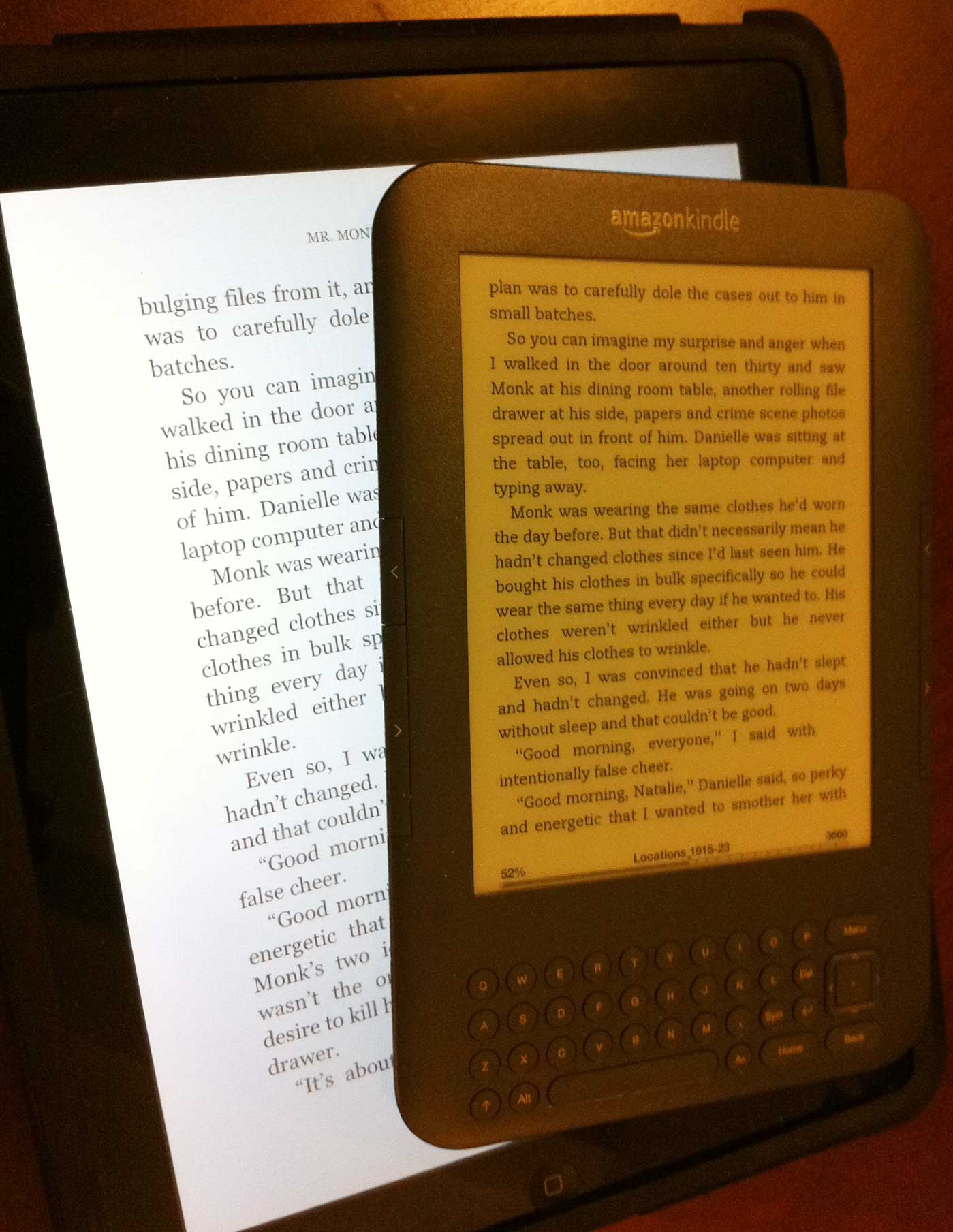
Kindle and iPad showing the same page. [Click for larger image]
Don’t get me wrong: I love my iPad and I do read a lot on it. I just haven’t found myself reading too many novels. I’ve read some technical books, reference books, comic books, and cookbooks, but only a few novels. For the former, the iPad is ideal — it’s super fast for skimming through a book, examining diagrams (zooming in and out is instantaneous), or studying technical material. For just plain novel reading, however, I’ve found there are two problems.
One is the size of the device. An iPad is magazine size, nearly a letter-sized page, and while for actual magazines that’s great, it’s not so good for novels. I prefer the paperback size for casual reading and on the iPad, seeing so many words on a page is slightly intimidating. It makes reading feel more like work and it’s easier to lose your place. (I can increase the font size so there’s less info per page, but then it feels like I’m reading a large print edition which has its own weirdness.) The iPad is also dense and heavy, and while that’s not a big deal (many of my paper books weigh more) as it’s comfortable to rest the device against your chest or bed or table, it does add to the feeling of effort. Just like a four-inch thick novel is intimidating, a heavy iPad gives you the impression that there’s a lot of words left to read.
The second and greater problem with reading novels on the iPad is one of distraction. Here I’ve found there are two types of distraction. One is actual interruptions: fresh email chiming, alerts from various programs, a Words With Friends’ alert that it’s my turn to play, and so on. The other distraction is simply the knowledge that there’s so much I can do on my iPad: games, work, web pages to read, music, apps to check out, and so much more. This latter distraction is the worst because it saps my energy for novel reading. When it occurs to me I’d like to read and I reach for my iPad, it’s natural to first check my email to make sure there’s not an urgent message waiting, and then I see all my app icons and remember I need to do this or that, or maybe I’ll play a quick game of solitaire or Boggle and before I know it I’ve used my reading time doing other things.
The Kindle, on the other hand, only lets you read. That’s it. I hope they don’t change that. They’ve got some simple games available as they’re attempting to get developers to write apps for Kindles — but I don’t want apps and games on my Kindle. First off, apps on Kindle pale in comparison to the gorgeous color and touch-screen simplicity of the iPad. Second, because of the Kindles’ e-ink screen limitations (more on that in a minute), stuff can’t be very interactive. But most importantly, what I like most about Kindle is when I pick it up, it’s to read and that’s it. It’s much more like a paperback in that respect — you can’t play games, surf the web, or check stocks with a paperback!
Though I felt sort of silly buying a Kindle when I already had an iPad, the two devices seem to serve such utterly different purposes that it also felt like the correct thing to do. An iPad is great as a lightweight general purpose computer. It also lets you read books. I’d recommend it for the casual reader. For the hardcore reader, I recommend both.
After using both, I’ve also come to realize that they each are best for different types of books. Kindle is ideal for novels. Novels are read linearly, you don’t jump around in them, and they usually don’t require pictures or complex formatting. All you really need is a good black-and-white display and a page turn button and Kindle does that pretty well.
Moving around a book on a Kindle is not easy. It’s not terrible — it’s actually better than I expected — but it’s not as good as a real book and an iPad is actually better than a real book. For reference books or manuals where you flip through them a lot, I much prefer the iPad. Charts, diagrams, and pictures look far better on iPad as well. Of course, once you’ve established bookmarks you can jump around inside a book instantly, but that doesn’t work for new books and even then a lot of the slowness is due to the Kindle’s display and the cursor-based interface. For instance, if you have 10 bookmarks or a table of contents listing and you want the 8th one, you have to move the arrow down 8 times until that row is highlighted and then press the select button. On an iPad, you just touch that row with your finger. For novels this isn’t an issue at all as you read them straight through, and if you didn’t have an iPad for comparison, you probably wouldn’t think the Kindle too bad. But for me, I’ll just pick and choose which device I use for which kind of book.
That’s the real beauty of the Kindle system: I don’t feel locked into the Kindle because all my Kindle books are available on both my Kindle device and my iPad (and iPhone and Mac). Of course, on the iPad, I can also use other bookstores (iBooks, Barnes and Noble’s Nook app, Stanza, etc.) and my own content (PDFs, texts, etc.). Basically the iPad can read any digital format while the Kindle hardware is more limited. Having both is the ideal, but that somewhat depends on what you like to read (if you read only novels and have no interest in iPad’s other functions, a Kindle might be all you need).
First Impressions
Though I’d never used or even seen a Kindle, I had read a lot about them and thought there would be little to surprise me. Instead, I got a number of surprises, most of them pleasant.
The e-ink screen on the Kindle is one pleasant surprise. It really is paper-like. I’d been skeptical of e-ink from what I’d seen in the past, both in terms of poor contrast and because of sluggish updating. But this latest generation Kindle is surprisingly fast.
If you aren’t familiar with e-ink, the key difference between it and other kinds of display technologies, is that e-ink requires power only to change the display. Once pixels are set to “on,” they stay in that state with no power. For book material where things are static while you read the page, that’s ideal, as power is only used when you change the page. That’s why a Kindle gets weeks of battery life compared to an iPad’s one day. (iPads use color LCD screens which require constant power and backlight to be visible.)
The problem with e-ink is that it is slow to change state. Showing something like a movie isn’t too feasible because the pixels can’t be changed fast enough for animation (they’re working on this but I don’t think e-ink will ever be as good as LCD for movies). In earlier e-ink readers, the delay to change the entire screen was quite long — two seconds, I think. I’m not sure how fast this one is — maybe half a second — but it’s plenty fast enough for changing pages in a novel. I found I was able to read the line at the bottom of the screen, hit the next page button, and start reading at the top without missing a beat in the slightest (the screen refreshes in the time it takes your eye to move from the bottom to the top). It is actually smoother, easier, and faster than turning a page in a physical book! E-ink screens still have a brief flash when you change pages (the entire screen inverts for a fraction of a second) and I had worried that would bother me (or trigger an epileptic fit), but literally after minutes of use I forgot all about it and I don’t even notice it now. It’s quick enough it’s hardly noticeable.
I had also worried that the device would feel sluggish because the screen wasn’t updating very fast, but that wasn’t much of an issue. There are times when you do something faster than the device can display it — like move the cursor too fast or change several pages in a row — and it feels like the device can’t keep up, but it’s only annoying, not terrible. Typing, for instance, can’t be done too quickly. When I tried pushing buttons as fast I could, the display couldn’t keep up and I ended up with different results than I expected. But since you don’t need to type much on the Kindle and when you do it’s usually just a word or two, it’s not a problem.
I expected the display to work well out-of-doors and it does (it’s way better than iPad’s washed out display in bright light), but I hadn’t realized just how poor the lighting in my living room is for reading. I’ve read paper books there okay, but the Kindle was nigh unreadable until I turned on a lamp. It really requires plenty of light. That tells me that its contrast, while far better than in the past, still isn’t quite as good as paper. In dim light you’re reading dark letters on a dark gray background and it’s difficult. The solution of a reading lamp isn’t a big deal and is probably better for my eyes anyway (I have a bad habit of reading wherever I am even if the lighting isn’t ideal). This means you can’t read Kindle in the dark, like an iPad. (But I wouldn’t recommend reading an iPad in the dark as it’s not good to stare at bright screen in the dark.) I was glad to see that my small bedside lamp gives off plenty of light for Kindle use; I’d been worried it wouldn’t be bright enough.
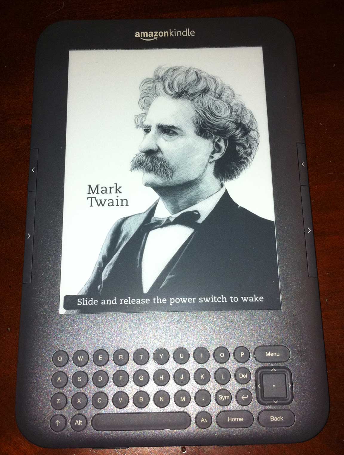
One aspect of the display that’s disconcerting is that never seems to go off! Even when asleep, the Kindle screen still has stuff on it — since it doesn’t use any power it doesn’t hurt anything so this isn’t an issue at all, but it feels odd. Amazon did a very cool thing to take advantage of this feature. When the Kindle goes to sleep (or you put it to sleep), the screen changes to a picture of a famous author. The pictures are old-fashioned woodcut-style drawings. Really nice. I don’t know how many there are, but I haven’t seen a duplicate yet. So when your Kindle is lying around unused, it has a picture of an author on it instead of an empty screen (see the cool Mark Twain one in the photo I took below). It’s surprising to me how much pleasure this feature gives me!
Unfortunately, other surprises weren’t as nice. The biggest for me was right away when the first thing I needed to do was enter the password for my wireless network. That’s when I realized that the keyboard has no numbers! To type a number, you press the Symbol key to bring up an on-screen menu of special characters (punctuation, symbols, numbers, etc.) and you use the cursor keys to navigate to the character you want and press select to “type” it. It’s a bit like typing text on a TV with a remote control. Not fun. My password is a long mix of random numbers and letters so it took forever to type it on the Kindle. Fortunately, it’s a one-time thing as Kindle will remember it and automatically log in in the future, but it was still annoying.
On a similar note, when I noticed that Amazon had automatically named my Kindle “Marc’s Kindle” I saw that it had used a straight quote (foot mark) instead of a curved apostrophe. Being a perfectionist and graphic designer, this irked me so I went to change it and was shocked to discover that curved quotes (“smart” quotes) are not on the symbol chart! There’s just no way to type those on the Kindle. I ended up changing the name to “The Kindle of Marc” just to avoid looking at that awful foot mark. Later, I noticed that I can also set the name via Amazon’s website on my Mac, so I changed it to “Marc’s Kindle” with a curved quote and it worked wonderfully! At least there’s a workaround, but this example perfectly shows the kind of details that Apple sweats and Amazon does not.
Most everything else about the Kindle worked as I expected. It basically displays the text of books so you can read it. There are options for adjusting the font, text size, and some other visual aspects, but there’s really not a lot of variation. (Most of the ereaders on the iPad give you much more control over how text looks.) I found the default settings were fine — all I want to do is read.
One interesting thing is that the Kindle hardware allows you to create “collections” of books. These are sort of like named folders, except that books can appear in more than one collection. This is awesome. I’ve been dying for this on my iPad: none of the ereader apps support this and essentially show you a long scrolling list of books you have to wade through (which makes it really hard to find the right book). I like to organize my books by type, mood, and other characteristics. I sure hope Amazon updates the Kindle app for iPhone and iPad to support collections because they are awesome. For now, collections are only supported on Kindle devices. If I had known that, I might have been tempted to buy a Kindle earlier — it’s that important of a feature to me.
Putting your books into collections on the Kindle isn’t trivial, but it’s not too bad. On an iPad you would just touch and drag items around, but of course you can’t do that on the Kindle. Instead, you have to use the cursor to move through each book, item by item, until you reach the one you want. It’s tedious, but not complicated. Amazon has done some nice things to make it easier. For instance, when you go inside an empty collection there’s only one thing in it — a menu selection to add items to the collection. When you choose it, you’re right within your list of books and just can just hit the select button on each one you want to add to that collection.
Speaking of that list, while it’s a neat feature that Amazon lets you put items into multiple collections (each member of the family could have their old collection of books, for instance, with some overlap where reading tastes coincide), it is a bit annoying that Amazon has to show you the complete list of items on your Kindle when all you want is the last few that haven’t been put into collections yet (you have to scroll through the entire list of every item on your Kindle to find them). It’d be nicer if there was an option to only show unfiled books. Amazon does help in subtle ways, like showing your most recently added books first, but that doesn’t help when you’re setting up a brand new Kindle and all your books are recently added. Also, there are other ways to put books into collections, such as selecting the book and then assigning it to a collection.
Getting Content
Getting books into your Kindle is easy. Once you register your Kindle — a simple process of typing in your Kindle’s serial number on your “Manage My Kindle” page on Amazon’s website — all books associated with that account are immediately available for that device. Since I’d already bought a bunch of Kindle books on my iPad, those books were now available on my Kindle. I still had to download them — they’re archived on Amazon’s site until I request them — but that’s just a matter of selecting them from my archive list. You’re allowed to download most books onto multiple devices (six is the typical limit though some have different restrictions) so you can read the same book on multiple Kindles, iPhones, iPads, etc. Amazon will keep them all in sync, too, jumping to the most recent place read, as well as copying all the bookmarks, notes, and annotations you’ve made.
Once your Kindle is registered, it is tied to your Amazon account and able to make purchases. This is almost too easy: if you see a Buy button and select it, the book is immediately purchased and downloaded to your device. When Amazon says “books in sixty seconds,” they are exaggerating — it’s much faster than that. While this is convenient, there is no confirmation dialog, which made me wary. Apple makes you tap twice before you buy something, to ensure you didn’t hit the button by mistake the first time. Amazon just buys it. There does seem to be an “unbuy” procedure, but I’m not sure how that works and I didn’t test that. (Apple, on the other hand, famously has a “no refunds” policy for their bookstore and app store.)
You can also get subscriptions to magazines and newspapers on the Kindle and the new issues are wirelessly delivered as made available. I’m not a newspaper reader, but that’s partly because I hate getting the ink all over my fingers so this is somewhat tempting as Kindle obviously eliminates that problem. But I still don’t know that I’d pay for a paper (or have time to read one). Magazines don’t seem like a good fit for Kindle — at least not glossy, design-heavy publications. They’re awesome on iPad (I already have several subscriptions via Zinio). Some periodicals might work. I saw Reader’s Digest is available via Amazon for a reasonable $1.25/month and gave it a try (easy as I can cancel within 14 days and not be charged). Since that publication is mostly bare text, it works extremely well. All the sections are easily jumped to via navigation tools, making it better than the print edition. However, the vocabulary quiz “Word Power” is really easy since on Kindle you can just point at a word and have the definition pop up! (Just to be clear, I didn’t cheat: I just tested this on a word I knew to see if it would work and it did. I got a 14 out of 16 on the quiz, which isn’t too bad, though I obviously need practice as I usually do better.)
Another way to get content into your Kindle is to email it to a special email address Amazon assigns to your Kindle. I wasn’t too sure about this until I tried it — it really is cool. It will even convert documents into a Kindle-friendly format if you want, though the formats supported are limited and the results are not always good (I converted a PDF and though it was generally readable, a lot of the formatting had been lost making the text awkward). I knew that Amazon offered this feature but thought that it cost money. Since Amazon pays for the free 3G service that comes with Kindles, they usually do charge for this. But the new Kindle I have is Wifi-only, so there is no charge! Because of that, I think I will use this. It’s a great way to get stuff to the Kindle. From any computer, phone, or iPad, I can instantly email my Kindle one or more documents and within seconds they are on the device. You do have to register the email address you send from on Amazon’s website or this won’t work (it prevents unauthorized people from cluttering your Kindle), and there are some other limits, but generally this worked surprisingly well. I thought maybe it would take too long but it seemed really fast — by the time I’d finished hitting send on my computer and picked up the Kindle, the new file was there. (As a nice touch, Kindle displays the email address that sent the file next to the file name so you can remember who sent it.) I bet family members with multiple Kindles could send things to each other this way as a “You should read this” suggestion.
You can also hook your Kindle to the USB jack on your computer to mount it like a flash drive and copy files to it that. That’s how Amazon recommends you get big things like music and audiobooks onto the Kindle.
Other Features
Kindles can do more than just let you read digital books, but I question the need for some of these abilities. They add to the complexity and learning curve of the device, and yet I suspect that few use the features. But other things I hadn’t expected to like might be useful, so I guess it’s fine they offer these. I just don’t want the device getting so feature-heavy it tries to be something it’s not. What appeals to me about it its simplicity and as long as Amazon focuses on reading, it will sell, but if they try to make it more iPad-like, it’ll fail.
I’d heard that the Kindle has a built-in voice that can read books to you. It didn’t sound like such a good thing — a robot can’t read like a real person — and I didn’t think it would be that useful. I still don’t think I’d use it often, but I tested it on the Kindle User Manual and it was great for that. I’m not sure it would work for fiction, but I listened to the manual being read while I fixed my breakfast and it was rather cool — I could get the gist of what was being said without distracting me from my main task. It’s a nice feature and would be useful for reading news reports, blogs, cooking instructions, or other non-emotional material. I can also imagine using it on a airplane when I’m exhausted of reading but I still want to follow a story.
The Kindle can also play real audiobooks and music (even music in the background). While there’s nothing wrong with such features, they seem superfluous (but that could just be because I’ve got an iPhone for such tasks) and I expect they would severely damage battery life.
This new Kindle can read PDFs directly, which is really nice in principal. In practice, however, most PDFs aren’t formatted for the Kindle screen, so the text ends up microscopic. Kindle will let you zoom in, but it’s an extremely convoluted process, and once you’re zoomed in, moving around the zoomed area is slow and awkward (you use the arrow keys to pan).
One tip is to read to-small PDFs while holding the Kindle sideways. You can do this by going to a menu and telling Kindle to rotate the screen. This works fine, but after using iPhone for years, it feels bizarre that the device can’t tell which way I’m holding it and rotate automatically. It’s also weird that all the controls (keyboard, etc.) are sideways. When you’re working sideways you can’t see the full page of the PDF, only about half of it, but the page advance controls work well to let you move through the document in half-page chunks (except that now those buttons are on the top and bottom of the horizontal device instead of the sides). In short, the PDF ability is useful in a pinch, but not too practical. If I had both an iPad and a Kindle, I’d use the iPad to read PDFs hands down.
Kindle includes a Web Browser under the “experimental” section. It works, but pictures look pitiful in muddy grays and it’s rather painful navigating through web pages without a mouse (the arrow keys jump you between links and you can push select to open the link). Useful, but definitely not essential.
You can shop for books right from the Kindle, which is nice, but I wasn’t too impressed with the options and presentation. For instance, it’s easy to look at best-seller lists, Amazon’s recommendations, etc., and you can search for titles by name or author, but there’s no way to sort such lists by price or other characteristics. This makes finding a particular edition tedious as you have to go through each one (and you’re fighting with Kindle’s cursor-based navigation the whole way). This happened to me when I was looking for some free books — I kept finding paid versions and yet knew those were old out-of-copyright books that should be available for free (I did eventually find some).
The bottom line: while it’s handy to buy able to buy books right on the device and it works wonderfully if you know the exact book you’re looking for, it does not work so well for browsing the store. For instance, when the lists show thumbnails of book covers, the art is in shades of gray and the pictures are so tiny (way smaller than a postage stamp) that you can’t tell what it is. It’s far more practical to shop for books on a real computer or iPad than on the Kindle.
One of my favorite extra feature of Kindle is the ability to see the definition of any word as you read. It’s not quite as easy as on the iPad where you just touch the word — on Kindle you have to use the arrow keys to move to the word which is slow.
Kindle also makes it easy to highlight phrases, add notes and annotations, and bookmark places. That’s an obvious function, but what I didn’t know is that Kindle automatically saves such highlighted text into a “clippings” file. It’s a plain text file you can access on your computer when plug your Kindle in via USB, so it’s a terrific way to preserve quotes or copy short passages of text. This is interesting because you can’t copy text from Kindle books on the iPad, but this effectively gives you a way to do that on the Kindle device. The drawback is that the only way to access this file is via the physical cable connection — it would be nice if you could email this to yourself or access it wirelessly.
Interface
I had expected the Kindle interface to be horrible. First of all, it’s not made by Apple, who are famous for creating elegant interfaces, and second, the device’s hardware by its nature prevents certain kinds of interfaces (i.e. touch). To my surprise, the Kindle’s not that bad. There’s a Home button which takes you to the main screen which lists all your content (collections, books, PDFs, music, etc.). You move around with the arrow keys, highlighting lines (one item per line). If you press the right arrow, you’re given some options of what to do with the item (open it, delete it, etc.). If you press Select instead, the item opens up to the last page you read in it.
Amazon has placed two page turn buttons on either side of the Kindle. These are flush with the device and right in the middle. The bottom ones are taller than the shorter upper buttons. The bigger button is “next page,” the smaller one “previous page.” Presumably you flip to the next page a lot more often so it’s bigger, but aesthetically it looks unbalanced. (Why not just make them both nice and big?) I’m also not quite convinced about the placement of these buttons in the middle of the device. If I grip the Kindle with one hand, my fingers wrap around the edges where these buttons are and I squeeze them accidentally. I can hold it lower in my hand, which isn’t too bad, but then I have to use my other hand to press the “next page” button. It’s not terrible, but I’m still not used to it, and I haven’t quite figured out the ideal position for holding the Kindle and turning pages. It feels like more work than it should to turn a page, but that’s probably because I’m too used to iPad, where I can just give the screen the faintest tap with my wrapped around finger (the iPad’s wide bezel around the screen keeps me from tapping the next page area unintentionally).
The biggest frustration I’ve found with Kindle is that there is no counterpart to the “back” button. The Back button returns you to the previous screen — not the previous page within a book, but the previous screen where you had a choice (like the view inside a collection where you see the books in that collection). It also works if you follow a link in a book to jump to another section: pressing Back returns you to that original point. This is great and useful, but it’s somewhat unpredictable. I’m not always sure where Back is going to take me. If it takes me to wrong place or I hit it by accident (easy to do), I can’t figure out to to return to where I was as there’s no Forward button. (It could be I just haven’t explored Kindle deep enough and there is a way to do this, but I haven’t found it yet.)
Another interface quirk that I haven’t decided if I like or dislike yet, is the way the purpose of the Menu button changes depending on where you are. For instance, to get to Settings, where you can change some of the device’s settings, you must be on the Home screen when you press Menu. If you press Menu while on a different screen, the options on the menu are completely different.
This context-sensitive menu can be helpful by eliminating unavailable choices, but it’s often hard to remember where you saw an option. You remember that there was a way to move a book to collection, for instance, but when you press Menu, that option isn’t listed. So where is it? You eventually figure out that you have to be on a book’s nav page (right arrow) to find it. If you’re inside the book or elsewhere, that option isn’t available, which can be frustrating.
Keyboard
Earlier versions of the Kindle were hideously ugly. This new Kindle is far better, but unlike the clean and simple iPad, it does kludge the design by including the tiny keyboard across the bottom. It wastes a lot of real estate on the pad with something you won’t use that often (unless you’re really into typing notes on the books you read or do a lot of searches). If they can ever get a touch-screen Kindle with a virtual keyboard, I’d go for that option any day.
(For those who think a hard keyboard is so much better, it’s actually not: on a device this small, neither is optimal and a hard keyboard isn’t faster. Its disadvantages — no automatic rotation, no foreign language support, and real estate wasted when you aren’t typing — outweigh any benefits of a hardware keyboard.)
Since this Kindle’s not touch, the hard keyboard is far better than a virtual keyboard navigated by arrow keys, but it’s still not great. The layout is poor, with dangerous keys right next to each other. For instance, there’s a return key right below the same-sized Del (backspace) button, so when I was attempting to type the name of a Collection I’d created and needed to erase a typo, I accidentally hit return which accepted the incorrect name. In that case it wasn’t fatal, as there is a rename feature, but in other situations return accepts the current or default answer to a question which could be something important like, “Are you sure you want to delete this?”
The Kindle keyboard. [Click for larger image]
The all-important Home, Menu, and Back buttons are not placed in any particular order (you could rearrange them and they’d be just as effective — in other words, there’s no logical reason for them to be where they are). I found I kept confusing Home and Back. Home is the most important, but Back is the bottom rightmost key which is the easiest to find by feel. Personally, I’d have put Home in the bottom right, Back above the directional pad, and the less-used Menu to the left of Home (this assumes I’m keeping the layout the same and just rearranging the keys).
The five-way arrow pad (with select button in the middle) is tiny. It works, but though I have small hands and love small things, it’s really too small for me. It should be twice the size as it’s the main thing you use on the device (far more than the keyboard).
I do like the feel of the keys. They are solid without being too hard to press, and they aren’t so raised as to make the device feel thicker. But I don’t know why more thought wasn’t give to the layout. Why are so many keys the same size? Several control-type keys, such as Symbol and the “Aa” text resize button, seem stuck in random locations where there was some leftover space, and there’s not even color distinction to show that these keys are different from regular letter keys. Another oddity is the naming of the Alt key which is used for keyboard shortcuts (like Command on the Mac or Control on Windows) which seems needlessly different from the Alt key people are accustomed to on computers.
The Bottom Line
Though I’m critical of the design in several areas, overall I am delighted with my Kindle. I’ve only had it for a couple of days so it’s still too early for me to judge if it’s something I’ll use long-term or not. Right now it feels like I would, but my enthusiasm could wane. We shall see. (I have a 14-day return option, so if I actually use it, I’ll keep it.)
What I like about the Kindle (compared to iPad):
Size. Remarkably and delightfully small and light. Makes me want to read.
Single purpose. I pick it up when I want to read novels. No distractions of other functions.
What’s good about both iPad and Kindle:
Long battery life. With three weeks of reading time on the Kindle, it’s nice to not have to worry about the battery at all. But in truth I don’t worry much with iPad as its battery lasts more than a full day for me and it’s no chore to plug it at night before bed.
Clear screen. For reading a good screen is vital. The iPad and Kindle both excel in this area. Some prefer one over the other, but that’s a personality thing. Kindle definitely wins for outdoor reading, but how often do you do that? Kindle is definitely far worse in poor lighting which to me is a more often occurrence than the need to read outside (but then I live in Oregon where it rains all the time so we’re indoor creatures here). I like both of them.
Overall, the Kindle ecosystem — hardware, digital store, software readers on every platform — is very nice. Using the Kindle you really get the feeling that this is the future of books. As a science fiction fan, this Kindle is something I would have imagined and lusted over as a child when I could never find enough books. The idea of a thin pad that holds thousands of books and can get any book over the airwaves in seconds is a dream. The future is here. Within a couple of years when these are selling for $59, I bet people will have several all over the house, each with all their books on them. For instance, I could keep one in my room for reading before bed. Why carry one around when I can have several and just use Wifi to keep them all in sync? Shoot, if they get cheap enough, you could have one in every bathroom instead of a stack of old magazines!
While I worry a little of Amazon’s tactics to extort publishers, at this point the digital book market is still tiny and Amazon’s monopoly is a problem for another day. For now, I’m pretty happy with it and the Kindle store. I really have the best of both worlds owning both iPad and Kindle.
If you’re a reader, I encourage you to check one out in person (they’re being sold at Staples and Target stores, I believe). Like the iPad, it’s the type of device that is best experienced versus just reading about it.